Hidden Gems in the smartUI SDK: The side.panel

An overview of the side panel

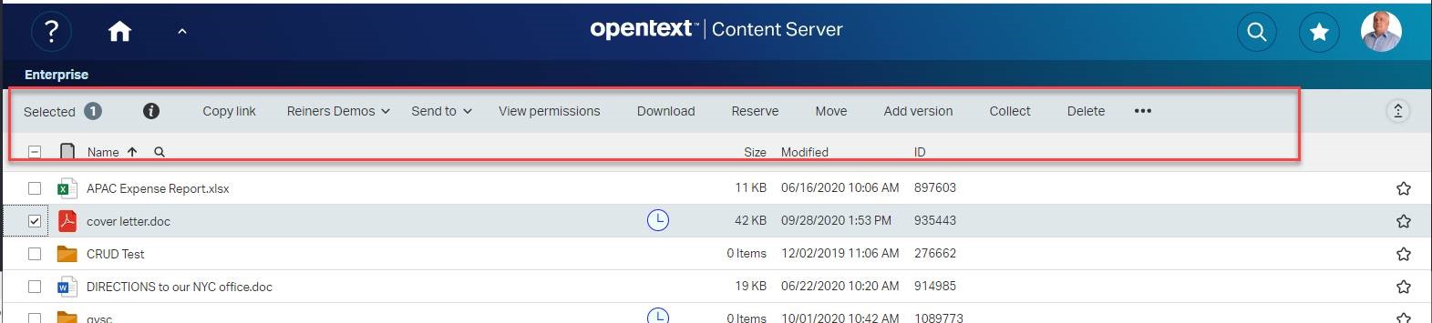
One of the most interesting controls in the SDK is the side.panel. Reminds somehow to the good Documentum side panels, but is native in the new SDK for Content Server 20.4.

This can be used as a simple control to show things like search forms or oanything you like. Also, multiple views (slides) can be shown in a “Wizard Style”.

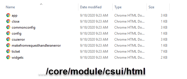
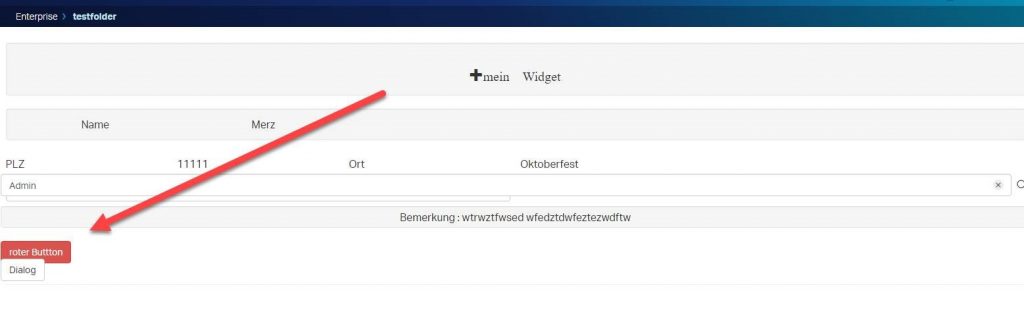
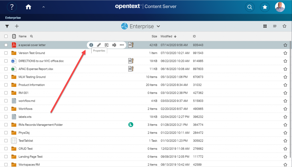
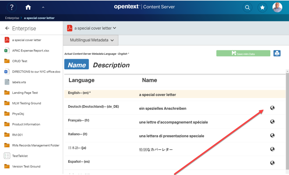
First lets take a look on the the sidepanel right out of the box. Quite astonishing, there is a index.html actually working under csui/controls/side.panel/test/index.html. If somebody starts this file, we’ll see side.panel in action:

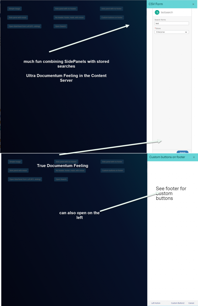
Shows a nice panel sliding from left/right based on the configuration. This view can be used to show a single view or multiple views (as slides) as per configuration provided to it.

Quite interesting is the fact that if slides provided to the panel, panel’s footer include navigation buttons along with the button provided to the respective slide as part of configuration.

side.panel has modal (dialog) behaviour by default which optionally can pass using constructor param as well (options.modal).

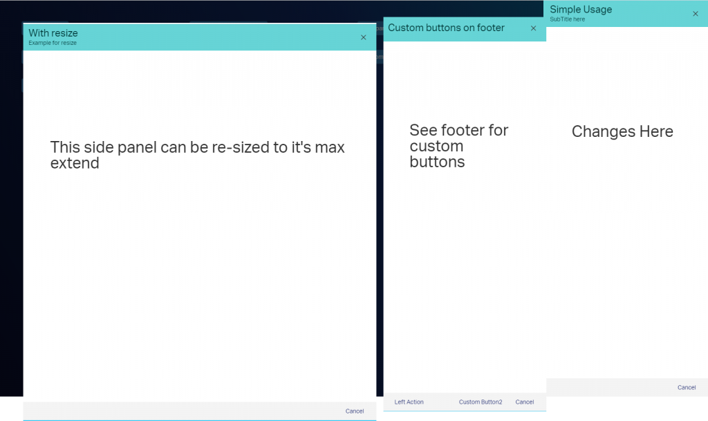
There are several usage possibilities.

Simple Usage (on the right of the screenshot above):

var sidePanel = new SidePanelView({
title: 'Simple Usage Title',
content: new Backbone.View(),
buttons: [{
label: 'Button1'
}]
});
sidePanel.show();

If you want to have several buttons on the footer (in the middle of the screenshot above):

var sidePanel = new SidePanelView({
headerView: new Backbone.View(),
content: new Backbone.View(),
footer: {
leftButtons: [{
label: 'Button1'
}],
rightButtons: [{
label: 'Button2',
id: 'btn2'
}]
});
sidePanel.show();

An example for a “wizard style” sidepanel sliding from the left or the right into the screen

var sidePanel = new SidePanelView({
slides: [{
title: 'Step1',
content: new Backbone.View(),
buttons: [{
label: 'Reset Form',
className: 'binf-btn binf-btn-default'
},
{
label: 'Search',
disabled: true
}]
},
{
title: 'Step2',
content: new Backbone.View(),
buttons: [{
label: 'Finish',
close: true,
className: 'binf-btn binf-btn-primary'
}]
}]
});
sidePanel.show();

There is also a documentation available, at csui/controls/side.panel/doc/side.panel.view.md

Nice, isn’ it?

Happy sliding !

Remove Commands from Nodestable etc in the smartUI SDK

Command is Gone

From time to time you’ll need to remove commands from the widgets, like the nodeslist widget.

The magic spice is setting up a blacklist on the masks.js files during the initial phase:

csui.require.config({
  config: {
    'csui/widgets/search.results/toolbaritems.masks': {
      'mycustomer': {
        'otherToolbar': { blacklist: ['Properties', 'permissions'] },
        'inlineToolbar': { blacklist: ['Properties', 'permissions'] }
      }
    }
  }
})

There are several possibilities to do that.

1, The approved way

The approved way is to configure smartUI before its initialized from OScript.

This can be done by overriding the GetDynamicConfiguration in your base smartUI module (the one with the csuiextension orphan) like:

override function Assoc GetDynamicConfiguration(Object prgCtx, Record request)
  
    List blacklist = { "Copy", "Move" }
    return assoc{
      "csui/widgets/nodestable/toolbaritems.masks": assoc{
        "basecsui": assoc{
          "tableHeaderToolbar": assoc{ "blacklist": blacklist },
          "inlineToolbar": assoc{ "blacklist": blacklist },
        }
      },
      "csui/widgets/nodestable/headermenuitems.masks": assoc{ 
        "basecsui": assoc{ "blacklist": blacklist }     }    }
  end
end

Here in this example, the toolbaritem.masks and the headermenuitem.masks are set up with our magic spice (a blacklist containing all the signatures of the commands not desired). This will remove the “Copy” and “Move” commands from the list of commands permanently. And permanently means, this will survice a Page Reload.

2. The ugly way (but also surviving a Page Reload)

The ugly way is a way is the standard OpenText Way of overriding app.html and configuring the blacklists by yourself. Lets take a look at the app.html (found at ../core/module/csui/html).

Here is an example on a windows server:

Where to find app.html
app.html - the head

In the upper part you can see the csui.require calls. At the top you’ll notice a csui.require.config call, where you can put our magic spice (see above).

The disadvantage is, when you override app.html (directly or by using htmlmap) then you’ll have to check, if any future OpenText patches will override the app.html also.

BUT: If you override app.html, you can take advantage of this for example by implementing a permanent footer, which is always drawn at the bottom. You cannot do that with pure smartUI tools.

Here is an example of a permanent footer in the body part of the app.html.

Multiple usages of app.html - the body

3. The force way

There is also a brutal way to remove commands without that configuration of app.html. This requires

  • a widget or a command to do the removal
  • a couple of js lines

But on the other hand, this is the way which allows easy recovery of the command by doing a simple refresh of the page.

Here is a demo case (a wild version of the hello widget from my training installation). This is a widget with some demos and a new inserted button to delete a command.

a very chaotic demo

Behind the button are some js lines of code, which will remove the Copy-Command. Actually, the lines var b=commands.get(“Copy”); and commands.remove(b); do the job.

You will have to require /csui/utils/commands unter commands to use this two lines.

Two lines to decide the fate of the copy command.
Two Javascript Lines will decide the fate of the copy command

Lets see the initial command set. The Copy Command is here as usual.

Copy command lives

After the red button is pressed in the then the Copy Command is gone:

Copy Command is gone

We simply deleted the Copy command from the list of commands. This means, a simple Refresh will restore it.

Have much fun on playing around with commands!

Hidden Gems in smartUI: The Wizard Control

The wizard in Action

From time to time there are real gems waiting to be discovered in the deep abyss of smartUI. Today we’ll take a look on the Wizard control.

Example

Lets look at an example.

Hidden inside the permission explorer, there is an option to assign a new user with some permissions to a document.

When you select a document, you can select a user or a group to add to this document. This is the first page of our wizard. This control directly calls the MemberPickerWizard with this two steps.

Step 1: Select user or group

Wizard Example: Step 1

Step 2: Assign permissions

Wizard Exapmple: Step 2

Nice thing.

The code definition

Lets look at the member picker wizard:

var membersPickerDialog,
    dialogClass = "cs-permission-group-picker",
    dialogTitle = "Add users or groups",
    displayName = "Users and Groups",
    context = new PageContext(),
    connector = context.getObject(ConnectorFactory),
    node = new NodeModel({id: 37474}, {connector: connector}),
    startLocations = ['all.members', 'member.groups'];
membersPickerDialog = new MembersPickerDialog({
  command: 'adduserorgroup',
  context: context,
  connector: connector,
  dialogClass: dialogClass,
  displayName: displayName,
  dialogTitle: dialogTitle,
  startLocation: 'all.members',
  adduserorgroup: true,
  addButtonLabel: lang.AddButtonLabel,
  startLocations: startLocations,
  nodeModel: node,
});
membersPickerDialog.show();

Almost immediately the memberPickersDialog is instantiated and shown:

The membersPickerDialog

As we can see, here is our wizard.view.js used as reference.

The wizard itself is wired inside the prototyype:

Show the wizard

First, the steps are created in _createWizardSteps (see below).

All of these steps are used as argument on instantiating the wizard. Then the wizard listens to some events (“save:result” and “add:member”) and processes them.

Thats all. Easy.

The Step Defnitions

Steps are defined inside the _createWizardSteps method:

Define the steps

The object step1 defines the selection of the users, the object step2 (below) defines the permission level.

Example of a step: The Step 2

All steps have in common:

  • a title
  • headers (with the NLS language sting, a class and an id)
  • a next Button (with next button label)
  • and, of course, a view defining the content of the wizard step.

At the end, the defined steps are returned as array:

return [step1, step2, step3];

So you`ll find that under

csui/controls/wizard/wizard.view

Happy wizarding

smartUI in practice: SMART TOOLS(4) –Direct Access of Renditions – Technical

smart tools
Cell Renderer

Overview

Last week, we discussed a possible implementation of the direct access to renditions. This icon is drawn an a document, which das renditions at the newest version. Clicking on that icon opens a panel which lets the user select one of the renditions to download or delete.

Direct Access Rendition

Selecting one of the renditions will download this rendition or (if permissions allow it)( delete the rendition.

Technical

The whole thing is based on a cell renderer. This relies on the extension point node.state.icons which is (as always) declared in the extensions.json file:

"csui/controls/table/cells/node.state/node.state.icons": {
"extensions": {
    "csuia": [
       "csuia/cells/node.state/node.rendition/node.state.icons"
             ]
      }
},

This declaration points direct to the appropriate node.state.icons

define(['csuia/cells/node.state/node.rendition/rendition.view'
],
function (RenditionView) {
'use strict';
return [ { sequence: 60, iconView: RenditionView } ]; });

This basically declares the required view named “rendition.view.js” as responsible to draw the icon at sequence position 60.

This is the template used for the view.

Cell renderer Template

The image is drawn cia the css seen above.

Encapsulating this inside a link allows to make the svg clickable.

Enable the direct access

The first point is the decision, if the cell renderer is to be drawn or not. This is a static method at the view, returning true or false. We dont have ony clue if the nodeid does have a rendition at the newest version, so we have to implement a new REST command at the server to get the information. The REST must be called synchronously.

the static enable function

This is done via a simple XMLHTTPRequest. If the result is true, we return true and store the number of each rendition types at the node in the prototype for further processing.

Then lets take a look on the events:

events

This means, a click on the class of our link in the template will call onOpenView. Before we look at that, look at this in the templateHelpers:

Open the Panel after the click

Remember, we got the number of each rendition types from the server? We want tzo display these numbers as a tooltip over the icon, so this is the way to formet the output string. A note to the knights of the holy JS-grail: Referencing this.__proto__ instead of finding the prototype via object maybe depreciated, but at least its also in ECMA 6! So nowadays its a valid method.

When we click on the icon, we want to open a DialogView from the sdk toolkit with an embedded view (SelectView) in the method onOpenView:

OpenDialog

Before we open this view, we call the server to get the renditionlist of this node via XMLHTTPRequest. If we get the list (status=200) we intiantiate the view (selview1) and display the DialogView containing the instantiated view at the bin_modal default EL anchor.

Then lets show this region and store a event handler (string “submit”), which is listening on the view selview1 for that string. If it receives that string, the DialogView is closed.

Next week, we’ll examine the SelectView.

Missed something in the Posts? Here are the parts already posted:

smartUI in practice: SMART TOOLS(3) – Renditions

smart UI in practice: SMART TOOLS(2) – Multilingual Metadata

smart UI in practice: SMART TOOLS(1) – the beginning

smartUI in practice: SMART TOOLS(3) – Renditions

smart tools

In SMART TOOLS renditions are also build in the properties manager of smartUI. Renditions can be displayed by selecting renditions on the pull down menu, just like Multilingual Metatata in my last post.

The main menu

Rendition Main Panel

Next, the main panel of renditions is displayed. The renditions of the newest version or the latest 5 versions will be displayed.. A Rendition can be downloaded, deleted, replaced or (if configured) with “View as Webpage” be seen.

Rendition Commands

If there are a lot of versions, a starting version can be selected. Then this version and the last 5 versions with all renditions will be displayed.

Ascending or descending sorts on versions can be done by clicking on Versions.

Interesting is the “View as Wewbpage” function. This is a build in function in the Content Server, so it can also be used to see the contents of any renditions in the classic UI and in a separate window.

view as webpage display

A rendition can also be downloadeed by clicking on the down.arrow icon. This will normally download the file as setup by the users browser. If the rendition is a PDF and print.js (a standard extension in browsers) is activated, the the pdf can also be displayed directly.

A list of renditions can also be printed. This is a nice addition to help you to get an overview.

Rendition list

Direct Access Renditions

For a direct access to renditions, I also added a cell renderer to be displayed, if the newest version of the document has a rendition.

This is a little svg icon displayed directly in the list of documents.

Cell Renderer

The little icon can be clicked and then a list of renditions belopnging to this document is displayed.

Direct Access Rendition

From this panel, a rendition can be selected and downloaded. If the user has proper permissions, he can also delete the rendition selected. Also a printed list (see above) can be made at this point.

Sorting in ascending/descending versions can be done by clicking on the Arrow in the “Vers” columnn.

Because this direct access requires a lot of calls to the server, this feature can be switched off at the Admin Pages of smartUI.

Add Rendition Command

Additionally, there is also one command required, the “Add Rendition” command. The “Make Rendition” command is not implemented, because this requires local admin rights, something which should be rare.

This command can be issued at any document directly from the list of documents

Addrendition command

Commands are usually displayed in two locations, the Headertoolbar (above) and the Toolbar (below)

Command in Toolbar

Adding a rendition means, selecting one of system defined rendition types and a file beeing intended as the rendition. If the selected rendition type does not exist on that document, then the file is uploaded and used as a rendition.

Add Renditions - Panel

Next week, we dive more in the direct access of renditions and the Pros and Cons of that technique.

Missed something in the Posts? Here are the parts already posted:

smart UI in practice: SMART TOOLS(2) – Multilingual Metadata

smart UI in practice: SMART TOOLS(1) – the beginning

Using react components in smartUI environments

Optional Module

With the react-dom package this can be easier then expected. The idea is, add the react component directly to the DOM

Build Environment

When you have a project directory made by yo from the sdk, you’ll need a couple more node.js module:

npm install -save react
npm install -save react-dom

Then make the two files

react.js
react-dom.js

ready for use with require, either by directly requiring them or use the require in the src path of your development. Dont forget, you cant use the IMPORT statement, because its ES6. The exact procedure depends on your project build modifications .

First steps

The React component

define([
'basec/widgets/hello/impl/lib/react'
], function (React) {
'use strict';
class UserInfo extends React.Component {
render() {
var img = this.props.img, name = this.props.name, mail = this.props.title; return ( 
React.createElement("div", null, 
      React.createElement("img", {width: "100", src: img}),
      React.createElement("div", {className: "name"}, name),
     React.createElement("div", {className: "mail"}, mail)));
}
);

This component is a simple div containing an image link and two other divs with content (name and mail)

The sdk demo widget

Then use the sdk demo widget, which will be generated, if you tell yo to do so:

yo csui-extensions:widget

This will add a widget/hello tree in your source tree (if your name for the widget was hello), The first couple of lines in the hello.view.js are:

define([
'csui/lib/underscore', // Cross-browser utility belt
'csui/lib/jquery',
'csui/lib/marionette', // MVC application support
'basec/widgets/hello/impl/hello.model.factory', // Factory for the data model
'basec/widgets/hello/impl/lib/react',
'basec/widgets/hello/impl/lib/react-dom',
'basec/widgets/hello/impl/UserInfo',
'i18n!basec/widgets/hello/impl/nls/lang', // Use localizable texts
'hbs!basec/widgets/hello/impl/hello', // Template to render the HTML
'css!basec/widgets/hello/impl/hello' // Stylesheet needed for this view
], function (_, $, Marionette, HelloModelFactory, React, ReactDOM, UserInfo, lang, template) {
'use strict';
// An application widget is a view, because it should render a HTML fragment var HelloView = Marionette.ItemView.extend({

First we need react and react-dom as modules. They are added here via define. I put it in some weird place, but this is up to you where to put this two modules. There are also a couple of different possibilities to get react and react-dom inside a module.

Next, we need a place where we can add our react component. So lets add this in the hello.hbs file:

...
<div id="userreact">
And this is the react component
</div>

this is simply a div going to held out react component.

The react-dom plays its role

The react-dom can render the component to a designated element, something like the $el element. We added a div with the id “userreact” in the hbs file above.

Now we can render the handlebars template. In Marionette, there is an onRender event routine, which can be used to spice up any rendings of Marionette.

onRender: function() {
var name = this.model.get("last_name");
var mail = this.model.get("mail");
var img = this.model.get("photo_url");
ReactDOM.render(
React.createElement(UserInfo, { name: name, mail: mail, img: img }),
this.$("#userreact").get(0));
},

In the onRender function, all is rendered and we now have a DOM. Now we can render our component.

  1. We need to provide your component with some data. So we extract these from our userdata model we got from the content server. This is more or less the equivalent to our old friend template_helper
  2. The ReactDOM is supposed to render the element UserInfo with the parameters in our div with the id “userreact”

Housekeeping

When the Backbone view’s remove method is called (from the csui app from the content server), we need to remove also our react component.

So lets add our Remove in the Backbone remove()

  remove: function() {
    ReactDOM.unmountComponentAtNode(this.el);
    Marionette.View.prototype.remove.call(this);
  },

Btw: If you want to use jsx for react ui definitions, you should amend your build process with the babel transpiler. This is an example of jsx and quite different to javascipt.

const element = ( <h1 className="greeting"> Hello, world! </h1> );

The transpiler basically builds this structure

// Note: this structure is simplified 
const element = { 
type: 'h1', 
props: { className: 'greeting', 
        children: 'Hello, world!' } 
};

Summary

  • Install react and react-dom and make them requirable.
  • Build or get the react components. Make them requireable.
  • Require this components from your view.
  • Add an anchor to your hbs file.
  • Let Backbone-Marionette render.
  • In the OnRender callback, gather all data for your react component and let react-dom render the component to the anchon.
  • Use standard JQuery to get data from the react-component.

Some further infos (on pure Backbone/React things without smartUI reference)

Integrating React with Backbone

Using BackboneJS successfully with React (using MobX)

Thats it.

But nevertheless not often used in our OpenText smartUI practical live. 🙂

smart UI in practice: SMART TOOLS(2) – Multilingual Metadata

smart tools

This is the second part of a multipart post of the new SMART TOOLS – a product supporting mlm and renditions in smartui.

You can get the first part smart UI in practice: SMART TOOLS(1) – the beginning

Today lets look on the functionality of the multilingual metadata part of smartUI.

Its directly integrated in the properties manager of the nodelist widget.

The multilingual metadata panel

Use the pulldown menu in the properties manager.

If you go to the “Multilingual Metadata” entry, you’ll see a list of the two attributes, which make up the multilingual metadata in all supported languages.

Here, just for demo purposes, metadata languages are English, German, French, Italien, Japan, Spanish and simplified Chinese.

Automatic translation with Microsoft Azure services

At right, there is a globe icon visible. If there is a globe icon, then this language is configured to do an automatic translate using Microsofts Translate service. Its to translate from the users default metadata language (here English, also displayed with a different background) to this target language. Simplified chinese is not configured to use automatic translation, therefore there is no globe set at chinese. To configure that is the job the Content Server administrator.

Clicking on the globe will replace any text with the translation of the attribute in the default metadata language (here “a special cover letter”).

Although this translating machines are quite good, its always a good idea to have the opportunity to manual correct the automatic entries. Its done simply by clicking on an entry.

By pressing <RETURN> in a inpput field or by clicking on any language name, the edit mode is switched off and the green button “save mlm data” is activated. By pressing this button, mlm data is saved on the server.

Print a list of actual mlm data

If you have a lot of these language entries, its unlikely for one person to check all language values. It would be nice to have a list (printed of pdf) with the actual values. This can be done by simply clicking on the blue Print-Button.

This will open the browsers print window and give you a preview of the list.

Ok, thats all for today. Next week we’ll take a look at the SMART TOOLS Rendition support.

smart UI in practice: SMART TOOLS(1) – the beginning

smart tools

Using OpenText Content Server as as developer, you have to face it sooner or later: Write an application in smartUI. This will give you a lot of experience for smartUI projects, especially on the Cost/Times/Materials base.

I did chose to build a product called SMART TOOLS with Renditions and Multilingual Metadata Support. Product means, it can be sold by other OT partners as well.

This is a multipart post. Today we talk about the basics of the application running in Content Server 20.2. Additional posts will explain the usage and some technical aspects

Features

SMART TOOLS includes these features:

  • Adds support for Multilingual Metadata to smartUI
    • Automatic Translations for the multilingual data using Microsoft Azure REST service (as nobody speaks all languages on this planet)
    • Add print lists (to get a list of the data entered for editing)
    • Add/edit mlm data directly
    • Integrated in the standard nodelist widget using the property manager
  • Adds support for Renditions
    • List all Versions and Renditions
    • Use “view as webpage” as a base viewer
    • Download renditions
    • Delete renditions
    • Replace renditions
    • Add Renditon as command
    • A cell icon marks all documents in the document list having renditions at the newest version. Clicking on the icon will open a window to show all renditions. Download or delete a rendition.
  • Adds configuration support for the javascript client software from the Admin pages. Critical things like MS Rest API key can be protected by sending this things at the page creation time to the client.

The SMART Tools are build for Content Server 20.2. A a considerable amount of new REST services also to be implemented in the Content Server.

The Integration

Integration is simply direct in the nodelist widget using the property manager.

Open the property manager

By clicking in the first icon in the list, the property manager opens.

Renditions and Multilingual Metadata

The panels adressed by this menu are the multilingual metadata panel (with the two fields Name and Description) and the rendition panel. Here you see the mlm panel with the autotranslate Icon (the globe at the right).

mlm main panel

This is the rendition panel which shows all renditions attached to all versions.

Renditions main panel

Language support

The SMART TOOLS support a couple of UI languages like

  • English
  • German
  • French
  • Spanish
  • Italian

This is one example on the multilingual metadata dialog using German, French and English.

The nls feature of smartUI is nice, isn’t it? I even tried it (experimental) for Arabic, and it worked!

Lets go more in detail in the next posts, as this here is intended to be a simple overview.

Next week I will describe the multilingual metadata support of smartUI

Conditional Configuration with require.js in OpenText smartUI

Optional loading of modules

When you write a widget or something else in smartUI, you encounter (from time to time) the problem to provide your widget with different configurations.

Like one widget provided as DashBoard for Music Events and lateron provide the same Widget as Dashboard for Race Events with different Logos Graphics etc. Require.js conditional loading of a module will help.

The idea is, if a conditional configuration module exists, it will be loaded and override the standard configuration. If its not present at the defined place, it wont load this and use the existing configuration.

Lets see an example:

in a view, we define a config.js containing all configuration stuff of this module

The main View
The main View with the config.js declaration

This will load configration values like

Top of a configuration module
End of the configuration module
Mid of the configuration Module with the value "backgroundcolor" which we want to override
We want to override the value “backgroundcolor”

So far so good. When we want to override for example the value “backgroundcolor”, we can do that by editing the file, but we would have to redo that for all diffenent configurations. Its much smarter to define an optional require.js module, that will be loaded if present.

Our alternative config.file is called targetconfig.js.

Here are the values to replace the original ones.

For simplicity it contains only the value “backgroundcolor”.

The logic is:

If targetconfig.js exists, it will be loaded with require.js and replace the specific contents of the original config.js file with the contents in targetconfig. If its not existing, its simply doing nothing and the original config will be used.

How is this done?

First, we have to declare the additional targetconfig.js in the define area as optional.

Optional declaration

Second, we must add a require.js module called optional doing the job

The require.js optional module

Now, we can use this in our wonderful widget providing as much configuratíons as we want – based on the existence of this config files.

Welcome to the Wonderful world of OpenText smartUI!!!

New: We are offering custom widget development. Interested? Send an e-mail to merz at ebit-company.de stating the purpose of the widget and requesting a qoute

Routers in OpenText SmartUI

greetall screenshot

Inside a Single Page Application, a router will take care of that what a URI used to do for you in a classic Client/Server application, it will intercept the URIs from beeing send to server and decide based on the URI whats to do with it. All within Javascript (we are not talking about html5 push state, thats another story)

Normally, the router will change the perspective (the display page) depending on the URI. For example, if an URI is http://<yourserver>/app/greetings, the Router will change the perspective to some new widgets and display the contents.

There are 4 routers build in the sdk (all in csui\pages\start\impl)

  • node.perspective router
    switches to a different node
  • landing.perspective.router
    used to address landing pages of the users
  • search.perspective.router
    switches to the search perspective requested
  • Perspective.router is the parent object of all routers in the sdk

A router changes the perspective, for example a node perspective

var nextNode = context.getModel(NextNodeModelFactory);

nextNode.set(‘id’, 2000);

Normaly these routers shoudl be enough for standard usages, but if you need your own router, the next example can bring some light into a routers anatomy.

Scenario:
there are two routes in an URI, “greetings” and “greetings/:id”.

“greetings” clears a greeting subject, which was initialized from the model factories) and sets the id and “greetings” in the application scope

“greetings/:id sets the id in the greetings subject

The greetings router

_updateURL constructs the URL and moves to this URL.

Next, we neet plugin with two tasks:

  • –Get/create the model and switch perspective depending on the subject
    • In _fetchHelloPerspective
  • –Set the greetingSubject in the constructor
Thed greetings router plugin
Process local perspectives with a plugin

We defined two routes, so we must provide two perspectives. We want to load them not from the server, so we need to define them locally als json arrays.

the greetings/:id perspective
The perspective for the greeting/:id simply displays the greeting widget
the greetings perspective
The perspective for the greeting displays the hello widget
the extension points
The extension points for the router

And this thing works (see these screenshots)

example of a greetings route
URL localhost/cs162/cs.exe/app/greetings called
example of a greetings/reiner route
URL localhost/cs162/cs.exe/app/reiner called

Imagine the possibilities. You can add a bunch of functionalities to the client all with an URI, which can be behind a link or a button.

Quite powerful, the smartUI sdk! You will love your routers.