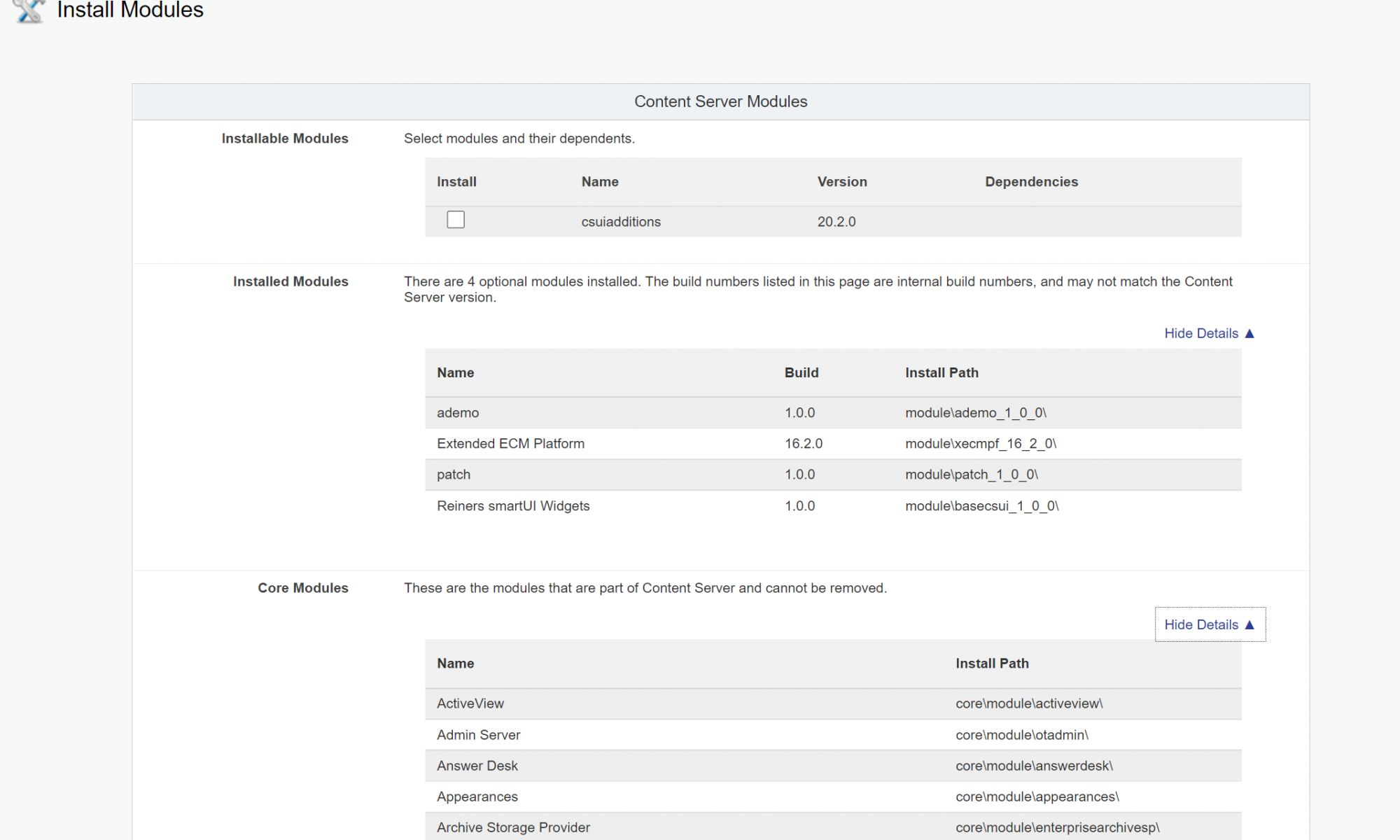
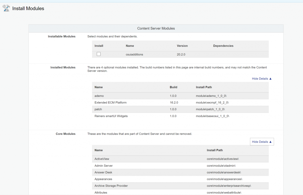
In the versions prior to 21.4 the module version numbers tented to be confusing. To fix this, there is a changed “Install Modules” page.
This page has been redesigned to avoid confusion.
The standard modules appear in a separate secsion without version numbers. And the somewhat long names (like “Content Server Comments” are simplified to “Comments”.
The optional modules are listed in the “Installed Modules” section. They now feature “Build” instead of “Version” to clarify the meaning.
Have much fun with the new “Install Modules” page.
Some weeks ago I published a new video on Rethinking smartUI on Youtube. Now we have Rethinking smartUI Part 4-B discussing the main part of gathering and displaying thr documents data.
If you havn’t it seen yet, here is the short video. In this posts, we’ll go though the technical aspects of this new kind of approach to smartUI. This demo is a Document Pad (or short DocPad), displaying all document properties in a SCIFI GUI arrangement.
A warning at the beginning: To use this code with IE11 is a perfect way to test all js error messages. Use this code only with the newest browsers. Its tested with Chrome (V98), Chrome Canary (V98), FF Developer (95.0b4), Edge (95.0) and Firefox (93.0)
In the part 4A, we had discussed all the js responsible for the perimeter of the whdgetz. Not lets discuss the main part which is responsible to gather and displad this data:
A CSS Grid
As you can see, there are 6 panels arranged in a CSS grid.
For infos on the css, please review this post, the part 3 of this series.
So let’s start with the panel at top left.
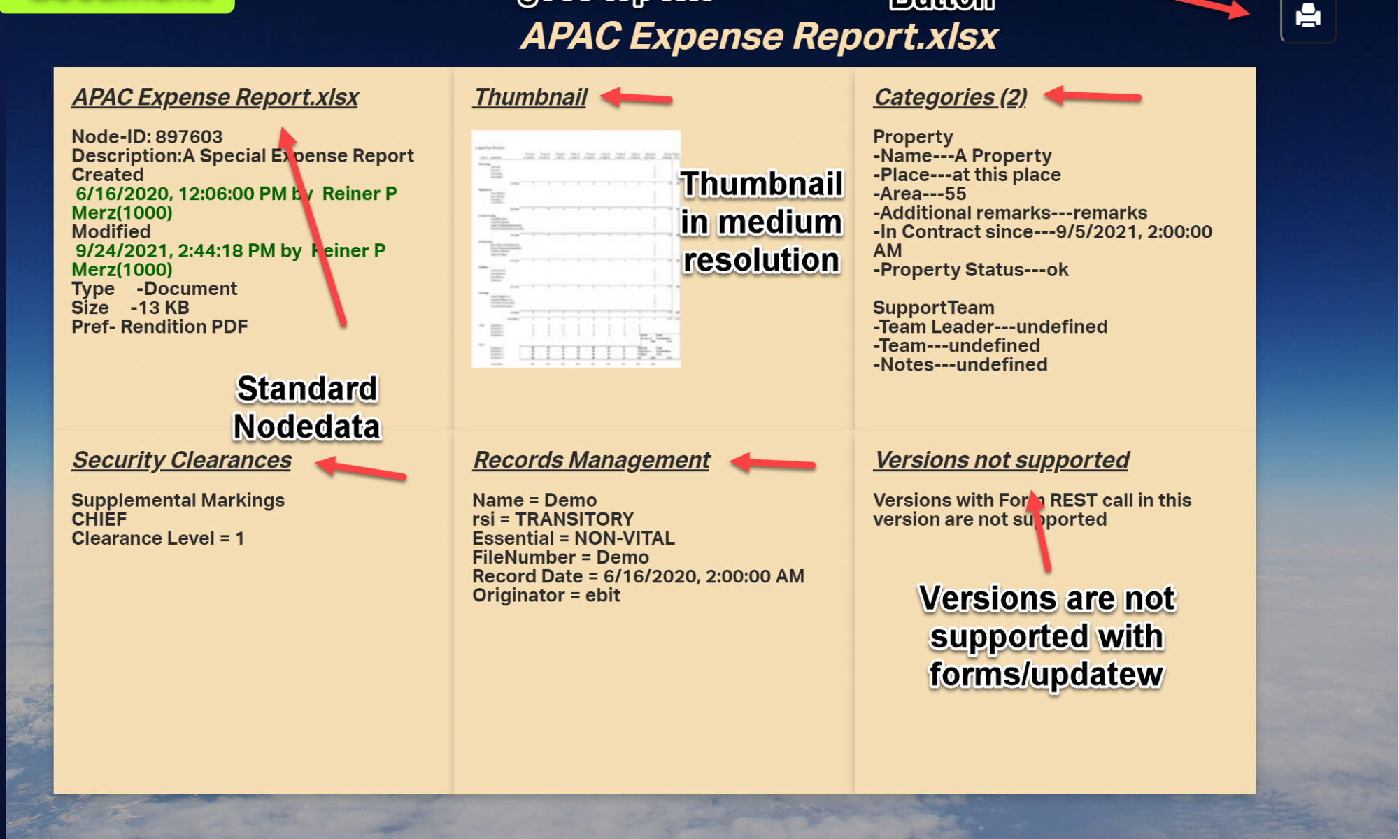
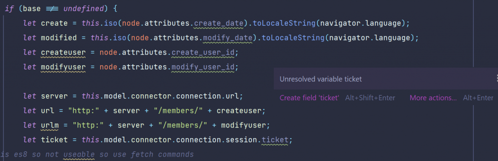
The documents metadata
This is more or less the data which is related directly to the document. The documents node number was the output from the node picker . The nodepicker was closed by the done() callback.
Here we are in the this function of the nodepicker. We extract the node from the callbacks arguments an get the id with the topmost arrow. We extract the name of the node and put this name inside the id #document.
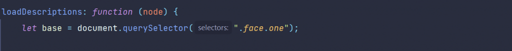
The loadDescriptions function does the work.
loadDescriptions
The prelude is simply to select the first face “.face.one”
If this is not undefined (remember, smartUI always makes 2 runs, so its always a goot idea to test if its defined) the create and modify dates are extracted and translated in a standard js data. For non-US readers it will be always a difference between p.ex 04-05-20 and 4.Mai 2020 (US and german dates for the Star Wars day May the fourth), thats why we translate the dates.
Also we need to get the users of the creation and the modification. But these are numbers, so we want to translate them to names.
Next, extract the server from the connection and construct the members REST command to get these names.
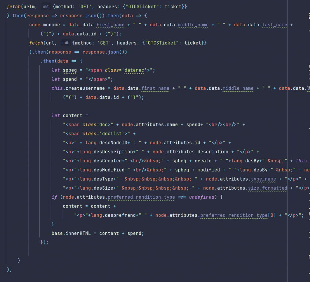
First view: The fetch command
fetch is new in js 6. In this older, antique times you would have used some ajax variants like xmlhttprequest or some similar methods which we will use in other calls for comparism.
Technically, we have to issue two REST calls to /member/ to get the names of the createuser and the modifyuser. We use the fetch command.
Remark: the famous async/await would be much more handy for that, but we wanted to limit the language scope to js6 for these posts.
Once we get the responses, we’ll put that names simply as innerHTML on the panel.
Technically, you can use all other avaliable methods to put text on the panel, from template-strings to create a and fill a text nodein the DOM. You can even invite handlebars to do this for you.
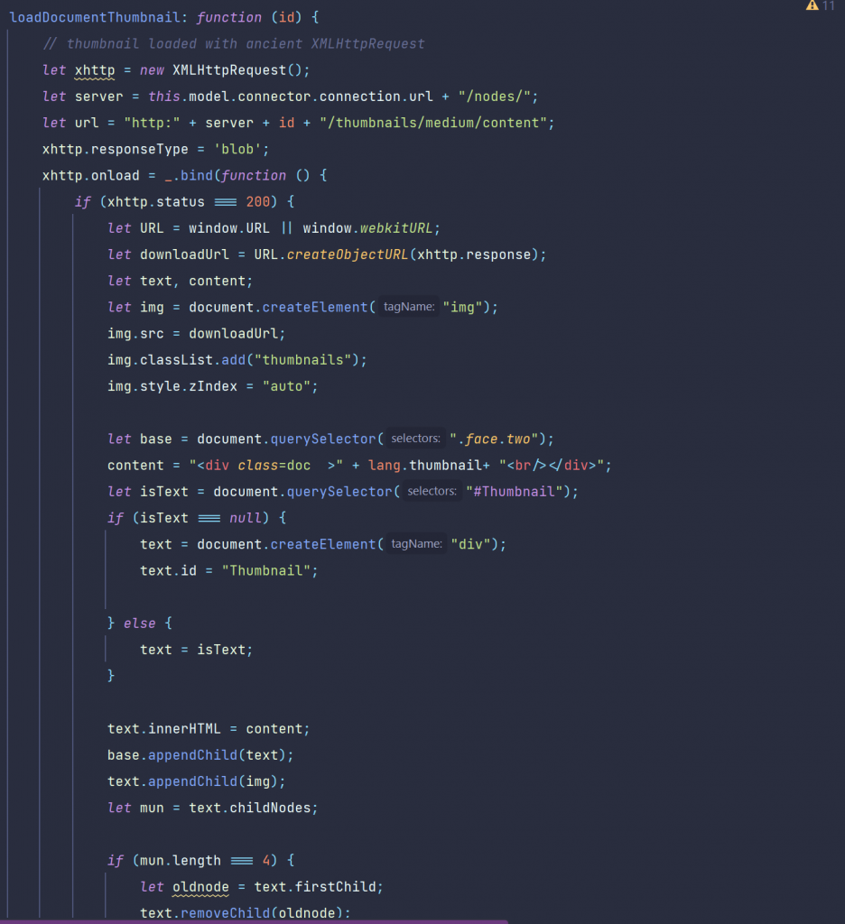
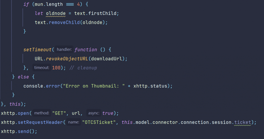
loadDocumentThumbnail
In the top middle panel we added the document thumbnail, which is created automatically during indexing on the server.
We must enter the nodeid in the REST command /thumbnails/medium/content to get the medium resolution version of the thumbnail.
To show the diffence to the fetch comand, the old archaic XMLHttpRequest was used.
The receiving image is put into a div with the id “Thumbnail”.
In the case the user selects another document the old thumbnail would remain. So we remove the old image element.
Almost done, we need to put our otcsticket in the request header and to send the request to the server.
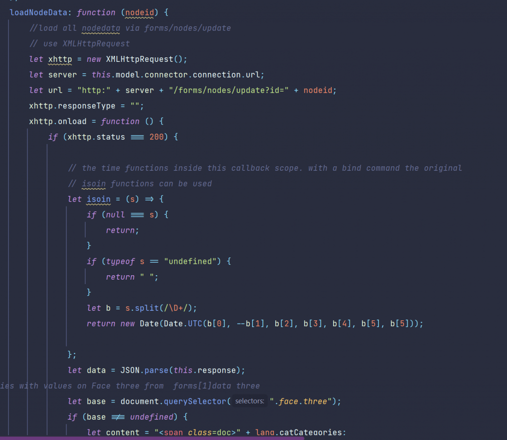
loadNodeData
In this function, we use exactly one REST call to get all data at once. This is done by the function /forms/update?id=xx whick will deliver all data for that nodeid at once. Expecially the categories take a while, so a css-fog was used to cloak the image of the approaching grid until the data was received (revisit the video). Then the css fog is cleared and trhe categories are displayed.
The call is also done with the old XMLHttpRequest to show the diffences to the modern fetch command.
Local functions were used instead of those in “this” to keep the scope clean.
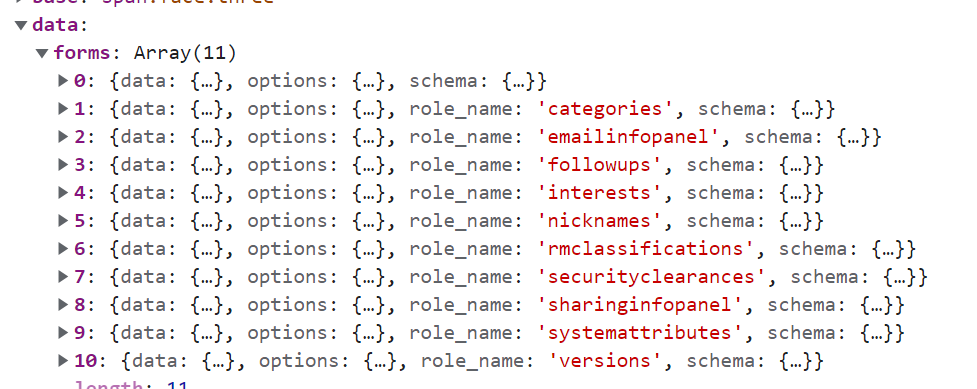
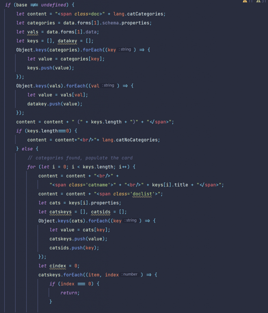
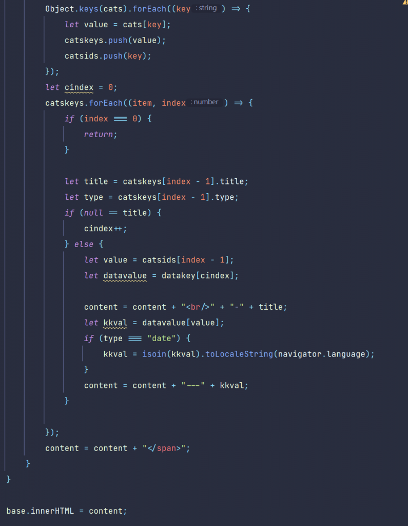
The categories and the attributes
Categories were returned in an object with their category name a title in the entry. To get the attributes we have to do a little bit more.
We split the result into several arrays to extract the values. If we have “date” in the type field, we have to use our date translation also on that to display the dates correct.
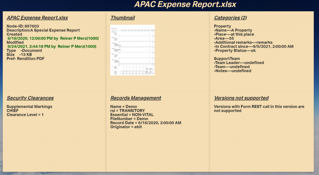
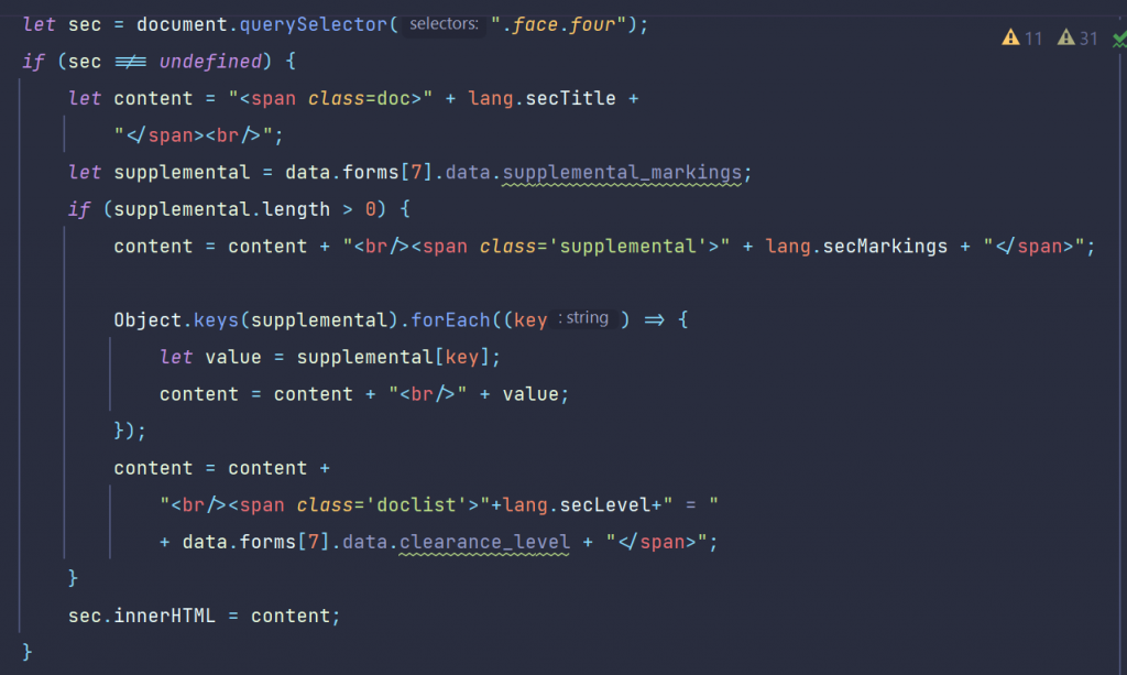
Security Clearances
All security related data is on the fouth face, the one on the lower left.
Here, all security levels and markings were displayed inside a span.
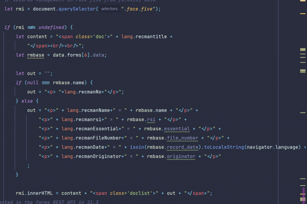
Records Management Data
here we extract and fill the data on the lower middle panel.
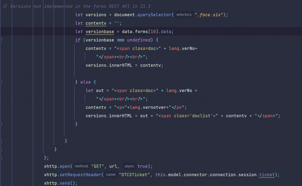
The Versions Data
Here, the REST commend has a problem. Versions are not included in the answer of the REST command, at least in the Content Server versions 21.3 and 21.4. So let’s ionform the user on this fact and display a local language string of this fact.
Tip: Maybe there will be a patch to fix this in the near future.
So we had all parts discussed.
We offer a one day remote training to understand the javascript code. If you are already a sophisticated Javascript Developer, you can get the free Sources also from https://github.com/ReinerMerz/reinerdemo (a public repository on Github).
Warning: This is only the sourcetree of the project, so you have to insert this in your own project file.
The data returned from the formsupdate?id=nn REST command
The whole data structure is send back in response to a forms/update?id=nnn REST call. Some of these entries take quite a while, so try using some css to cache this.
Have fun on discovering the endless possibilities of Dashboards and other Contentserver smartUI extensions using javascript6 and css3.
Three weeks ago I published a new video on Rethinking smartUI on Youtube. Now we have Rethinking smartUI Part 4-A discussing Javascript. If you havn’t it seen yet, here is the short video. In this posts, we’ll go though the technical aspects of this new kind of approach to smartUI. This demo is a Document Pad (or short DocPad), displaying all document properties in a SCIFI GUI arrangement.
This is Part 4-A of a multipart post covering Javascript of DocPad. For the css refer to part 3 of Rethinking smartUI.
Warning: This is a lot of js code, so I subdivided this Part 4 into Part 4-A and 4-B (getting all documents infos with 1 Rest call). Part 4-B will be published next week.
We offer a one day remote training to understand the javascript code. If you are already a sophisticated Javascript Developer, you can get the Sources also from https://github.com/ReinerMerz/reinerdemo (a public repository on Github).
Warning: This is only the sourcetree of the project, so you have to insert this in your own project file.
The idea of a model factory is to combine several functions in one.
a. Create a model and return it.
b. Load server data into this model for use in the main constructor function
A typical factory looks like this:
// the factory for the model define([ ‘csui/utils/contexts/factories/factory’, // Factory base to inherit from ‘csui/utils/contexts/factories/connector’, // Factory for the server connector ‘ademo/widgets/docpad/impl/docpad.model’ // Model to create the factory for ], function (ModelFactory, ConnectorFactory, DocpadModel) {
‘use strict’; var DocpadModelFactory = ModelFactory.extend({ propertyPrefix: ‘docpad’, constructor: function DocpadModelFactory(context, options) { ModelFactory.prototype.constructor.apply(this, arguments); var connector = context.getObject(ConnectorFactory, options); // Expose the model instance in the property key on this factory instance to be // used by the context this.property = new DocpadModel(undefined, {connector: connector}); }, fetch: function (options) { return this.property.fetch(options); } }); return DocpadModelFactory; });
The main Javascript files
The lang.js file(s)
The language system consists of those strings which are pupposed to change per language.
define([ ‘csui/lib/backbone’, ‘csui/utils/url’ ], function (Backbone, Url) { ‘use strict’;
let DocpadModel = Backbone.Model.extend({ defaults: { name: ‘Unnamed’ },
constructor: function DocpadModel(attributes, options) { Backbone.Model.prototype.constructor.apply(this, arguments);
// Enable this model for communication with the CS REST API if (options && options.connector) { options.connector.assignTo(this); } }, // Computes the REST API URL using the connection options // /auth returns information about the authenticated user // usage of => not possible because of “this” is used for urls url: function () { return Url.combine(this.connector.connection.url, ‘/auth’); } ,
parse: (response) => response.data
}];
return DocpadModel;
}];
Remark: The Arrow Function at parse is pure js6. But let me quote developer.mozilla.com here
An arrow function expression is a compact alternative to a traditional function expression, but is limited and can’t be used in all situations.
Differences & Limitations:
Does not have its own bindings to this or super, and should not be used as methods.
First, we initiate the model (and read the data) via a standard model using the model factory. Then we call the constructor in the prototype with the cs options. Lastly we listen to a change of the data and (in case) we rerender the widget.
Load the photo
The user data contains (eventually) a photo of the user. This is loaded and inserted in the DOM with the function loadPhoto. Here the js6+ fetch function is exposed to get the photo and insert it into after the element woth the .photo class in the dom.
loadPhoto: function () { let server = this.model.connector.connection.url; server = server.substr(0, server.search(“api/v1”)); let url = server + this.photo_url; let ticket = this.model.connector.connection.session.ticket; fetch(url, {method: ‘GET’, headers: {“OTCSTicket”: ticket}}) .then(response => response.blob()) .then(function (myBlob) { const URL = window.URL || window.webkitURL; let photo = URL.createObjectURL(myBlob); let img = document.createElement(“img”); img.classList.add(“photo”); img.src = photo; document.querySelector(“#photo”).appendChild(img); setTimeout(() => { URL.revokeObjectURL(photo); }, 100); // cleanup } ); },
Using the Node-Picker
The Node-Picker is a standard function in the sdk, so we use it.
The file ‘csui/dialogs/node.picker/node.picker’, // the csui node picker
is required at the beginning of the docpad.view.js file under the local name of NodePicker like this:
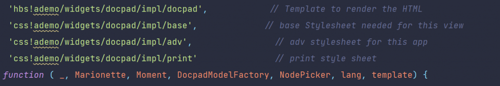
define([ ‘csui/lib/underscore’, // Cross-browser utility belt ‘csui/lib/marionette’, // Marionetter ‘csui/lib/moment’, // the date/time lib in csui ‘ademo/widgets/docpad/impl/docpad.model.factory’, // Factory for the data model ‘csui/dialogs/node.picker/node.picker’, // the csui node picker ‘i18n!ademo/widgets/docpad/impl/nls/lang’, // Use localizable texts ‘hbs!ademo/widgets/docpad/impl/docpad’, // Template to render the HTML ‘css!ademo/widgets/docpad/impl/base’, // base Stylesheet needed for this view ‘css!ademo/widgets/docpad/impl/adv’, // adv stylesheet for this app ‘css!ademo/widgets/docpad/impl/print’ // print style sheet ], function ( _, Marionette, Moment, DocpadModelFactory, NodePicker, lang, template)
The picker is started by pressing the big button, this actually calls showThePicker. Types of 144 (only Documents) and on the enterprise volume are among the start conditions.
The title and other strings are extacted from the appropriate lang.js language file(s). The command nodePicker.show() at the beginn of the chain displays the nodePicker
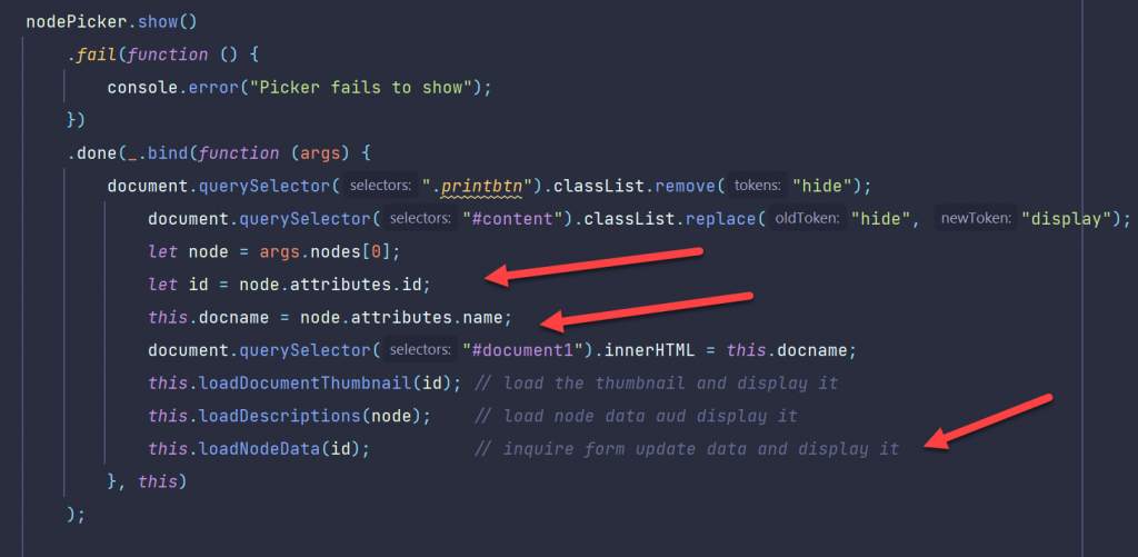
showThePicker: function () { if (undefined === this) { return; } let btn = document.querySelector(“.btn”); btn.classList.remove(“animate-large”); btn.classList.add(“animate-large-backward”);
let nodePicker = new NodePicker({ connector: this.model.connector, selectableTypes: [144], dialogTitle: lang.pickerTitle, selectButtonLabel: lang.selectPickerButtonLabel, startLocation: ‘enterprise.volume’ }); nodePicker.s how() .fail(function () { console.error(“Picker fails to show”); }) .done(_.bind(function (args) { document.querySelector(“.printbtn”).classList.remove(“hide”); document.querySelector(“#content”).classList .replace(“hide”, “display”); let node = args.nodes[0]; let id = node.attributes.id; this.docname = node.attributes.name; document.querySelector(“#document1”).innerHTML = this.docname; this.loadDocumentThumbnail(id); // load the thumbnail and display it this.loadDescriptions(node); // load node data and display it this.loadNodeData(id); // inquire form update data and display it }, this) );
},
The callback in the .done clause simply extracts the node id and the name from the results and stores them in the docpad “this”.
In the next week part “Rethinking smartUI Part 4-B” we’ll discuss the REST Commad how to get all document data (nearly) at once.
Two weeks ago I published a new video on Rethinking smartUI on Youtube. If you havn’t it seen yet, here is the short video. In this posts, we’ll go though the technical aspects of this new kind of approach to smartUI. This demo is a Document Pad (or short DocPad), displaying all document properties in a SCIFI GUI arrangement.
This is Part 3 of a multipart post covering the technical start of DocPad and the associated CSS
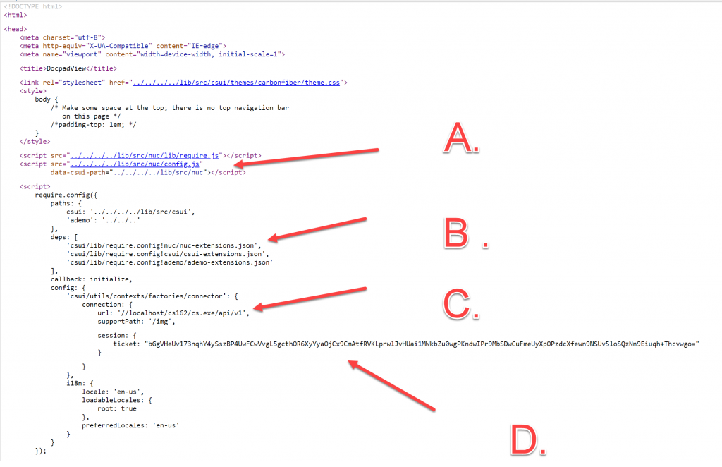
Die DocPad is started via the index.html, found in the test folder of the docpad. This is because of its much easier to test modifications via index.html compared to installing the finished widget in the content server and trying it then.
The first part of index.html
The whole page is more or less standard. We habe 4 areas of interest in the first part. Dont forget, nuc was introduced in 21.2. In older versions nuc was not existant.
A. Here, you see the config is moved to the nuc area
B. Change A will also require to add the nuc-extensions to the list of dependancies for csui. Thed whole js code is loaded by the “ademo” extension.
C. My machine is on a VM. This means, if you put this on your machine, you’ll have to enter your url and your support directory (called supportPath) in the configuration.
D. I’ve used my ticket to provide the login. You can use username and password to login the more convential way or also provide a ticket of youfself here. The displayed ticket won’t work at your site.
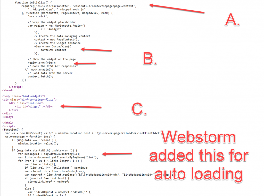
The second part of index.html
Here we have this points of interest
A. The require parts of needed modules. It is a docpad.mock.js in the list of modules, but its not recommended to use the mockup facility because there is lot of traffic from and to the server. Its much easier to add a real content server behind that index.html.
B. Standard procedure. Instanciate the widget with the context, display it in the region and fetch the context from the server. As mentioned, its easiere to use a real server as data source so switch the mockup off.
C. The marionette region is associated with the id=”widget” of this div, so the widget is displayed here.
At the end there is immediate function starting with
(function() {
var ws = new WebSocket('ws://' + window.location.host + '/jb-server-page?reloadServiceClientId=1');
This is inserted by Webstorm (my JS IDE) to allow auto-reload of changed files. You can ignore that, other IDEs will solve that differently.
B. The CSS
Here, all css files used in the docpad are listed in the require.js list of required modules. For demo purposed and to keep things simple, I used 3 css files:
base.css
This file contains the basic css instructions to style the .hbd template shown at the top of list.
adv.css
contains the more advanced css instructions for docpad
print.css
is the print style sheet to provide a proper output on paper.
Disclaimer: The css instructions selected do not impose or propose any styles to be followed, instead they are used for pure demo purposes here.
The base.css File
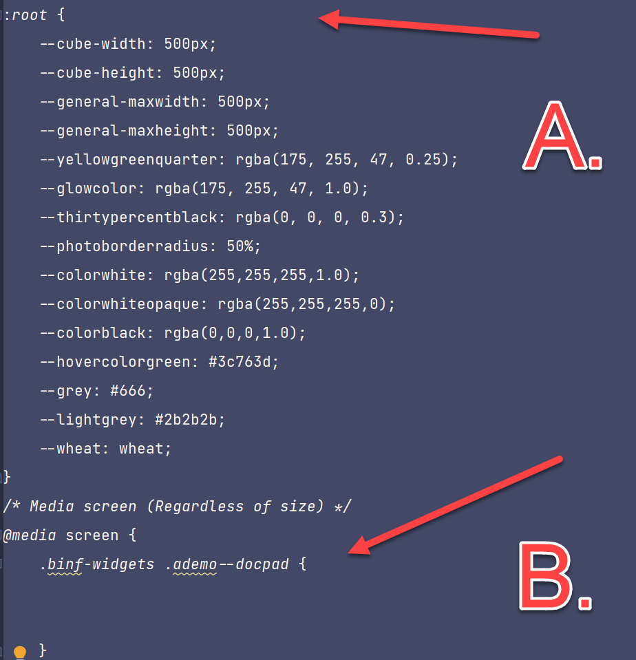
Here the main functionality of the css is found. One of the feature of css3, the variables, is used. In the pseudo element :root all variables used in different rules are defined.
At the end of the snipped you’ll see a media query, saying the following is used tor screen display.
Lets discuss several stages:
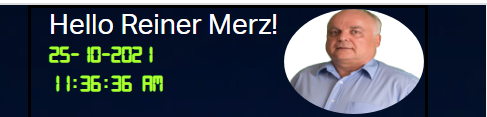
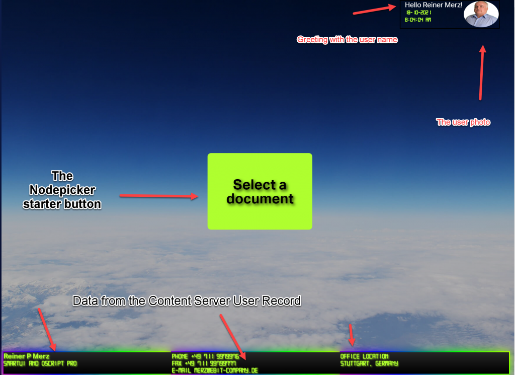
The header + the footer
These two structures exploit the standard userinfo with REST from the content server in a standard backbone model. “Hello xxxxxx” is a structure from the hello world demo with the word “hello” and the signed in user. The photo is downloaded from the content server and dosplayed.
The bottom structure simply prints out other user data on the screen .
Points of interest:
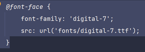
The nice digital effect is build with the font “digital-7”
The header is done with
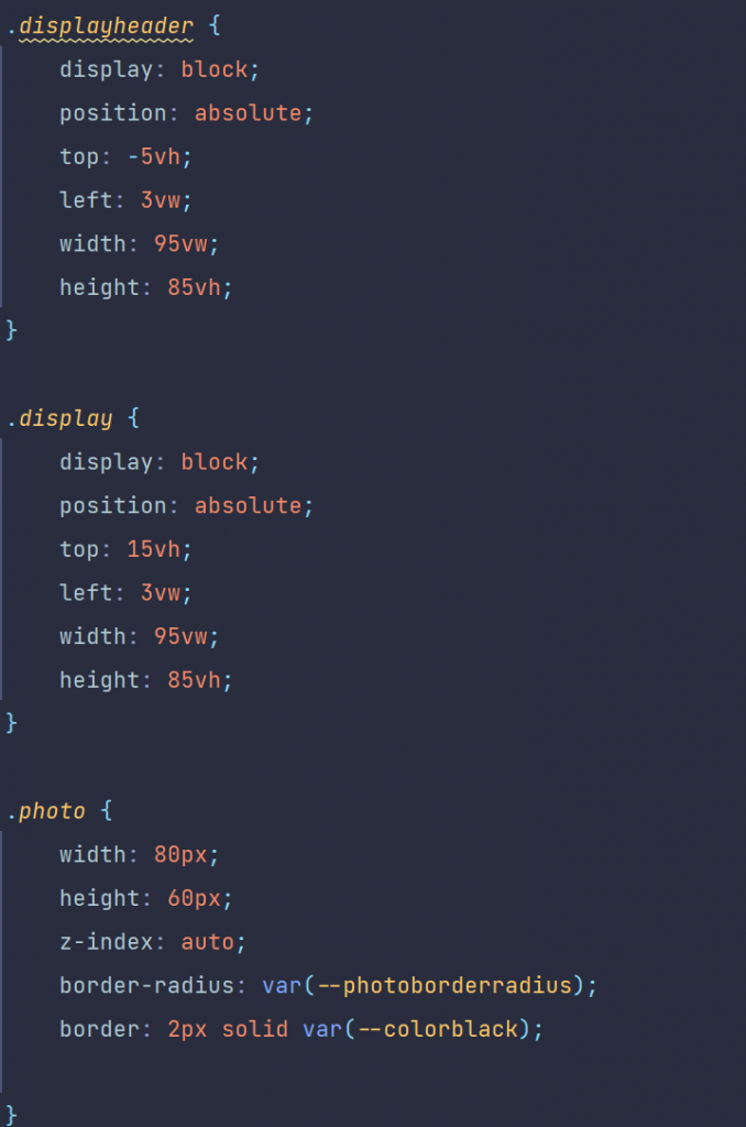
Ther photo is inserted at the position of the .photo class in the size of 80×60 pixel. Then the photo gets this nioce rounded look using border-radius.
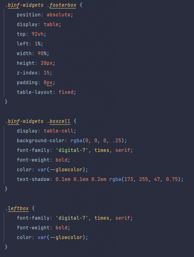
the footer conststs of three divs, which are positioned in 3 columns
The divs have the classes .boxcell and .leftbox and are descendants of the .footerbox
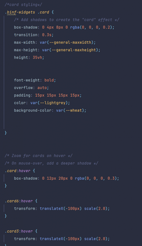
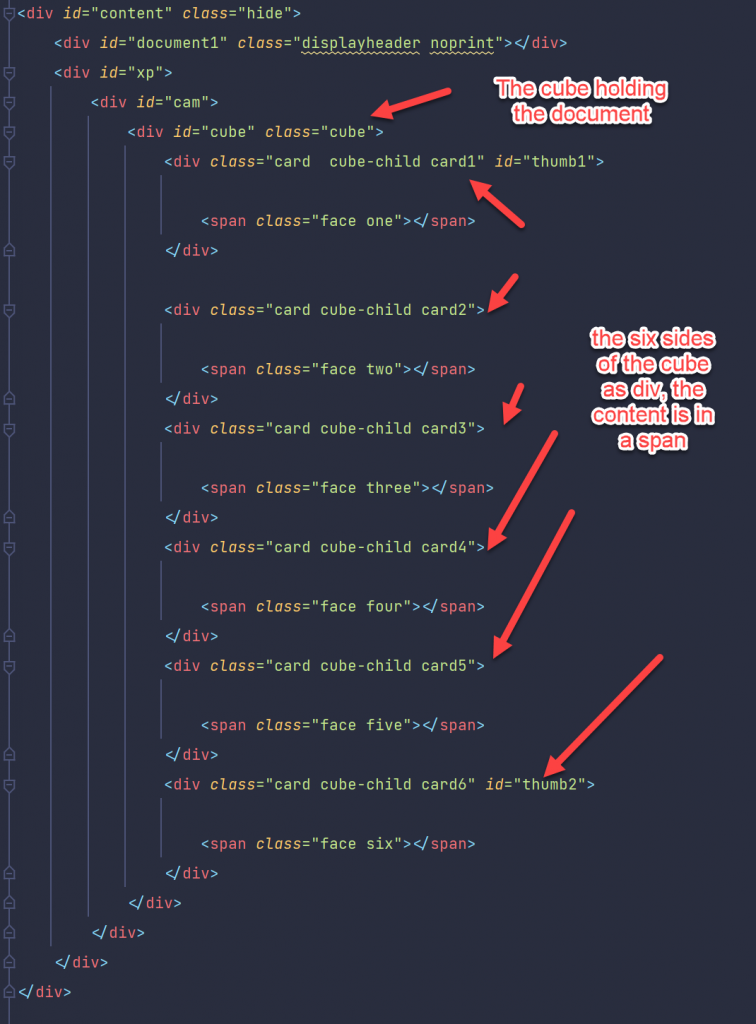
The document display
The document display consists of six divs and are positioned using a css grid.
They have numbers, the numbers range from one (“card1”) to 6 (“card6”). The css part is (shown here only a fraction):
They are all children of the cube, using the display mode grid and displaying the 6 cards in two rows and threee columns.
Using the diffent REST methods in the js code, these cards were filled by the standard methods of DOM interaction from js. This will be the main theme of next weeks post, the js code of “Rethinking smartUI” Part 3.
Last week I published a new video on Rethinking smartUI on Youtube. If you havnt seen yet, here is the short video. In this posts, we’ll go though the technical aspects of this new kind of approach to smartUI. This demo is a Document Pad (or short DocPad), displaying all document properties in a SCIFI GUI arrangement.
This is Part 2 of a multipart post covering all aspects of this Docpad.
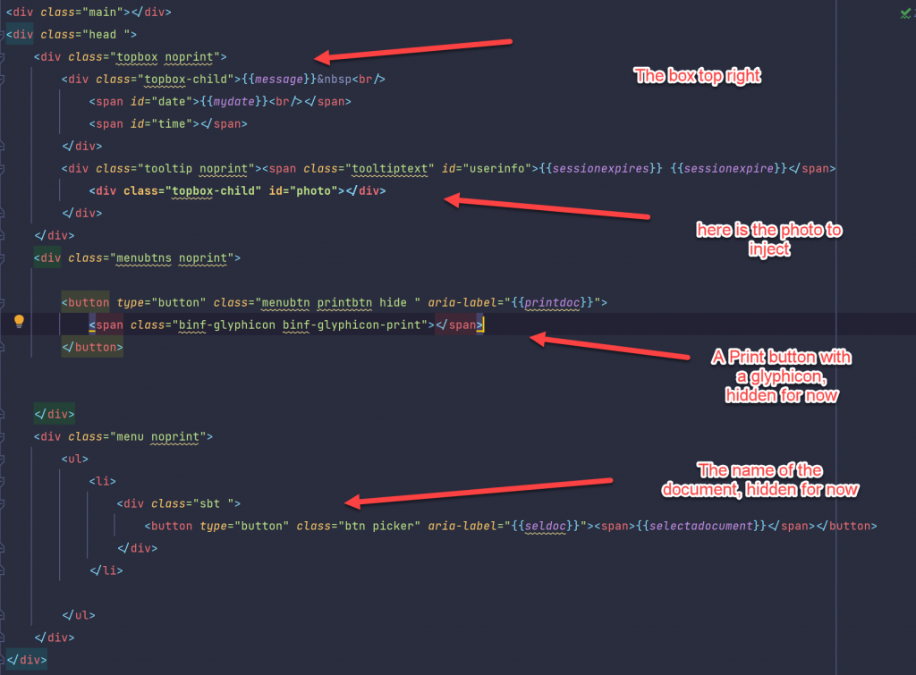
First, lets take a look on the html (in out case the .hbs file). This is the top part of the widget,
The div with the class “topbox” contains the Username and the Photo. There is also a Print-Button, if a document is selected.
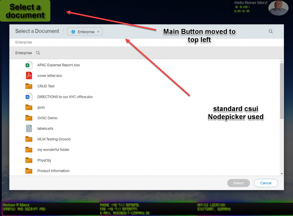
A button, class “picker” is sorted in a div with “picker”. This is the button used to start the node picker component. Its hidden now, will be used later, when a document is selected.
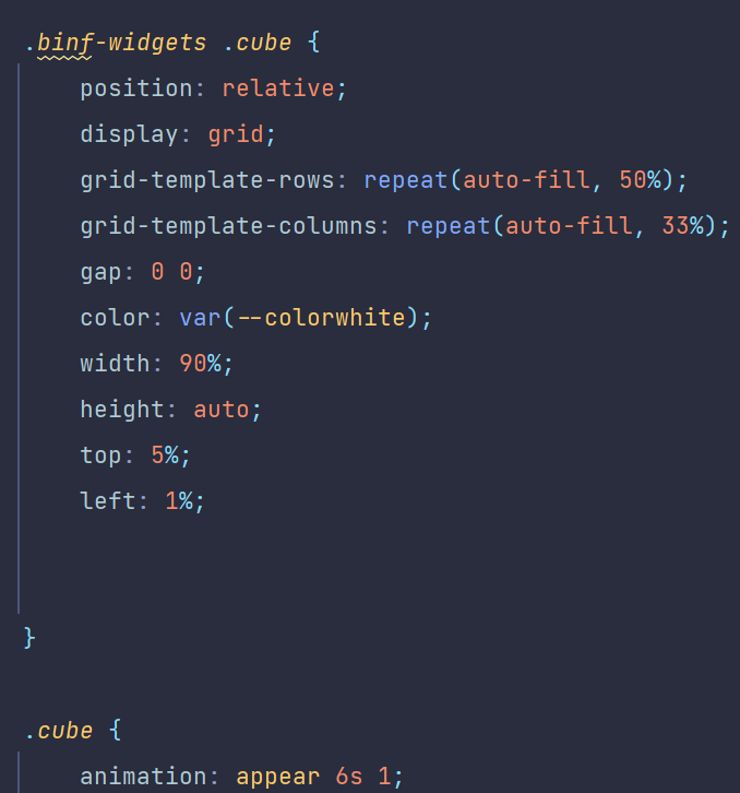
The documents data is displayed using a cube. A cube has six sides so all sides can be presented using a css grid or …. (arranged in a 3D cube which can be rotated in 3D. But thhis is not part of this demo).
The whole thing is arranged in a div with the id of “content”. The top element is a div with the class “cube”, holding six divs for the six sides
Just for fun, the cube is surrounded by a div with the class “cam”. If you want to display the cube as 3d cube. This is used to set the perspective on a 3d Cube. If you are interested in learning more on 3D css cubes, refer to https://css-tricks.com/simplifying-css-cubes-custom-properties/
Lets see the Actions.
The Actions in Detail
After starting the aplication, there are several stages, They are
a. Application started
Docpad started
Here, the application is just started. the “Select a document” started from the top left and moved in the center of the window. This button will initiate the nodepicker, a standard component of the smartUI library.
Until now, we queried the user logged in. Then, we greet the user, extract the photo from the Content Server Database and display this photo in the top right. To make it more interesting, we displayed the photo in round form via css.
In the three panels at the bottom we displayed the rest of the user record. Just for fun we surrounded the three botton panels with a border animation.
b. Nodepicker selected
The next stage is the nodepicker. After pressing the “Select a document” button, it is started and delivers a list folders and documents on the associated Content Server. Meanwhile, the Button moved again back to upper left corner.
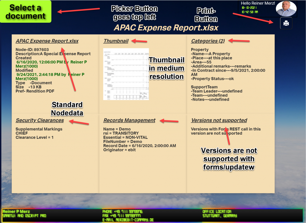
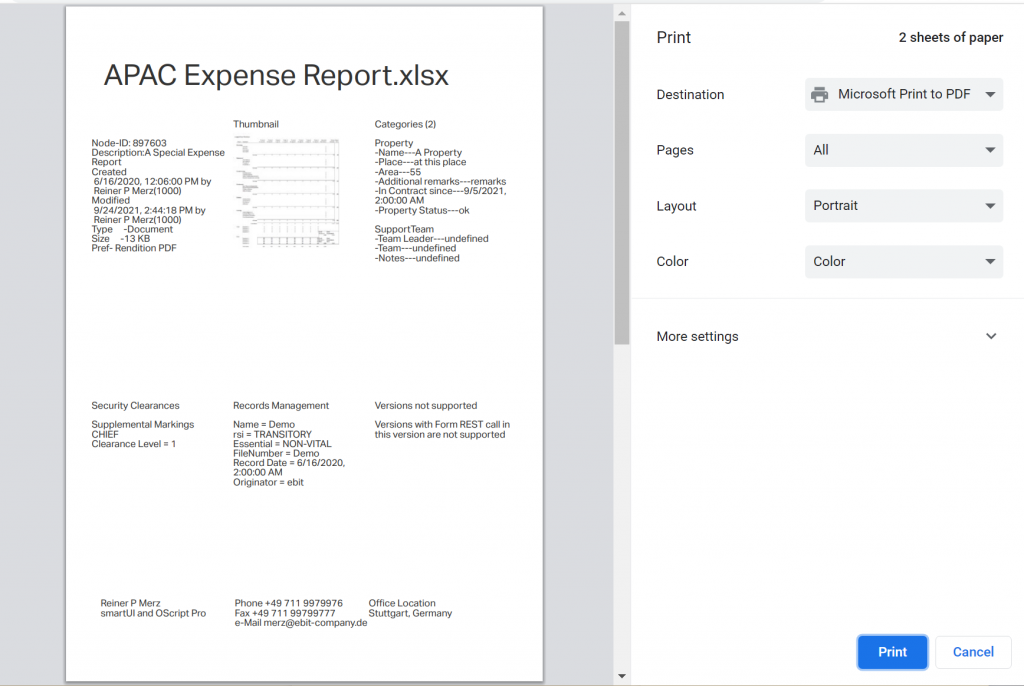
c. Document selected
After the user selects a document, all data of this document is read from the server. In this case, the “APAC Expense Report.xlsx” is selected. (Refer to part 1 to see which REST commmands are used).
As of do have a document, we can display the header and the print button.
As you can see when playing the video, the cube starts in some distance and is a little but foggy during the approach and clears when we receive all data.
The reason is, that the forms/update REST call takes longer and we use CSS animations ans css view filters to hide that fact from the user. When in doubt, view the video on top of this post again.
For beauty there are also some hovering effects added, on the panels and on the thumbnail.
d.Document to Print
The last stage is (besides selecting a new document to display) is to print the document.
Here we have the print previev in Chrome
As we can see. the node data is printed in the form of a css grid on paper. The display is in standard layout. A media query selects a print style sheet instead of the normal stylesheet(s).
In the next week we discuss in Part 3 the index.html to start the widget standalone and css stylesheets (there are really several). We’ll then conclude this series in Part 4 discussing the Javascript made for this demo.
We’ll use the 4 steps of the application as the schema for Part 3 and 4.