New Trainings for smartUI and Content Server 16.2.10

Content Server 16.2.10 gave us a lot of new Features, which require a new Traininigs.

Therefore there is a Workshop Line of smartUI Trainings and a new Practical Series.

Workshop Line: The two Workshops Content Server SmartUI Workshop Basic and Contnent Server smartUI Workshop advanced have been extended to 16.2.10. As always this Workshops give the explanation, what and why is going on in der SDK

  • Content Server Smart UI Workshop Basic
  • Content Server Smart UI Workshop Advanced

The Practical Series include a complete Implementation of Widgets, REST Services and Contnent Server based Applications in the form of Business Workspaces. So this part is more a Workshop for the practical usage of smartUI. As the content of the Workshop Line is required in the Practical Series, a knowledge comparable to this Workshop Line is recommended for attending the practical Series.

  • Practical Series I: Strategies to “widgedize” an existing Content Server module and to add functionality in an existing widget.
  • Practical Series II: Building an EVENT Management System in the Content Server using a graphical smartUI Dashboard and Connected Workspaces

New: We are offering custom widget development. Interested? Send an e-mail to merz at ebit-company.de stating the purpose of the widget and requesting a qoute

New in 16.2.10: New Favorites, MyAssignments and RecentAccessed Widgets

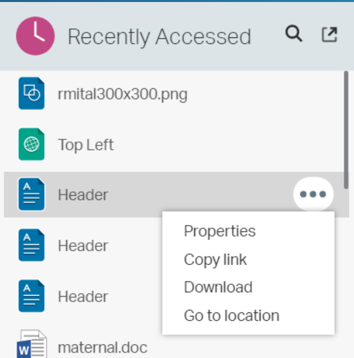
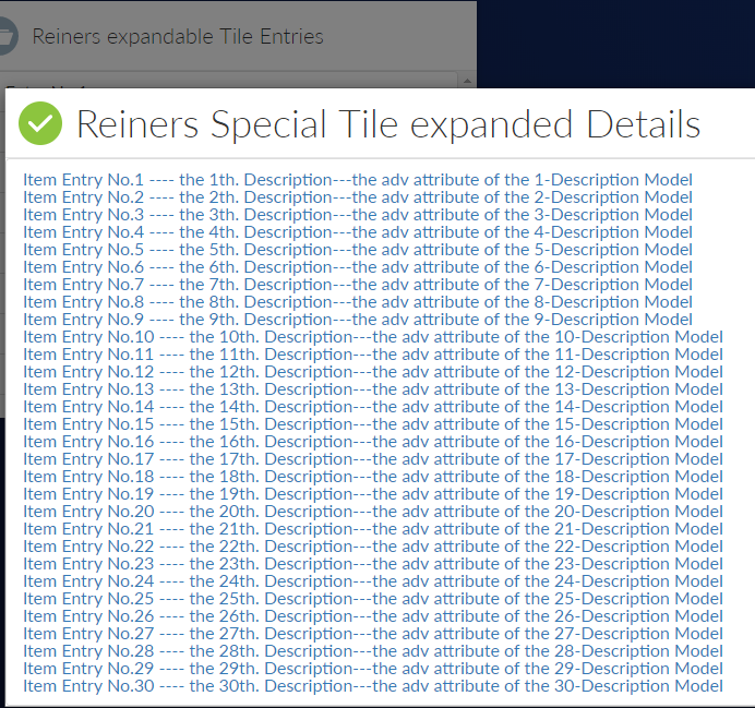
New in the actual Content Server Release 16.2.10 are redesigned Favorites, My Assignments and Recently Accessed Widgets.

All three widgets can now be expanded from an Icon located at the upper right. And the expanded view is no longer a popup Window, its a separate view, giving you much more space to display. Also, there are node Commands available at the entries

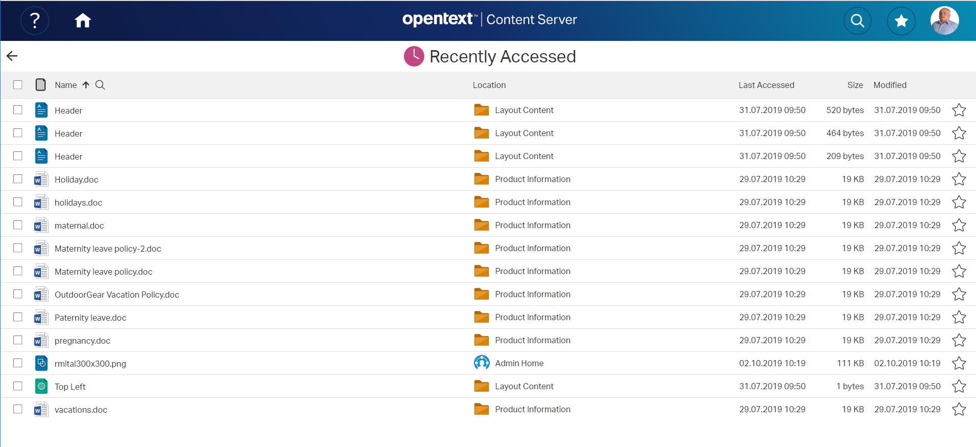
Lets start from with the Recently Accessed widget:

The new Recently Accessed Main View
with the new menu

Here we see, that the expanded view has been moved to the upper right. And direct node commands are available from the menu

The expanded view of the recently accessed widget
The new expanded view of the recently Accessed Widget

To leave the expanded view, simply click on the Arrow at the upper left.

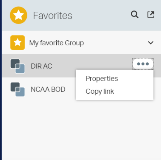
Next, we have a new Favorites Widget

Favorites Widget
The new Favorites Widget

By hovering over the entries, there are new node commands available (here for the business workspace). Also the expand Icon moved to the top right.

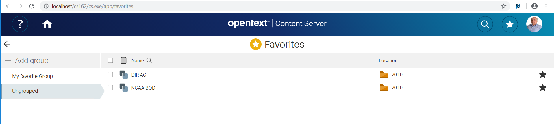
Favorites Expanded View

This is an example of the Favorites expanded view.

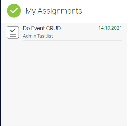
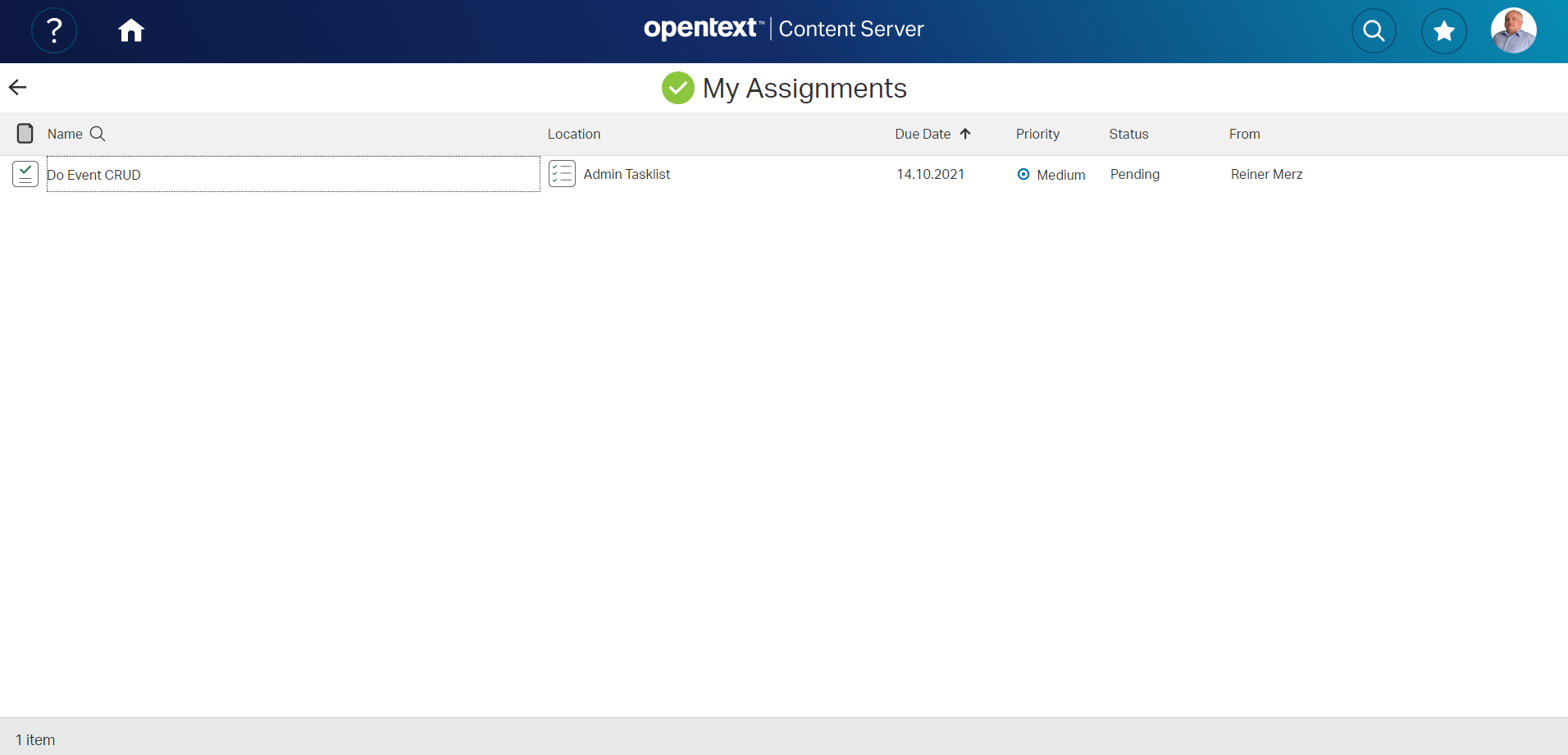
The next is the MyAssignments Widget

The MyAssignments Widget

and the expanded view is

MyAssignments Widget expanded
The MyAssignments Widget

Interesting, isn’t it?

New: We are offering custom widget development. Interested? Send an e-mail to merz at ebit-company.de stating the purpose of the widget and requesting a qoute

smartUI SDK additional Libraries

There are a few additional libraries in smartUI, which are distributed in any content server installation. Therefore its not necessary, to instatt the libraries, just use them. We discuss several libraries also in the smartUI base and advanced trainings.

These are

  • alpacca.js
    A library to develop and use JSON based forms. Supported by Content Server RESTS calls
  • ally.js
    simplify certain accessibility features, functions and behaviors.
  • bililite.js
    Cross-Browser Text Ranges and Selection
  • ckeditor.js
    Configurable javascript RTF Editor
  • d3.js
    Data driven documents. A highly interactive library to draw interactive SVG graphics. Used to visualize data. The OpenText distribution contains
  • d3-selection
  • d3-array
  • d3-scale
  • d3-shape
  • d3-axis
  • d3-collection
  • d3-transition
  • d3-interpolate
  • d3-format
  • hammer.js
    Gestures in Webapps
  • less.js
    dynamic stylesheet language
  • moment.js
    Date Arithmetic in JS. Very useful with d3.
  • numeral.js
    Formatting and manipulating numbers
  • text.js
    AMD/Loader Plugin for loading text resources
  • jqueryui.js
    Includes:
    widget.js, position.js, data.js, disable-selection.js, focusable.js, form-reset-mixin.js,
    jquery-1-7.js, keycode.js, labels.js, scroll-parent.js, tabbable.js, unique-id.js, widgets/draggable.js, widgets/droppable.js, widgets/resizable.js,
    widgets/selectable.js, widgets/sortable.js, widgets/mouse.js, effect.js,
    effects/effect-blind.js, effects/effect-bounce.js, effects/effect-clip.js,
    effects/effect-drop.js, effects/effect-explode.js, effects/effect-fade.js, effects/effect-fold.js, effects/effect-highlight.js, effects/effect-puff.js, effects/effect-pulsate.js, effects/effect-scale.js, effects/effect-shake.js, effects/effect-size.js, effects/effect-slide.js, effects/effect-transfer.js

SmartUI expandable Tiles at Work

Wondered, how expandable Tiles work in smartUI?

The base Widget is a simple Tile:

Reiners Expandable Tile Entries
Expandable Tile Entries

Pressing the Expand Button (lower right) shows a different view with more details as a list:

Expanded Tile Entries

Implementation:

For simplicity sake, all require.js setups are omitted. The complete javascript would run on a simple html page without connecting to Server.

First, we need a collection and a model. The model does have 3 attributes, name, desc, adv. 30 Models are filled automatically in the collection.

     var  ItemModel = Backbone.Model.extend({
              defaults: {
                  id: null,
                  name: 'Unnamed',
                  desc: 'Unnamed',
                  adv: 'Unnamed'
              }
          }),

      ItemCollection = Backbone.Collection.extend({
              model: ItemModel,
              initialize: function (models, options) {
                  this._items = _.times(30, function (index) {
                          ++index;
                          return {
                              id: index,
                              name: 'Item Entry No.' + index,
                              desc: 'the ' + index + 'th. Description',
                              adv: 'the adv attribute of the ' + index + '-Description Model'
                          };
                      });
                  this.makeFetchable(options)
                  .makeClientSideBrowsable(options);
              },
              sync: function (method, collection, options) {
                  if (method !== 'read') {
                      throw new Error('Only fetching the collection is supported.');
                  }
                  console.log('Getting', collection._items.length, 'items');
                  var deferred = $.Deferred();
                  setTimeout(function () {
                      var response = _.clone(collection._items);
                      if (!options) {
                          options = {};
                      }
                      if (options.success) {
                          options.success(response, options);
                      }
                      collection.trigger('sync', collection, response, options);
                      deferred.resolve(response);
                  }, 250);
                  return deferred.promise();
              }
          }),

Second, we need two views, a base view and an expanded view.

The base view with its template is:

      ListItemView = Marionette.ItemView.extend({
              className: 'binf-list-group-item',
              template: Handlebars.compile($('#list-item-template').html())
          }),
 
script id="list-item-template" type="text/x-handlebars-template"
  {{name}} 
/script

<> around the script tags are omitted

The extended view with its template is

ListFieldItemView = Marionette.ItemView.extend({

                  className: 'binf-list-group-item',

                  template: Handlebars.compile($('#list-item-template1').html()),

                  initialize: function () {

                      this.listenTo(this.collection, 'sync', this.render);

                      this.collection.fetch();

                  },

                  serializeData: function () {

                      if (!this.model && !this.collection) {

                          return {};

                      }
                   var args = [this.model || this.collection];
                  if (arguments.length) {
                      args.push.apply(args, arguments);
                  }

                  if (this.model) {
                      return this.serializeModel.apply(this, args);
                  } else {
                      return {
                          items: this.serializeCollection.apply(this, args)
                      };
                  }
              },
          }), 
script id="list-item-template1" type="text/x-handlebars-template"
   {{#each items}}
      p class="items"a href=#{{name}}  ----     {{desc}}---{{adv}}/a/p
  {{/each}}
/script

<> brackets around the html and script tags are omitted

The serialize function is used to make the collection renderable with handlebars.js. This and item-template1 will render to this expanded view:

We also need one base view, referencing our two views, one as contentview and one as expandedView. We add the Behavior Expanding with the options with our collection set. And of course, with several title and icon options set.

     ListTileView = TileView.extend({
              icon: 'header-openfolder',
              title: 'Reiners expandable Tile Entries',
              contentView: ListView,
              contentViewOptions: function () {
                  return {
                      collection: this.items
                  };
              },
              childEvents: {
                  'click .items': 'onClickItem'
              },
              onClickItem: function (target) {
                  this.trigger('click:item');
                  this.triggerMethod('execute:defaultAction', target.model);
                  alert("Clicked on item '" + target.model.attributes.name + "'");
              },
              behaviors: {

                  Expanding: {
                      behaviorClass: ExpandingBehavior,
                      expandedView: ListFieldItemView,
                      expandedViewOptions: function () {
                          return {
                              collection: this.contentView.collection
                          };
                      },
                      titleBarIcon: 'title-assignments',
                      dialogTitle: 'Reiners Special Tile expanded Details',
                      expandIconTitle: 'Reiners Expand Button',
                      dialogTitleIconRight: "icon-tileCollapse"
                  }
              },
              constructor: function (options) {
                  ListTileView.__super__.constructor.apply(this, arguments);
                  this.items = new ItemCollection(undefined, {
                          top: 30
                      });
                     // options.items = this.items;
              },
              onShow: function () {
                  this.items.fetch();
              }
          });

Initialize it and show it at the el #tile. Then you are done

      var
      // Create instances of the views to show on the page
      tileView = new ListTileView(),

      // Create helpers to show the views on the page

      tileRegion = new Marionette.Region({
              el: "#tile"
          });

      tileRegion.show(tileView);

Easy, isn’t it?

The complete html file containing the javascript demo code can be downloaded here

The smartUI Page Context

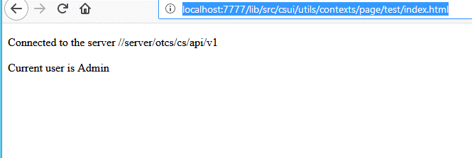
•The simplest context in smartUI is the Page Context, which can include and fetch models and collections, but does not provide any other functionality. If you use it with widgets, which expect changes based on their context-changing models, you will have to handle these changes yourself.

You can use the page context like this

 
 require(['csui/lib/jquery', '../page.context', 'csui/utils/contexts/factories/connector',
       'csui/utils/contexts/factories/user', './page.context.mock'
     ], function ($, PageContext, ConnectorFactory, UserModelFactory, PageContextMock) {
       var contentElement = $('body'),
           context = new PageContext(),
           connector = context.getObject(ConnectorFactory),
           currentUser = context.getModel(UserModelFactory);
       $('<p>')
           .text('Connected to the server ' + connector.connection.url)
           .appendTo(contentElement);
 
       PageContextMock.enable();
       context.fetch()
           .done(function () {
             $('<p>')
                 .text('Current user is ' + currentUser.get('name'))
                 .appendTo(contentElement);
           });
     }); 

This results in

How to use Zip&Download in smartUI

This is a control in smartUI. Basic infos are:

This control uses the command:

–lib\src\csui\utils\commands\zipanddownload.js

Requires:

“module”, “require”, “csui/lib/underscore”, “csui/lib/jquery”, “i18n!csui/utils/commands/nls/localized.strings”, “csui/utils/command.error”,   “csui/utils/commandhelper”, “csui/models/command”, ” csui/utils/url ”   

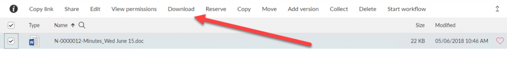
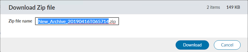
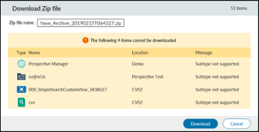
Triggered, when more than 1 file is selected. Action.ID = “zipanddownload« 

Uses ‘csui/controls/globalmessage/globalmessage’,         “csui/models/zipanddownload/zipanddownload.preflight”,         “csui/models/zipanddownload/zipanddownload.stages”,         “csui/dialogs/modal.alert/modal.alert”  in local require.

Uses REST Calls. To use the command, these REST calls must exist on the Content Server side.

  • Post api/v2/zipanddownload with body={” id_list”:[oids zu compress],”type” : “zipanddownload ” 
    • Returns in results/data/jobs/id the oid of the archive to download
  • Post api/v2/zipanddownload/oid to download the compressed archive

Simply put the command in a place where your menu options are. Typically in a toolbar config like

/* Example where to put the command
define([
'module',
"csui/controls/toolbar/toolitem.model",
'csui/controls/toolbar/toolitems.factory',
'i18n!conws/utils/commands/nls/commands.lang'
], function (module, ToolItemModel, ToolItemsFactory, lang) {
var toolbarItems = {
    otherToolbar: new ToolItemsFactory({

        first: [{
                signature: "AddParticipant",
                name: lang.CommandNameAddParticipant,
                icon: "binf-glyphicon binf-glyphicon-plus"
            },
            {
                signature: "YourCommand",
                name: "YourCommandname",
                icon: "Your Binf-Glyphicon"
            },
            {
                signature: "PrintParticipants",
                name: lang.CommandNamePrintParticipants,
                icon: "binf-glyphicon binf-glyphicon-print"
            }, {
                signature: "ExportParticipants",
                name: lang.CommandNameExportParticipants,
                icon: "binf-glyphicon binf-glyphicon-download"
            }, {
                signature: "ShowRoles",
                name: lang.CommandNameShowRoles
            }, {
                signature: "RemoveParticipant",
                name: lang.CommandNameRemoveParticipant
            }

        ],
        second: [
        ],
        third: [
        ]
    }, {
        maxItemsShown: 99,
        dropDownIcon: "icon icon-toolbar-more"
    })

};

return toolbarItems;

});

The new smartUI Zip&Download control

Zip&Download has arrived in smartUI. Finally.

The new download and zip command

Open up a nodelist and you’ll see the new Download command.

How to use it?

  • First select a couple of files to download
  • Click on Download
  • Then the ZIP archive is build
Building the ZIP Archive
  • When finished, you can change the default name
ZIP file build
ZIP file build

Then you get the summary of all files contained in this ZIP Archive

Filelist for all files i n the ZIP archive

Click on Download and this archive will be downloaded to your machine.

New Permissions Explorer in smartUI

Have you seen the new permissions explorer in smartUI? Open up the permissions on an object and you’ll see the new selection.

Permission Selection
The Permissions Explorer

The permissions explorer is opened with a click on the “Permissions Explorer” Button on the upper right.

Inside the Permissions Explorer

This will give you the option to edit all permissions of the objects in this folder at once.

New smartUI Training for Content Server 16.2.8

The actual Content Server release 16.2.8 brought a lot of improvements to the smartUI SDK, for example the xECM and the connected Workspaces Widgets are nowadays part of the SDK.

Also a lot of of people were interested in smartUI, not only Developers.

So we introduced an updated 5 days training to reflect the changes of 16.2.8 and a 2 days training to provide an overview of the SDK. Naturally, a 5 days training gives more information and also more exercises than a 2 days training, but this 2 days training can provide a good overview for Team Leaders and technical Managers.

For those with little time, there is also a 1 day training giving you a more compact overview for technical Managers and technical Evangelists. The one day training is not recommended for Developers. This training was held at the Enterprise World in Vienna 2019.

Whats new in the trainings?

New in the basic training

The Chapter 6 (SDK Intro) (5 days training Basic)

  • 6.1 Introduction
  • 6.2 Installing the SDK. Different Installations in 16.2.4 and 16.2.8. (NEW)
  • 6.3 Building the Demo Widget
  • 6.4 CSS Style Overrides Binf (OpenText Bootstrap Version)
  • 6.5 General Overview
    • General Overview
    • General Architecture, Coding Guidelines
    • Logging, Internationalization and Localization
  • 6.6 Content of the SDK
  • 6.7 Routing Preview (see adv. Training for a more detailed discussion)
  • 6.8 New Command
  • 6.9 Custom Column
  • 6.10 Metadata
  • 6.11 Define a new Nodetype
  • 6.12 Create a Widget
  • 6.13 Base Widgets. Detailed info’s on base widgets.
    • Favorites
    • Recently Accessed
    • MyAssignments
    • Shortcut
    • Shortcuts
    • Metadata
    • NodesTable
    • DocumentOverview
    • Search Results (NEW)
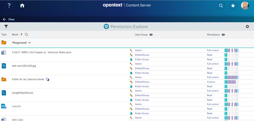
    • Permissions (NEW)
    • Html.editor (NEW)
    • Navigation Header (NEW)
  • 6.14 Controls and Contexts
    • Controls
      • Node Picker
      • Modal Alert
      • File Open
      • Perspectives: Grid, Single, Left-Center-Right, Tabbed, Tabbed-Flow
      • Tile
      • ListView
      • ListItem
      • Signin
      • UserPicker
      • Breadcrumps
      • Checkbox
      • Dialog
      • Disclosure (NEW)
      • Error (NEW)
      • Form (NEW)
      • Globalmessage (NEW)
      • Grid (NEW)
      • Zip&Download (NEW)
      • Integration Folder Browser
      • Integration Target Picker
    • Contexts
      • Detached objects
      • Permanent objects
      • Temporary objects
      • Page Context
      • Browsing Context
      • Perspective Context
      • Portal Context
  • 6.15 Models and Factories
    • NodeModel
    • Other Models
    • Factories
      • Fetchable Factory
      • Configurable Factory

A new Chapter 12 discusses the strategys needed to “widgedize” an existing legacy g module and to add things to an existing widget

The strange word “to widgedize” stands for “Build a widget for a legacy module not already supporting widgets”. The Strategies on amending a Module by adding a widget and on adding additional functionality inside an existing widget are discussed.

Content:

  • Moving from a legacy gui module to a smartUI module
    • Examine a legacy module and rebuild a smartUI widget (here only on the client side)
    • As an example, the barcode widget
  • Add a functionality in an existing widget
    • Add an email functionality in the Connected Workspaces Team Widget.
    • Usable from inside the Widget
    • As an example the new team widget with email Support

New in the advanced training

The advanced training will eventually grow more and more to cover the new widgets and controls coming in future releases.

Chapter 1: Extended SDK Parts

  • Additional Widgets
    • Webreports
      • NodesListReportView
      • TilereportView
      • FilteredCountChartView
      • Carousel Widget View
      • parameter.prompt.form (NEW)
      • table.report (NEW)
      • status.screen (NEW)
      • open.webreport.js (action to show the Parameters form) (NEW)
  • binf-Datepicker
    • Using the build in datepicker
  • binf-switch
    • Using the binf-switch to turn checkboxes and radio buttons into switches
  • Workflow
    • Workflow Components
    • Workflow in smartUI including Workflow Status (new in 16.2.4)
    • Starting Workflows
    • URL Routes
    • Workitem Model
    • Workitem Actions
    • Workitem Extension
    • Writing Workflow Extensions
    • REST API Support for Workflows
  • Connected Workspaces
    • Configurationvolume (NEW)
    • Header (NEW)
  • Extended ECM
    • xECM: Office365 Groups (NEW)
    • xECM: Header Widget with Business Object Infos (NEW)
    • xECM: Snapshot of current document Attachments (NEW)
    • xECM: Dossier View Widget (NEW)
    • Event Action Center (NEW)
  • Widgets not part of the SDK
    • Mobile Scanning
    • Discussion Widget
    • Engineering Doc Management: Search
    • MyShares

The chapter 3 has also been amended

  • Tips and Tricks (Work in Progress- List can change)
    • Add a OTDS Ticket already in the browser to the connection object
    • Re-using a OTDS Ticket as LLCookie
    • Checking the paths in the test/index.html
    • Adding non CSUI supported jQuery functions in a view
    • Add additional jQuery Libraries
    • Adding Controls to a widget (NEW)
    • CKEDITOR 4 (NEW)
      • Intro (NEW)
      • JQuery Non SDK example (NEW)
      • Usage in the SDK (NEW)
    • Handlebars advanced
      • Handlebars QuickStart
      • Expressions
      • Helpers
      • Helpers with html output
      • Helpers with Hash Object
      • The Helper fn property
      • The helper inverse property
      • Partials
      • Helpers in the SDK
      • 188 Handlebar Helpers
    • LESS advanced
      • LESS installation
      • Using LESS variables
      • Using Mixins in LESS
      • Parametric Mixins
      • Guarded Mixins
    • Accessibility in Bootstrap. Screen reader support and what’s to change in the SDK to support screen readers for visual impaired users.
      • What is Accessibility
      • Kinds of Disabilities
      • Accessibility and the law
      • WAI-ARIA
      • ASSETS.CMS.GOV
      • PayPal Bootstrap Accessibility Plugin
      • Web Experience Toolkit WET
      • Other resources
    • Best Practices in smartUI development
      • Pre-Development Steps
      • Preparation Steps
      • Development Steps
      • Integration Steps
      • Documentation Steps
  • Development Infrastructure for security aware Organizations (NEW)
    • Recommendations what’s to do if the reloading of npm modules during the creation of a widget is not wanted (NEW)

The agendas are available as pdf here

  • 2 day Agenda the training with more details and more exercises

Improved smartUI Webreport Usability

The usability of Webreports in smartUI has been improved. Now, you can, after starting a Webreport, edit the parameters of that report and receive feedbacks from the running Webreport. This makes a lot of fun!

Lets see, how this is done.

First a table.report widget can be used to list all data.

Click on a Webreport to start it

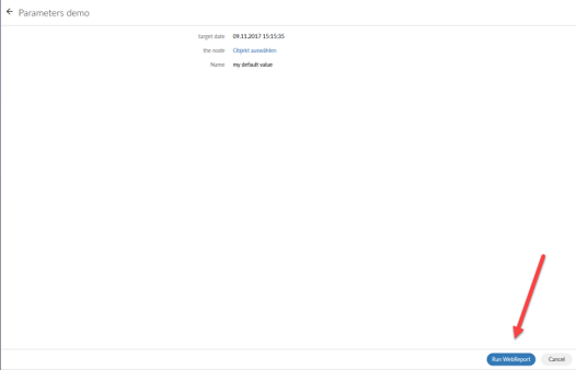
Then a Parameter Window opens. The Webreport can be startet by pressing the button “Run Webreport”

Webreport Parameters can be edited

A feedback can be given from the Webreport like this

Running webreports can give Feedbacks to SmartUI

The table.report shows a Smart UI table based on the output of WebReports data. The WebReport used by this widget must be based on either the widget_table_report_process_data_in_webreport or widget_table_report_process_data_in_datasource default reportviews which use the INSERTJSON @TABLEREPORT directive.

   // Create the data managing context
      var context = new PageContext(),
      sampleTableReportView = new TableReportView({
          context: context,
          data: {
            id: 24024,
            sortBy: "SubType",
            SortOrder: "ASC",
            columnsWithSearch: "SubType",
            titleBarIcon: 'mime_audio',
            title: 'Sample WebReports Table',
            header: true,
            swrLaunchCell: {
                id: 12345,
                iconClass: 'my-icon-class',
                hoverText: 'Some hover text for my icon.'
            },
 parameters: [
                {
                    name: 'myparm1',
                    value: 'val1'
                },
                {
                    name: 'myparm2',
                    value: 'val2'
                }
            ]
          }
      }),
      // Create helpers to show the views on the page
      region = new Marionette.Region({
        el: "#content"
      });

      // Show the views on the page
      region.show(sampleTableReportView);

      // Fetch the WebReport output from the server to populate the tile with
      context.fetch();

The parameter window can be implemented like this (the xxxxxx is the node number for the webreport)

  var promptView,
        promptModel,
        contentRegion = new Marionette.Region({el: "#content"}),
        pageContext = new PageContext(),
        currentNode = pageContext.getModel(NodeModelFactory, {attributes: {id: xxxxxx}}),
        runWRModel = pageContext.getModel(PromptModelFactory, {
            attributes: {
                node: currentNode
            }
        }),
        runWRController = new RunWRController();
pageContext.fetch()
            .done(function () {

                // We've got the page context, now get the runWRModel to see if there are parameters:
                runWRController.getRunWRPreModel({
                    node: currentNode,
                    context: pageContext
                }).done( function(){

                    // Build the prompt view and show it:
                    promptView = new PromptView({
                        context: pageContext,
                        model: currentNode,
                        promptModel: runWRController.runWRPreModel,
                        showBackIcon: false
                    });

                    contentRegion.show(promptView);
                });
            })

A feedback is implemented by the status.screen control.

  require(['csui/lib/underscore', 'csui/lib/marionette', 'csui/utils/contexts/page/page.context',  'csui/utils/contexts/factories/connector',
  'csui/controls/globalmessage/globalmessage',
  'webreports/controls/status.screen/status.screen.view',
  'webreports/models/run.webreport.pre/run.webreport.pre.model',
  'webreports/models/run.webreport/run.webreport.model',
  './status.screen.mock.js'
  ], function (_, Marionette, PageContext, ConnectorFactory, GlobalMessage, StatusScreenView, WebReportRunModelPre, WebReportRunModel, WRMock) {

  var statusView,
  context = new PageContext(),
  connector = context.getObject(ConnectorFactory),
  region = new Marionette.Region({el: "#webreport-status-screen-demo"}),
  attributes = { id: xxxxxx },
  options = { connector: connector },
  WRRunPreModel = new WebReportRunModelPre(attributes, options),
  WRRunModel = new WebReportRunModel(attributes, options);
  WRMock.enable(); // Mockup for local tests
WRRunPreModel
  .fetch()
  .done( function(){

WRRunModel
  .fetch()
  .done( function(){
statusView = new StatusScreenView({
  destinationModel: WRRunPreModel.destinationModel,
  executeModel: WRRunModel});
  region.show(statusView);
  })
  })

});

Working with WebReports and SmartUI now makes a lot of fun!