Last week I published a new video on Rethinking smartUI on Youtube. If you havnt seen yet, here is the short video. In this posts, we’ll go though the technical aspects of this new kind of approach to smartUI. This demo is a Document Pad (or short DocPad), displaying all document properties in a SCIFI GUI arrangement.
This is Part 2 of a multipart post covering all aspects of this Docpad.
The post parts until now
Part 4-A The Javascript Part 1
Part 3 The Infrastructure and the CSS
The html
First, lets take a look on the html (in out case the .hbs file). This is the top part of the widget,
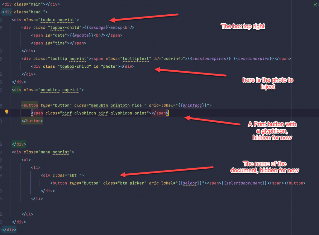
The div with the class “topbox” contains the Username and the Photo. There is also a Print-Button, if a document is selected.
A button, class “picker” is sorted in a div with “picker”. This is the button used to start the node picker component. Its hidden now, will be used later, when a document is selected.
The documents data is displayed using a cube. A cube has six sides so all sides can be presented using a css grid or …. (arranged in a 3D cube which can be rotated in 3D. But thhis is not part of this demo).
The whole thing is arranged in a div with the id of “content”. The top element is a div with the class “cube”, holding six divs for the six sides
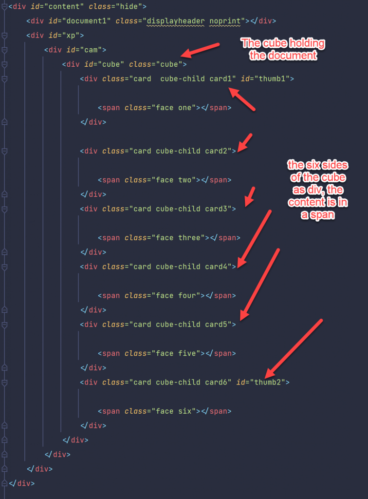
Just for fun, the cube is surrounded by a div with the class “cam”. If you want to display the cube as 3d cube. This is used to set the perspective on a 3d Cube. If you are interested in learning more on 3D css cubes, refer to https://css-tricks.com/simplifying-css-cubes-custom-properties/
Lets see the Actions.
The Actions in Detail
After starting the aplication, there are several stages, They are
a. Application started
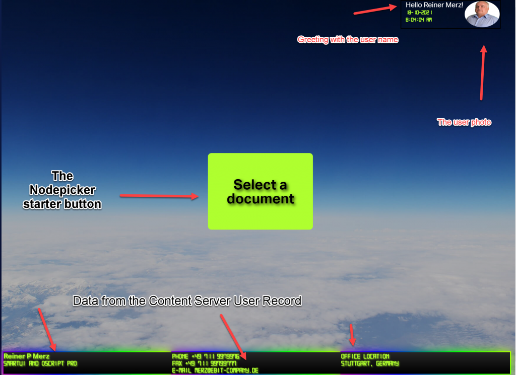
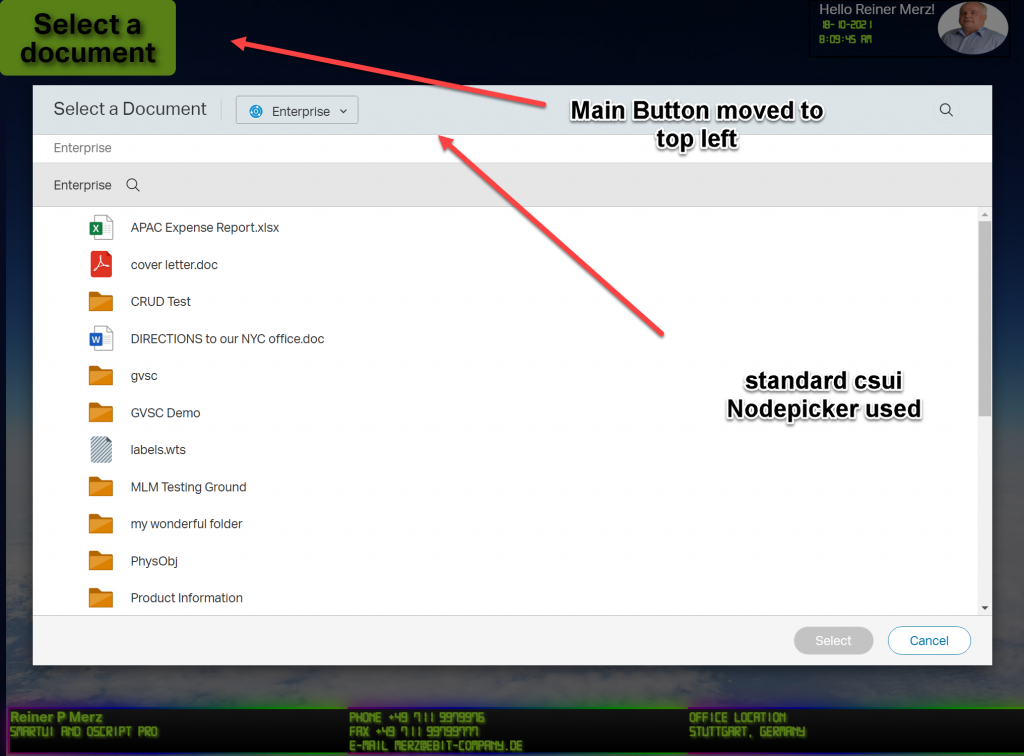
Here, the application is just started. the “Select a document” started from the top left and moved in the center of the window. This button will initiate the nodepicker, a standard component of the smartUI library.
Until now, we queried the user logged in. Then, we greet the user, extract the photo from the Content Server Database and display this photo in the top right. To make it more interesting, we displayed the photo in round form via css.
In the three panels at the bottom we displayed the rest of the user record. Just for fun we surrounded the three botton panels with a border animation.
b. Nodepicker selected
The next stage is the nodepicker. After pressing the “Select a document” button, it is started and delivers a list folders and documents on the associated Content Server. Meanwhile, the Button moved again back to upper left corner.
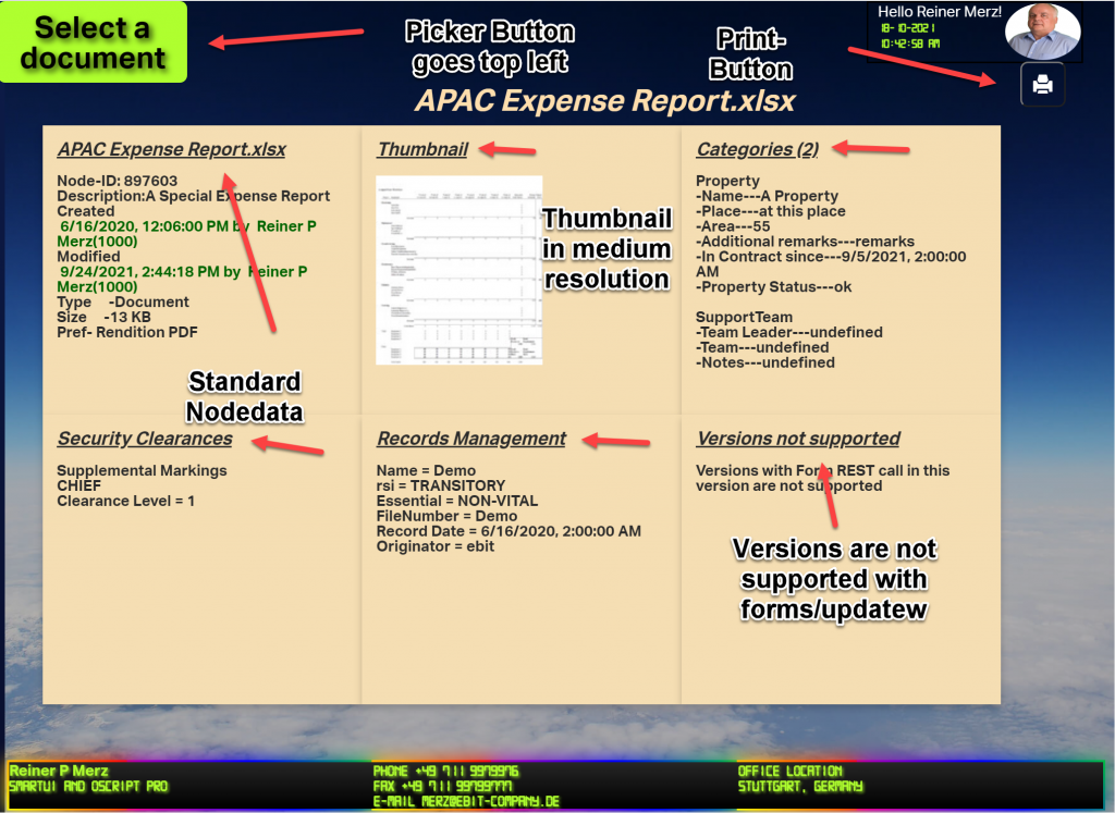
c. Document selected
After the user selects a document, all data of this document is read from the server. In this case, the “APAC Expense Report.xlsx” is selected. (Refer to part 1 to see which REST commmands are used).
As of do have a document, we can display the header and the print button.
As you can see when playing the video, the cube starts in some distance and is a little but foggy during the approach and clears when we receive all data.
The reason is, that the forms/update REST call takes longer and we use CSS animations ans css view filters to hide that fact from the user. When in doubt, view the video on top of this post again.
For beauty there are also some hovering effects added, on the panels and on the thumbnail.
d.Document to Print
The last stage is (besides selecting a new document to display) is to print the document.
Here we have the print previev in Chrome
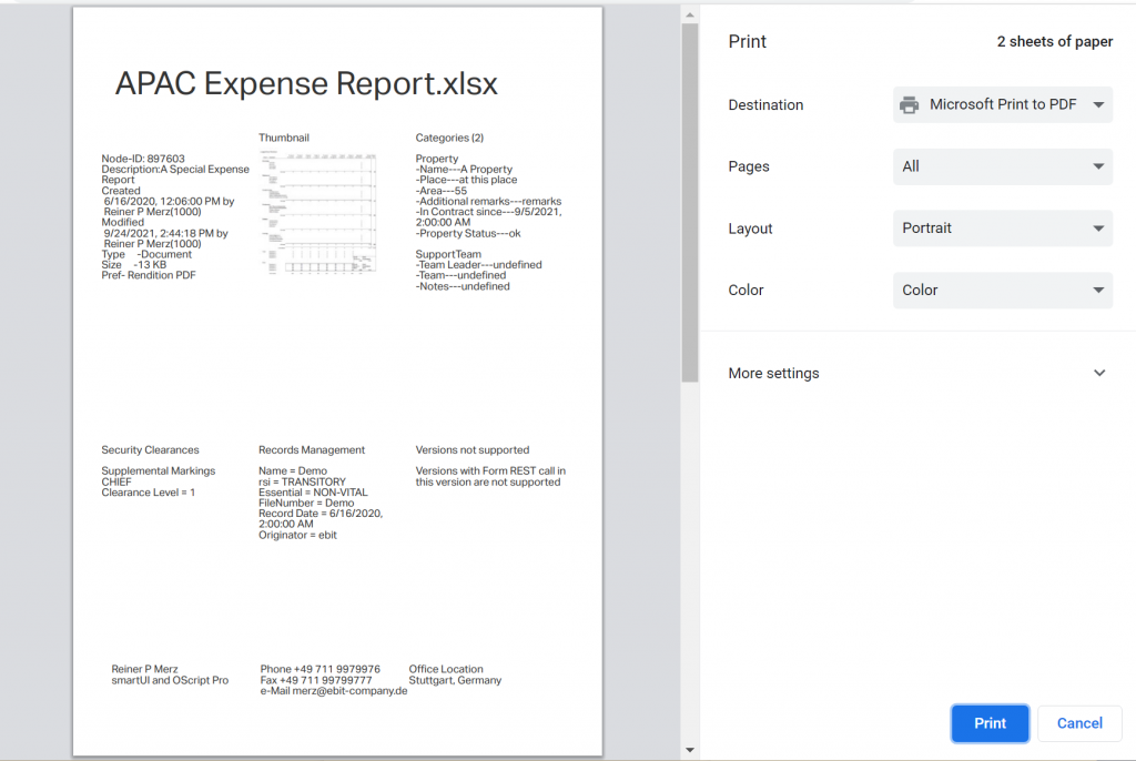
As we can see. the node data is printed in the form of a css grid on paper. The display is in standard layout. A media query selects a print style sheet instead of the normal stylesheet(s).
In the next week we discuss in Part 3 the index.html to start the widget standalone and css stylesheets (there are really several). We’ll then conclude this series in Part 4 discussing the Javascript made for this demo.
We’ll use the 4 steps of the application as the schema for Part 3 and 4.
See you next week!