Rethinking smartUI Part 4-A

Rethinking smartUI

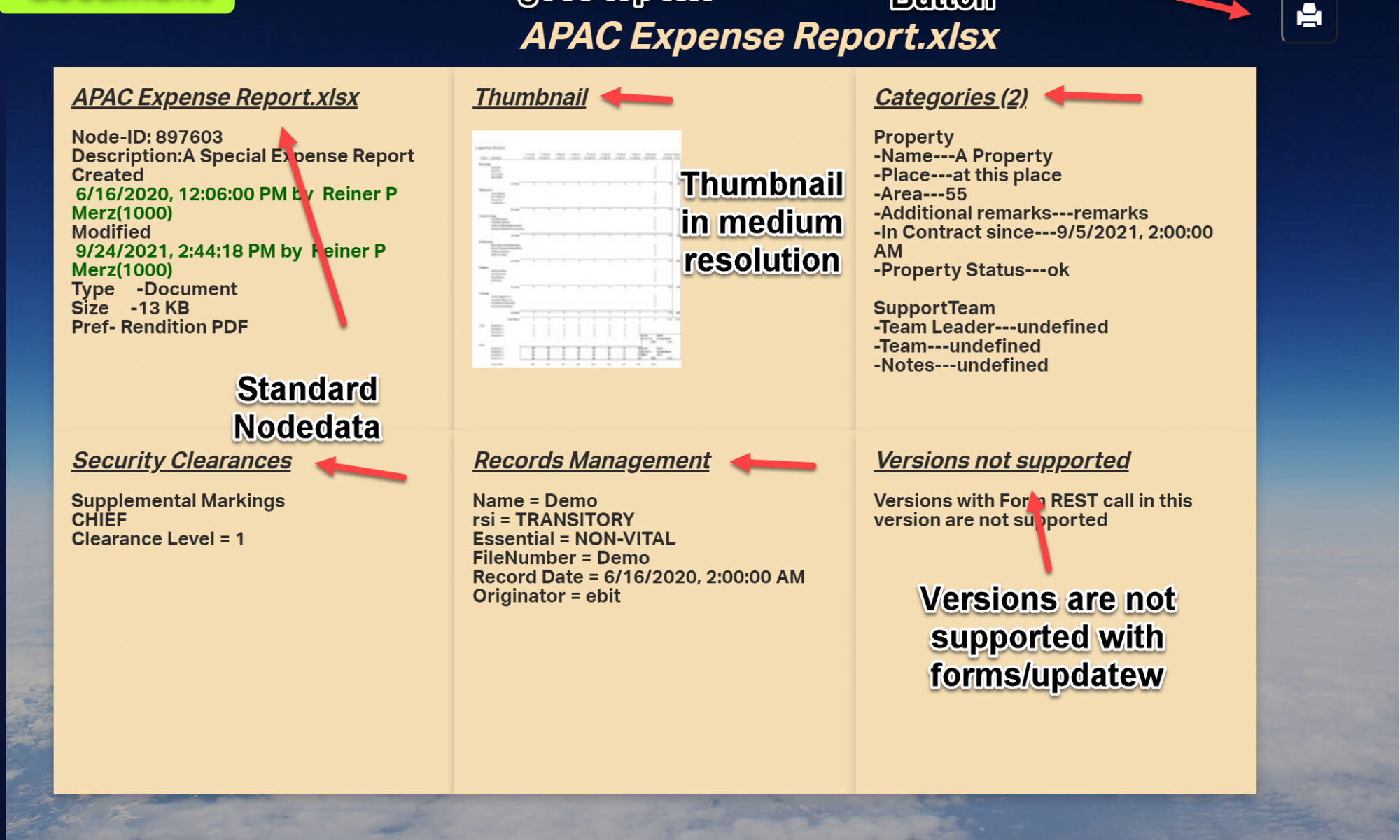
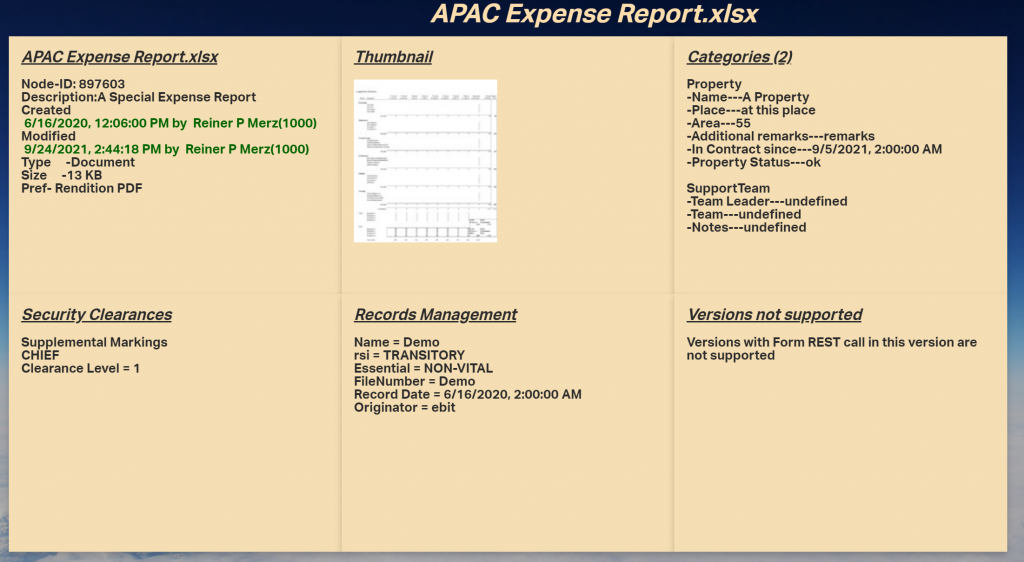
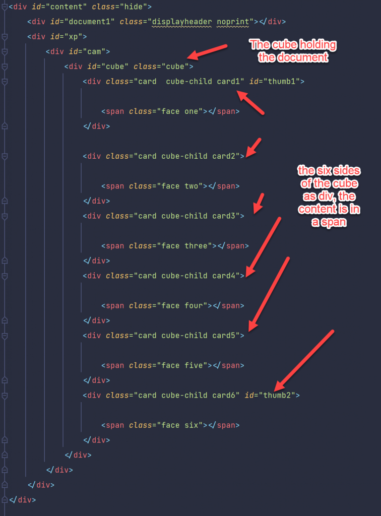
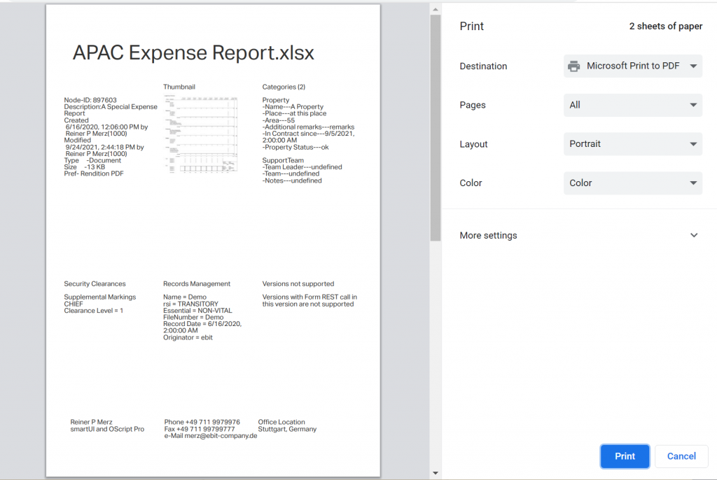
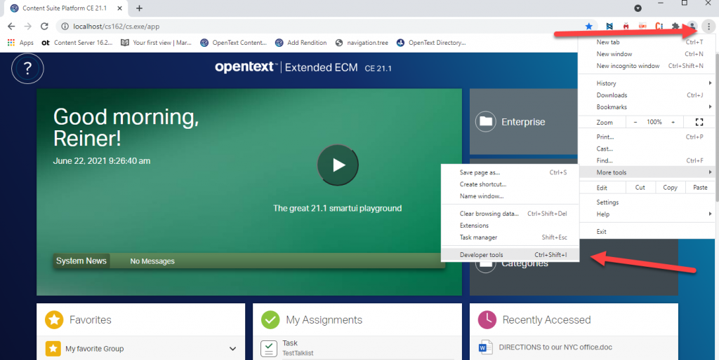
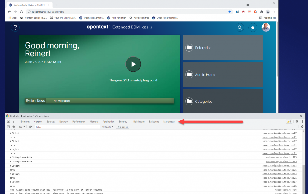
Three weeks ago I published a new video on Rethinking smartUI on Youtube. Now we have Rethinking smartUI Part 4-A discussing Javascript. If you havn’t it seen yet, here is the short video. In this posts, we’ll go though the technical aspects of this new kind of approach to smartUI. This demo is a Document Pad (or short DocPad), displaying all document properties in a SCIFI GUI arrangement.

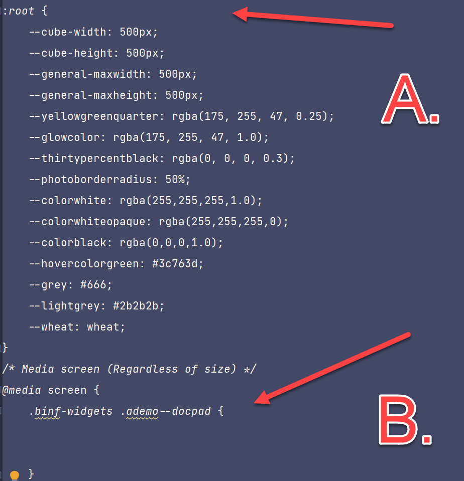
This is Part 4-A of a multipart post covering Javascript of DocPad. For the css refer to part 3 of Rethinking smartUI.

Warning: This is a lot of js code, so I subdivided this Part 4 into Part 4-A and 4-B (getting all documents infos with 1 Rest call). Part 4-B will be published next week.

We offer a one day remote training to understand the javascript code. If you are already a sophisticated Javascript Developer, you can get the Sources also from https://github.com/ReinerMerz/reinerdemo (a public repository on Github).

Warning: This is only the sourcetree of the project, so you have to insert this in your own project file.

The post parts until now

Part 4-A The Javascript Part 1

Part 3 The Infrastructure and the CSS

Part 2 The HTML

Part 1 Overview

But first to Rethinking smartUI Part 4-A.

The Javascript auxiliary files

Using the model factory

The idea of a model factory is to combine several functions in one.

a. Create a model and return it.

b. Load server data into this model for use in the main constructor function

A typical factory looks like this:

// the factory for the model
define([
‘csui/utils/contexts/factories/factory’, // Factory base to inherit from
‘csui/utils/contexts/factories/connector’, // Factory for the server connector
‘ademo/widgets/docpad/impl/docpad.model’ // Model to create the factory for
], function (ModelFactory, ConnectorFactory, DocpadModel) {

‘use strict’;
var DocpadModelFactory = ModelFactory.extend({
propertyPrefix: ‘docpad’,
constructor: function DocpadModelFactory(context, options) {
ModelFactory.prototype.constructor.apply(this, arguments);
var connector = context.getObject(ConnectorFactory, options);
// Expose the model instance in the property key on this factory instance to be // used by the context
this.property = new DocpadModel(undefined, {connector: connector});
},
fetch: function (options) {
return this.property.fetch(options);
}
});
return DocpadModelFactory;
});

The main Javascript files

The lang.js file(s)

The language system consists of those strings which are pupposed to change per language.

define({
helloMessage: ‘Hello {0} {1}!’,
waitMessage: ‘Please wait’,
seldoc: ‘Select a Document’,
printdoc: ‘Print the selected Document’,
pickerTitle: ‘Select a Document’,
selectPickerButtonLabel: ‘Select’,
descNodeID: ‘Node-ID’,
desDescription: ‘Description’,
desCreated: ‘Created’,
desModified: ‘Modified’,
……more …..
});

The standard model from Backbone.js

define([
‘csui/lib/backbone’,
‘csui/utils/url’
], function (Backbone, Url) {
‘use strict’;

let DocpadModel = Backbone.Model.extend({
defaults: {
name: ‘Unnamed’
},

constructor: function DocpadModel(attributes, options) {
Backbone.Model.prototype.constructor.apply(this, arguments);

// Enable this model for communication with the CS REST API
if (options && options.connector) {
options.connector.assignTo(this);
}
},
// Computes the REST API URL using the connection options
// /auth returns information about the authenticated user
// usage of => not possible because of “this” is used for urls
url: function () {
return Url.combine(this.connector.connection.url, ‘/auth’);
} ,

parse: (response) => response.data

}];

return DocpadModel;

}];


Remark: The Arrow Function at parse is pure js6. But let me quote developer.mozilla.com here

An arrow function expression is a compact alternative to a traditional function expression, but is limited and can’t be used in all situations.

Differences & Limitations:

(Endquote)

This means, its not possibe to use when any limitation will take place, like in the constructor.
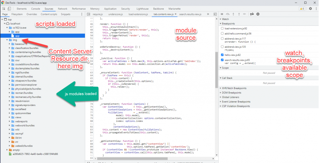
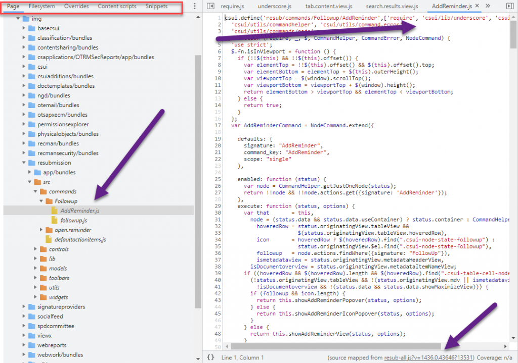
The docpad.view.js

The stages of docpad.view.js

Get infos via the Bootstrap model

constructor: function DocpadView(options) {
options.model = options.context.getModel(DocpadModelFactory);
Marionette.ItemView.prototype.constructor.call(this, options);
this.listenTo(this.model, ‘change’, this.render);
}

First, we initiate the model (and read the data) via a standard model using the model factory. Then we call the constructor in the prototype with the cs options. Lastly we listen to a change of the data and (in case) we rerender the widget.
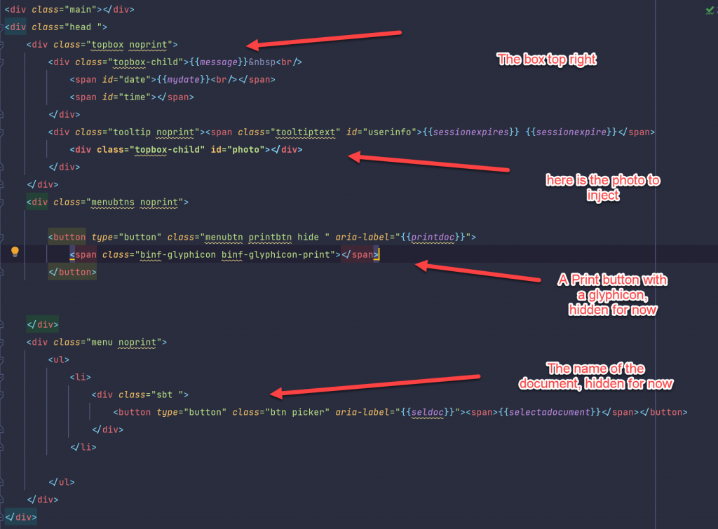
Load the photo

The user data contains (eventually) a photo of the user. This is loaded and inserted in the DOM with the function loadPhoto. Here the js6+ fetch function is exposed to get the photo and insert it into after the element woth the .photo class in the dom.

loadPhoto: function () {
let server = this.model.connector.connection.url;
server = server.substr(0, server.search(“api/v1”));
let url = server + this.photo_url;
let ticket = this.model.connector.connection.session.ticket;
fetch(url, {method: ‘GET’, headers: {“OTCSTicket”: ticket}})
.then(response => response.blob())
.then(function (myBlob) {
const URL = window.URL || window.webkitURL;
let photo = URL.createObjectURL(myBlob);
let img = document.createElement(“img”);
img.classList.add(“photo”);
img.src = photo;
document.querySelector(“#photo”).appendChild(img);
setTimeout(() => {
URL.revokeObjectURL(photo);
}, 100); // cleanup
}
);
},

       
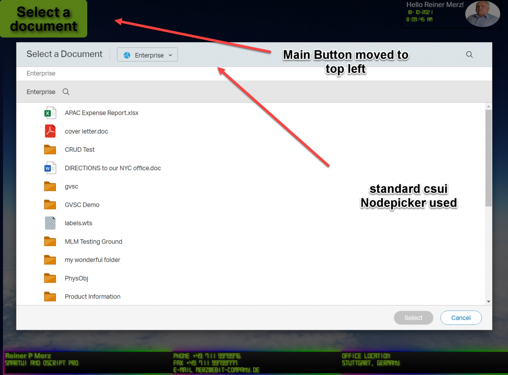
Using the Node-Picker

The Node-Picker is a standard function in the sdk, so we use it.

The file ‘csui/dialogs/node.picker/node.picker’, // the csui node picker

is required at the beginning of the docpad.view.js file under the local name of NodePicker like this:
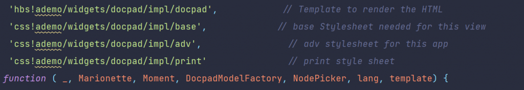
define([
‘csui/lib/underscore’, // Cross-browser utility belt
‘csui/lib/marionette’, // Marionetter
‘csui/lib/moment’, // the date/time lib in csui
‘ademo/widgets/docpad/impl/docpad.model.factory’, // Factory for the data model
‘csui/dialogs/node.picker/node.picker’, // the csui node picker
‘i18n!ademo/widgets/docpad/impl/nls/lang’, // Use localizable texts
‘hbs!ademo/widgets/docpad/impl/docpad’, // Template to render the HTML
‘css!ademo/widgets/docpad/impl/base’, // base Stylesheet needed for this view
‘css!ademo/widgets/docpad/impl/adv’, // adv stylesheet for this app
‘css!ademo/widgets/docpad/impl/print’ // print style sheet
], function ( _, Marionette, Moment, DocpadModelFactory, NodePicker, lang, template)

The picker is started by pressing the big button, this actually calls showThePicker. Types of 144 (only Documents) and on the enterprise volume are among the start conditions.

The title and other strings are extacted from the appropriate lang.js language file(s). The command nodePicker.show() at the beginn of the chain displays the nodePicker

showThePicker: function () {
if (undefined === this) {
return;
}
let btn = document.querySelector(“.btn”);
btn.classList.remove(“animate-large”);
btn.classList.add(“animate-large-backward”);

let nodePicker = new NodePicker({
connector: this.model.connector,
selectableTypes: [144],
dialogTitle: lang.pickerTitle,
selectButtonLabel: lang.selectPickerButtonLabel,
startLocation: ‘enterprise.volume’
});
nodePicker.s how()
.fail(function () {
console.error(“Picker fails to show”);
})
.done(_.bind(function (args) {
document.querySelector(“.printbtn”).classList.remove(“hide”);
document.querySelector(“#content”).classList
.replace(“hide”, “display”);
let node = args.nodes[0];
let id = node.attributes.id;
this.docname = node.attributes.name;
document.querySelector(“#document1”).innerHTML = this.docname;
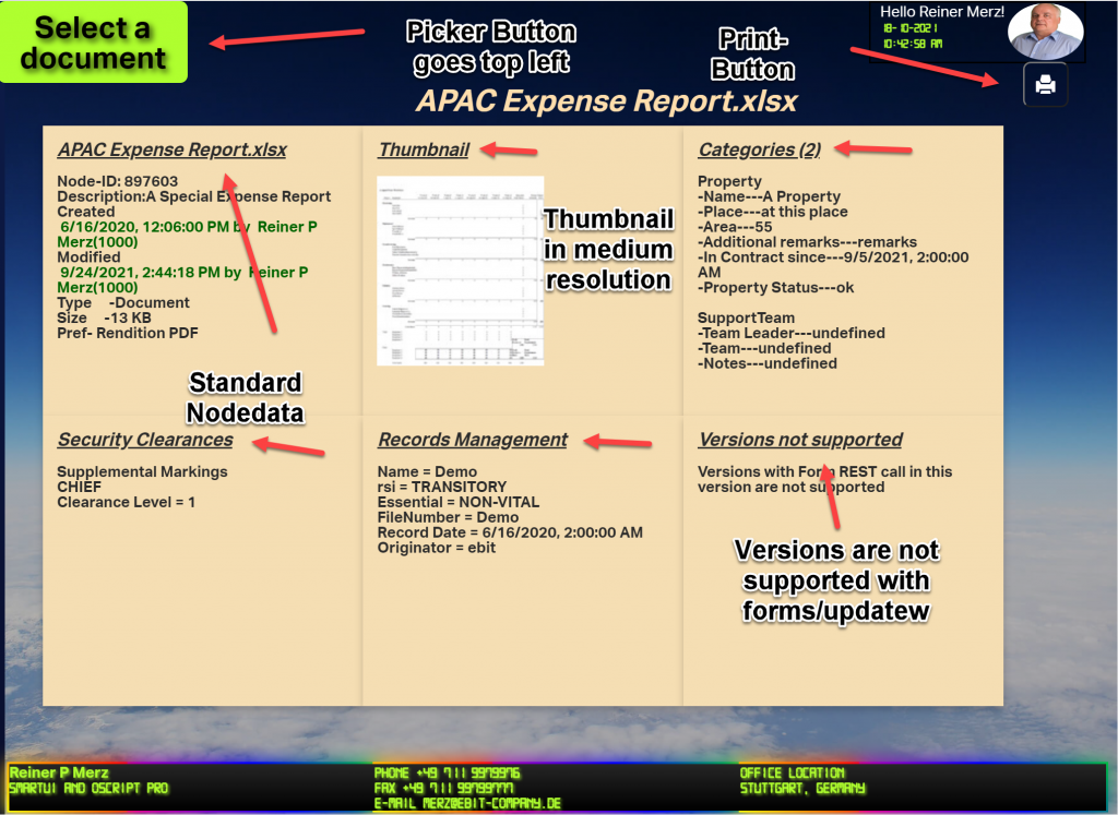
this.loadDocumentThumbnail(id); // load the thumbnail and display it
this.loadDescriptions(node); // load node data and display it
this.loadNodeData(id); // inquire form update data and display it
}, this)
);

},

The callback in the .done clause simply extracts the node id and the name from the results and stores them in the docpad “this”.

In the next week part “Rethinking smartUI Part 4-B” we’ll discuss the REST Commad how to get all document data (nearly) at once.

Rethinking smartUI Part 3

The upper PART

Two weeks ago I published a new video on Rethinking smartUI on Youtube. If you havn’t it seen yet, here is the short video. In this posts, we’ll go though the technical aspects of this new kind of approach to smartUI. This demo is a Document Pad (or short DocPad), displaying all document properties in a SCIFI GUI arrangement.

This is Part 3 of a multipart post covering the technical start of DocPad and the associated CSS

The post parts until now

Part 4-A The Javascript Part 1

Part 3 The Infrastructure and the CSS

Part 2 The HTML

Part 1 Overview

A. The technical infrastructure

Die DocPad is started via the index.html, found in the test folder of the docpad. This is because of its much easier to test modifications via index.html compared to installing the finished widget in the content server and trying it then.

The first part of index.html

The first part of index html

The whole page is more or less standard. We habe 4 areas of interest in the first part. Dont forget, nuc was introduced in 21.2. In older versions nuc was not existant.

  • A. Here, you see the config is moved to the nuc area
  • B. Change A will also require to add the nuc-extensions to the list of dependancies for csui. Thed whole js code is loaded by the “ademo” extension.
  • C. My machine is on a VM. This means, if you put this on your machine, you’ll have to enter your url and your support directory (called supportPath) in the configuration.
  • D. I’ve used my ticket to provide the login. You can use username and password to login the more convential way or also provide a ticket of youfself here. The displayed ticket won’t work at your site.

The second part of index.html

Part 2 of index html

Here we have this points of interest

  • A. The require parts of needed modules. It is a docpad.mock.js in the list of modules, but its not recommended to use the mockup facility because there is lot of traffic from and to the server. Its much easier to add a real content server behind that index.html.
  • B. Standard procedure. Instanciate the widget with the context, display it in the region and fetch the context from the server. As mentioned, its easiere to use a real server as data source so switch the mockup off.
  • C. The marionette region is associated with the id=”widget” of this div, so the widget is displayed here.

At the end there is immediate function starting with

(function() {
var ws = new WebSocket('ws://' + window.location.host + '/jb-server-page?reloadServiceClientId=1');

This is inserted by Webstorm (my JS IDE) to allow auto-reload of changed files. You can ignore that, other IDEs will solve that differently.

B. The CSS

The CSS

Here, all css files used in the docpad are listed in the require.js list of required modules. For demo purposed and to keep things simple, I used 3 css files:

base.css

This file contains the basic css instructions to style the .hbd template shown at the top of list.

adv.css

contains the more advanced css instructions for docpad

print.css

is the print style sheet to provide a proper output on paper.

Disclaimer: The css instructions selected do not impose or propose any styles to be followed, instead they are used for pure demo purposes here.

The base.css File

Here the main functionality of the css is found. One of the feature of css3, the variables, is used. In the pseudo element :root all variables used in different rules are defined.

css setup

At the end of the snipped you’ll see a media query, saying the following is used tor screen display.

Lets discuss several stages:

The header + the footer

Header
Footer

These two structures exploit the standard userinfo with REST from the content server in a standard backbone model. “Hello xxxxxx” is a structure from the hello world demo with the word “hello” and the signed in user. The photo is downloaded from the content server and dosplayed.

The bottom structure simply prints out other user data on the screen .

Points of interest:

Font used

The nice digital effect is build with the font “digital-7”

The header is done with

The header

Ther photo is inserted at the position of the .photo class in the size of 80×60 pixel. Then the photo gets this nioce rounded look using border-radius.

the footer conststs of three divs, which are positioned in 3 columns

The footer

The divs have the classes .boxcell and .leftbox and are descendants of the .footerbox

The document display

The document display consists of six divs and are positioned using a css grid.

docdisplay

They have numbers, the numbers range from one (“card1”) to 6 (“card6”). The css part is (shown here only a fraction):

Cards

They are all children of the cube, using the display mode grid and displaying the 6 cards in two rows and threee columns.

cube

Using the diffent REST methods in the js code, these cards were filled by the standard methods of DOM interaction from js. This will be the main theme of next weeks post, the js code of “Rethinking smartUI” Part 3.

Rethinking smartUI Part 2

Last week I published a new video on Rethinking smartUI on Youtube. If you havnt seen yet, here is the short video. In this posts, we’ll go though the technical aspects of this new kind of approach to smartUI. This demo is a Document Pad (or short DocPad), displaying all document properties in a SCIFI GUI arrangement.

This is Part 2 of a multipart post covering all aspects of this Docpad.

The post parts until now

Part 4-A The Javascript Part 1

Part 3 The Infrastructure and the CSS

Part 2 The HTML

Part 1 Overview

The html

First, lets take a look on the html (in out case the .hbs file). This is the top part of the widget,

The HBS file, Part 1

The div with the class “topbox” contains the Username and the Photo. There is also a Print-Button, if a document is selected.

A button, class “picker” is sorted in a div with “picker”. This is the button used to start the node picker component. Its hidden now, will be used later, when a document is selected.

The documents data is displayed using a cube. A cube has six sides so all sides can be presented using a css grid or …. (arranged in a 3D cube which can be rotated in 3D. But thhis is not part of this demo).

The whole thing is arranged in a div with the id of “content”. The top element is a div with the class “cube”, holding six divs for the six sides

The html of the cude

Just for fun, the cube is surrounded by a div with the class “cam”. If you want to display the cube as 3d cube. This is used to set the perspective on a 3d Cube. If you are interested in learning more on 3D css cubes, refer to https://css-tricks.com/simplifying-css-cubes-custom-properties/

Lets see the Actions.

The Actions in Detail

After starting the aplication, there are several stages, They are

a. Application started

Docpad started
Docpad started

Here, the application is just started. the “Select a document” started from the top left and moved in the center of the window. This button will initiate the nodepicker, a standard component of the smartUI library.

Until now, we queried the user logged in. Then, we greet the user, extract the photo from the Content Server Database and display this photo in the top right. To make it more interesting, we displayed the photo in round form via css.

In the three panels at the bottom we displayed the rest of the user record. Just for fun we surrounded the three botton panels with a border animation.

b. Nodepicker selected

The next stage is the nodepicker. After pressing the “Select a document” button, it is started and delivers a list folders and documents on the associated Content Server. Meanwhile, the Button moved again back to upper left corner.

c. Document selected

After the user selects a document, all data of this document is read from the server. In this case, the “APAC Expense Report.xlsx” is selected. (Refer to part 1 to see which REST commmands are used).

As of do have a document, we can display the header and the print button.

As you can see when playing the video, the cube starts in some distance and is a little but foggy during the approach and clears when we receive all data.

Display of the document

The reason is, that the forms/update REST call takes longer and we use CSS animations ans css view filters to hide that fact from the user. When in doubt, view the video on top of this post again.

For beauty there are also some hovering effects added, on the panels and on the thumbnail.

d.Document to Print

The last stage is (besides selecting a new document to display) is to print the document.

Here we have the print previev in Chrome

Print stylesheet in action

As we can see. the node data is printed in the form of a css grid on paper. The display is in standard layout. A media query selects a print style sheet instead of the normal stylesheet(s).

In the next week we discuss in Part 3 the index.html to start the widget standalone and css stylesheets (there are really several). We’ll then conclude this series in Part 4 discussing the Javascript made for this demo.

We’ll use the 4 steps of the application as the schema for Part 3 and 4.

See you next week!

Rethinking smartUI

Rethinking smartUI

Yesterday I published a new video on Rethinking smartUI on Youtube. If you havnt seen yet, here is the short video. In this posts, we’ll go though the technical aspects of this new kind of approach to smartUI. This demo is a Document Pad (or short DocPad), displaying all document properties in a SCIFI GUI arrangement.

This is Part 1 of a multipart post covering all aspects of this Docpad.

The post parts until now

Part 4-A The Javascript Part 1

Part 3 The Infrastructure and the CSS

Part 2 The HTML

Part 1 Overview

Part 1: Overview

This demo is supposed to do this:

  • Demonstrate the usage of html5, javascript 6 and css3. Especially how to use this modern components inside the smartUI framework. For example, the famous parse function in the standard demo widget will change this way:

js5
parse: function (response) {
// All attributes are placed below the data key
return response.data;
}

js6
parse: (response) => response.data

  • Compare the methods of getting data via REST using the methods
    • Model (as usual in Backbone)
    • XMLHttpRequest (the good old XMLHttpRequest as used since long)
    • Fetch (the modern javascript 6 method to get REST data)
    • Not used: async/await. Despite the fact that async/await is very handy, this appeared in javascript 8 and is beyond the scope of the demo.
  • Exploit the power of css by using
    • different display methods as Grid and Table
    • use panels in a cube. Origionally this was planned as moveable 3D cube. In this case, all metadata were written on the sides of the cube. Here is a very good technical description how to do it. Unfortunately the cube idea seems to be very impractical for the demo and was dropped
    • “burning borders”, fog and animations as element of the UI
    • provide an additional print style sheet to make this screen infos printeable in a normal way
  • Except some Icons of Bootstrap, nothing is to be used from Bootstrap. These Icons can be replaced by those in the fontawesome font
  • JQuery is not used
  • These Content Server REST commands are used
    • The log in is done in the index.html page, but when used as a dashboard widget the user is already logged in. If a separate login panel is required (p.ex. for a stand aloane dashboard on a tablet) then its necessary to provide a login via post […]/v1/auth
    • then the user info is retrieved via get […]/v1/auth
    • if the user has stored a photo in his profile, then the photo is retrieved by get […][photo-url] and then inserted in the DOM.
    • Then the standard Node-Picker Control is called. All Node-Picker interactions with the server are managed by this control. As a result, the nodeid of the selected Document is returned.
    • Next, the DAPINode infos of the selected node are retrieved by get […]/v1/nodes/{id}
    • for the “created_by” and “modified_by” there is only a nujmber returned, the userid. For this two cases, the username is retrieved from the server by get […]/v1/members
    • Its always nice to exploit the thumbnail of the document to the user. This is done by get […]/nodes/{id}/thumbnails/medium/content
    • To get all other data , a special trick is used. The command get […]/v1/forms/nodes/update returns all categories and the othere nodeinfos using one REST call. This commmand takes a while to execute, so the user is entertained using some css animations.

In the next week, we explore the infrastructure of this Docpad demo.

Rendition Administration

The new Rendition Administration option allows the Delete or Overwrite of the latest version. This is a configuration to be made under the Admin pages (Renditions/Configure Versions Folder/Edit Versions Folder)

If “Save as new Version” is marked on, the rendition will be saved as new version instead of beeing saved as Rendition.

If “Delete latest Version” is marked on then the document which triggered the rendition will be deleted.

This improves the workflow if processing and the retention of the original document is no longer required,

User Session Management – Expiration

User Session Management

The world is bad and bad boys are amongst us. They will not even change app.html, they even can steal real documents or do other things with their sessions. As a precaution, there is a new User Session Management – Expiration

?func=admin.securityvars

This new management allows to exploit the Cookie Authentication Infos. User sessions can be terminated in much more advanced way then the usual Security Tokens. The rules are:

  • By default, the session is set to expire 30 minutes after the last action is performed.
  • The Session Timeout minutes ranges from 1 to 10080 (7 Days)
  • Session Timeout Alert minutes ranges from 0 to 120
  • Also: Session Timeout Alert cannot be higher than the Session Timeout
User session management - expiration: New user session options

But: A session limit is not enabled by default

Sessions per User

Example

Example of a user session configuration

If the user is not active, then the session will expire after 30 minutes from the last request made to the server.

3 minutes before the session expiration (on the 27th minute) an alert will be displayed to the user that their session is about to expire

Note: A session is not equal a session, the system admin must cosider these rules:

• If the Content Server is active on multiple tabs of the same browser is considered as one session

• A Content Server active on multiple browsers is a separate session on its own

• If the Content Server is active on CS Mobile or Enterprise Connect is is considered as a separate session

•And when the Content Server is active on other integrations like SAP, Salesforce, SuccessFactors etc. this is considered to be a separate session

Warnings

User session terminations are proceceeded by some warnings. If the sesssion is still active but will be disconnected soon, the user gets his warning:

Session Timeout Warning

To keep the surprise as small as possible, the user can push the “Continue Session” button and extend his session. But if the session is expired the user gets this panel

Session timed out

The “Sign in” button redirects to OTDS and the user has to re-authenticate his session.

The other side: View Sessions

View User Sessions

This will be the tool for the admin to view sessions.

Detailed "View USer Sessions"

And, for different reasons, there is a button ‘Terminate Session’ ends the user session, and the user will be forced to re-authenticate again.

User Sessions will also be terminated by any “Logout” button and on removing the “Log-in enabled” privilege at the user profile edit page

User privilege "Lon-in enabled"

This will keep the bad boys out our your system.

smartUI – Printing

Print in smartUI

The support for smartUI – printing is new in smartUI 21.3.

Technically you’ll find a new command in the “Sent To” dropdown menu

The new print command

Then you get a list of the files to print and a list of all available printers

List of Printers

Happy printing.

Requirements: Content Server Browser Web extension and ebterpriseconnect_framework_21.3_x64.msi installed.

smartUI Goodies for Webreport Fans

One of the smartUI goodies for webreports

In the rich universe of Opentexts smartUI there are even some goodies for the webreport addicts. Besides the standard webreport widgets there are two controls witch are used happily and heavily by webreports designers, named Parameter.Prompt and Status.Screen. These are the true smartUI Goodies for Webreport fans.

smartUI support
Need smartUI support?

Especially two controls are of interest for the seasoned webreport developer.

For tests, I’ve used a senseless webreport

A senseless webreport just for demonstration

This is a dummy webreport with several parameters. At the top right corner you see the execution result. Just for demonstration purposes, this has been kept simple and stupid.

But what if…….. the webreport is supposed to be run under the new and amazing smartUI? In this case we have two controls to help.

Parameter.Prompt

This control senses, if the webreport does have one or several parameters and allows to alter the parameters before the webreport is started.

PArameter.Prompt, a special service for all the webreport addicts

Here, all parameters can be changed. A click on “Run WebReport” will start the webreport if activated.

The js code is easy

JS code for the parameter prompt control

Status.Screen

can be used to start the webreport and to display some End-Messages. A standard situation is displayed here

A webreport has finished and the End-Messages are displayed

For example, if a html file is defined as output under the folder “webreports”, then this infos can be displayed at the status screen.

The js code is easy

A smartUI goodie for webreport fans in JS: status.screen

Both controls can be combined to a widget to start and execute webreports.

If you need some more sophisticated, its easy to override those controls with custom controls.

That were the smartUI Goodies for Webreport Fans.

Happy playing with webreports, but dont forget: Webreports will make a machine not faster!

The new DEMO widget

Demo Widget for Learning By Doing workshop

We made it. We finished a simple widget for smartUI to demonstrate a lot of features of smartUI inside our new workshop “Learning by Doing”.

This is a remote workshop and during 2 days you get the source code of the widget and learn, how this widget is developed from the standard hello widget.

The widget features

  • Usage of Glyphicons in binf
  • programmable multi line tooltips in binf
  • Navigationbars in binf with commands behind the targets
  • expanding and collapsing of structures using binf
  • a dateselector on an input type=date field
  • switching a label to an input field and vice versa
  • rendering the logged in user photo from a content server behind
  • use a nodepicker to select a document and render the thumbnail
  • add a user select control after the widget is rendered
  • delete the “copy” command in smartUI
  • display messageboxes and global messageboxes
  • use a standard slide in and use a wizard slide in with several views

See here a short video (20min) of the features

And dont forget to register for the next workshop “smartUI Learning by Doing”

Asking your browser for help in smartUI developments

Browser Memory

When you think of smartgUI, you may always think of a lot of small js/css text files and a couple of resources to be loaded. All together act as smartUI Page like this:

A typical standard landing page

This is a typical landing page. With such a page you can control, how your perspective is working and also if certain commands, controls and widgets are correct. For example, the widget ot the top left is a modified Welcome Widget showing System Messages and other news channels.

What else can a browser do for you in your continuing quest to produce an awesome user experience for an enduser?

A lot! First, open the development tools in the browser. Here we are using Chrome, but this tools are available on all browsers.

Developer tools – a closer look

Developer Tools

Press Ctrl+Shift+I or the Develeloper tools entry in the menu.

The tabs in the developer tools

This will open up the develeloper tools. The functionality is subdivided in several tabs. The most important (from left to right) are

  • Elements. Gives you the possibility to see the actual DOM loaded, Here you can change css and other elements and you’ll see immediately the effect. The rightmost icon lets you identify any element on the screen (and display it in the DOM). Thaty a handy way to identify elements on the screen and to which js file they belong (Similar way as we had in legacy gui with oscript in these ancient times)
Identify Icon
  • Console. Gives you all messages from the browser. You can see all module messages, also missing modules are displayed in red. There are several levels of messages, which can be filtered. Here, since this is a develeopent VM, all levels are activated.
  • Sources. The main tab to work with.
The sources window

The complete smartUI is loaded in the browsers memory (except those data parts, which will be changed via REST/Ajax later on). So we can examine directly, whats happening in the browser.

Interesting is the treeview at left:

Loaded js parts

We see blue and orange folders, which can be opened. Lets open a blue folder, for example the “New Generation Desktop” ngd and the resubmission

Bundles and Sources

First, we see, the ngd has the name ngd/bundles. It contains the js and css bundles of ngd. Lets open another folder, the resubmission folder. Here you see a blue app/bundles folder and an orange folder named src. Here you have the standard SDK tree. If there sre orange folders, then you can browse into the source code, like this:

Load a souce file which is not in the SDK

Here we checked the AddReminder.js from the reminder package, which is one of these modules not part of the smartUI SDK.

Whats to do with that file(s)? Select the file (with js extension) in the tree and right klick. Here you can edit the file or save the file to your filesystem.

Save a loaded js file

Search a needle in a haystack

We have a lot of js files in the browser memory. How to search for a specific file?

First, display the search window by clicking on the to right 3 point menu. Goto More Tools and click on Search. Then a search bar opens at the lower left. Enter your search name (mostly part of the requirejs path) and you’ll see the results. Select the .js file (bundles are not very useful to read). The file is displayed in the source window.

Our requirejs paths in the browser

Sometimes its quite nice to inspect the loaded requirejs modules in the browsers memory.

At first, we have to switch to the debugger mode. So open the console tab and type “debugger” in the last line to put the browser in Debug mode.

Then our interestring things appear at the right of the developers tools.

We see, the scope is filled with the loaded objects. Go to the global scope. Scroll down, until you’ll find ther csui entry. Please note, this may change to nuc from 21.2!

There are several entries under csui. Open the first “require” entry (or “requirejs”). Then open s. Expand contexts. Open _ (underscore). Expand registry.

Then all loaded csui and extension parts are listed in the registry. Lets examine one entry (countryselector.view).

Under depmaps, we see the dependencies.

Under map we see all map related things, this is the place to override an original module with a custom one.

And we have access to the source code (if we click on the link at countryselector.view:13.)

Now you have the base for your own experiments. There are a lot of additional features in the developers tools, which could not be covered here. So: Happy experimenting.