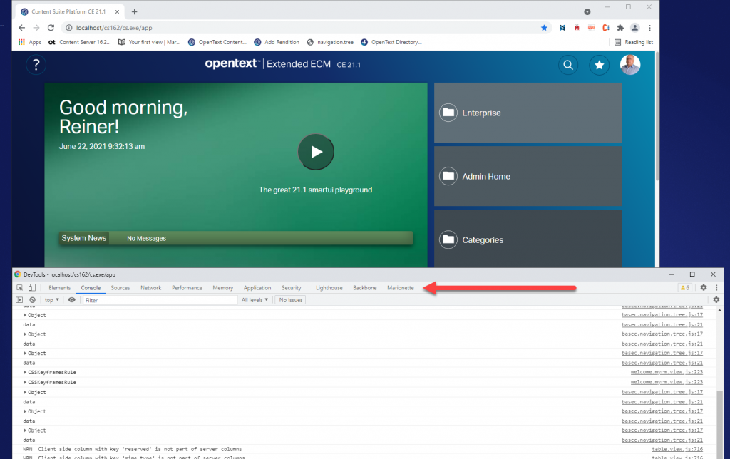
Some weeks ago I published a new video on Rethinking smartUI on Youtube. Now we have Rethinking smartUI Part 4-B discussing the main part of gathering and displaying thr documents data.
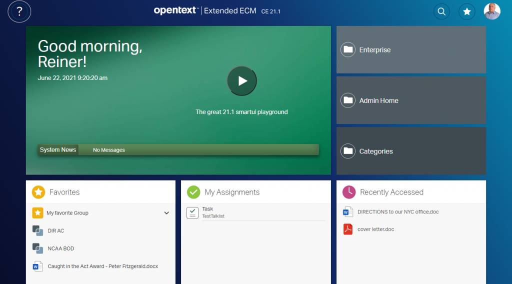
If you havn’t it seen yet, here is the short video. In this posts, we’ll go though the technical aspects of this new kind of approach to smartUI. This demo is a Document Pad (or short DocPad), displaying all document properties in a SCIFI GUI arrangement.
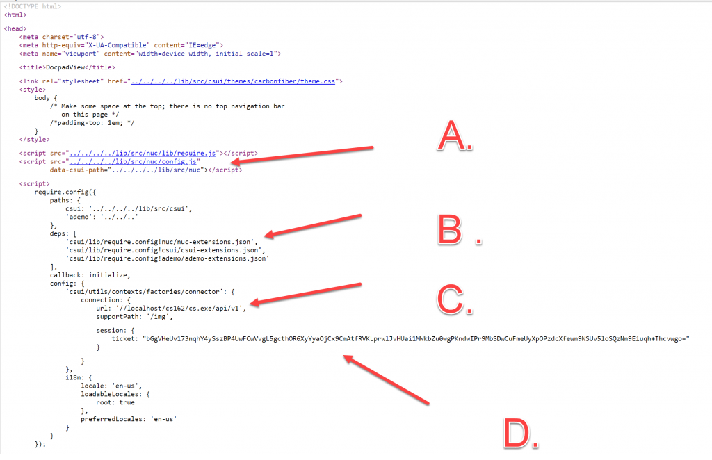
A warning at the beginning: To use this code with IE11 is a perfect way to test all js error messages. Use this code only with the newest browsers. Its tested with Chrome (V98), Chrome Canary (V98), FF Developer (95.0b4), Edge (95.0) and Firefox (93.0)
The other parts of this post were
Part 4-A The Javascript Part 1
Part 3 The Infrastructure and the CSS
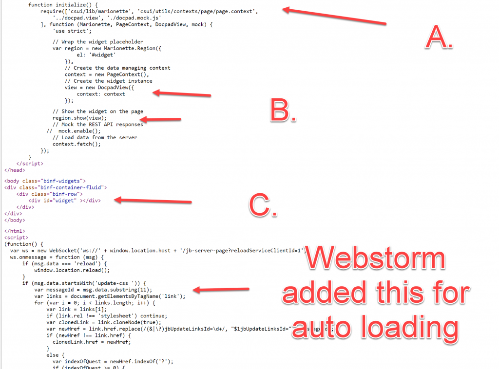
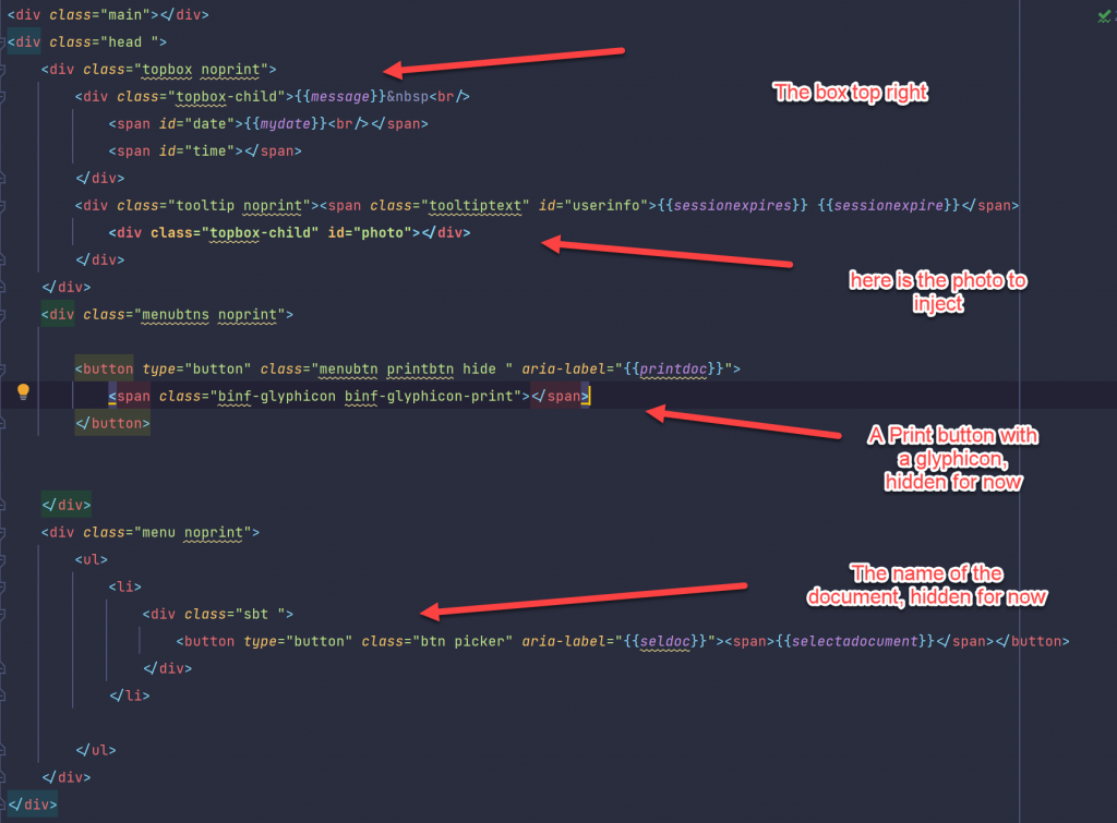
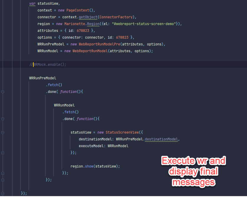
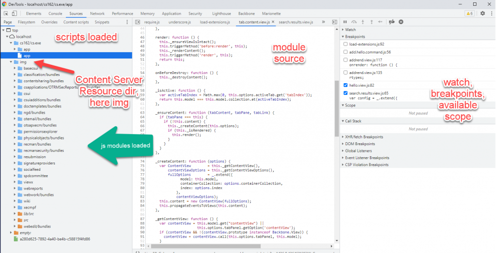
In the part 4A, we had discussed all the js responsible for the perimeter of the whdgetz. Not lets discuss the main part which is responsible to gather and displad this data:
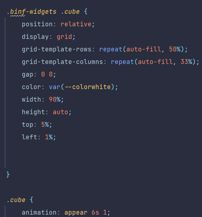
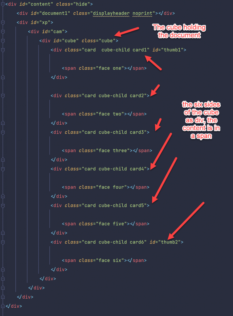
A CSS Grid
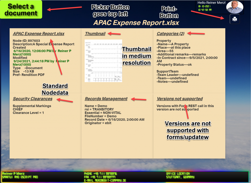
As you can see, there are 6 panels arranged in a CSS grid.
For infos on the css, please review this post, the part 3 of this series.
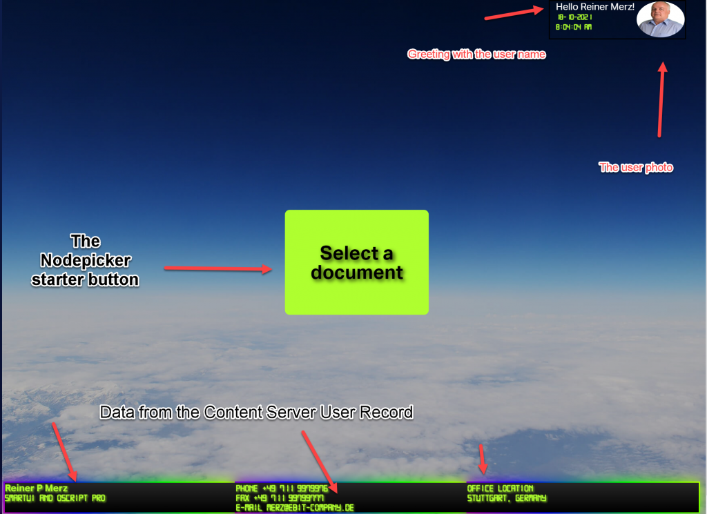
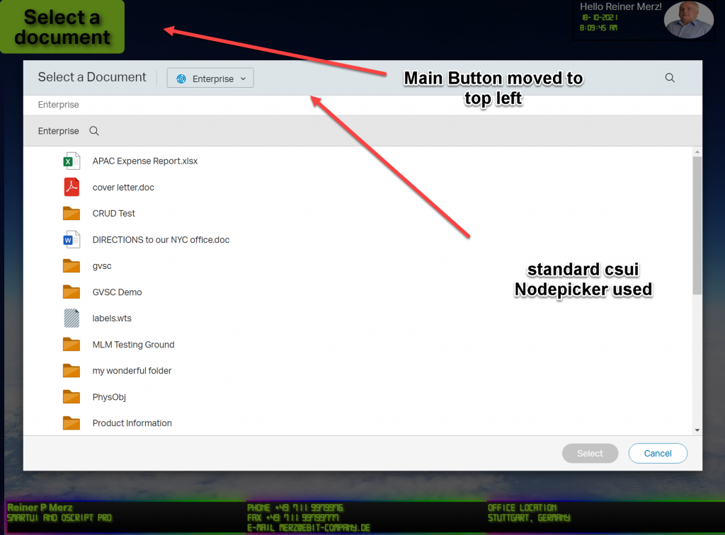
So let’s start with the panel at top left.
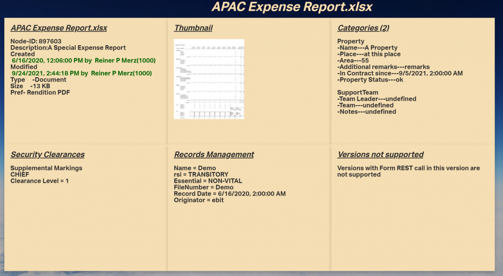
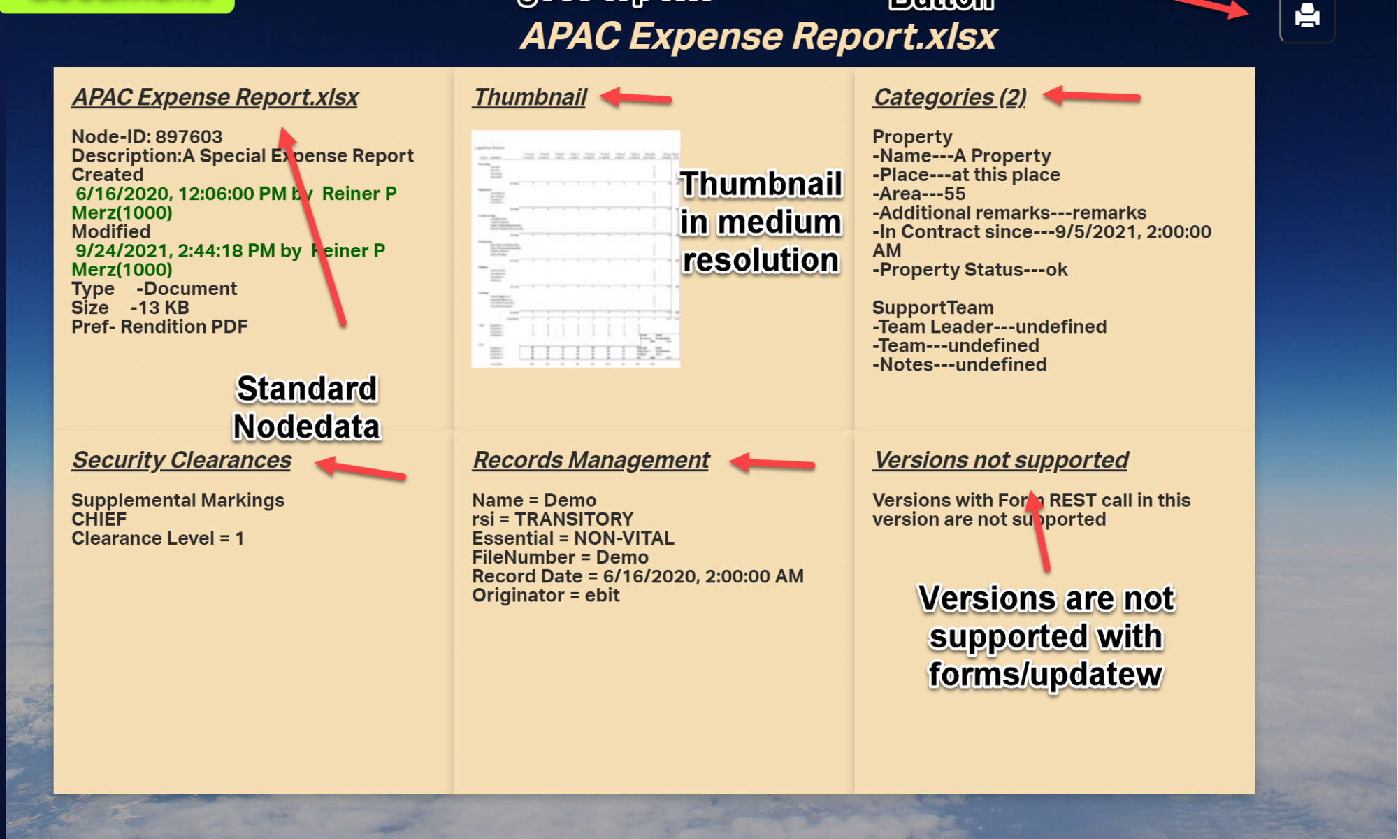
The documents metadata
This is more or less the data which is related directly to the document. The documents node number was the output from the node picker . The nodepicker was closed by the done() callback.
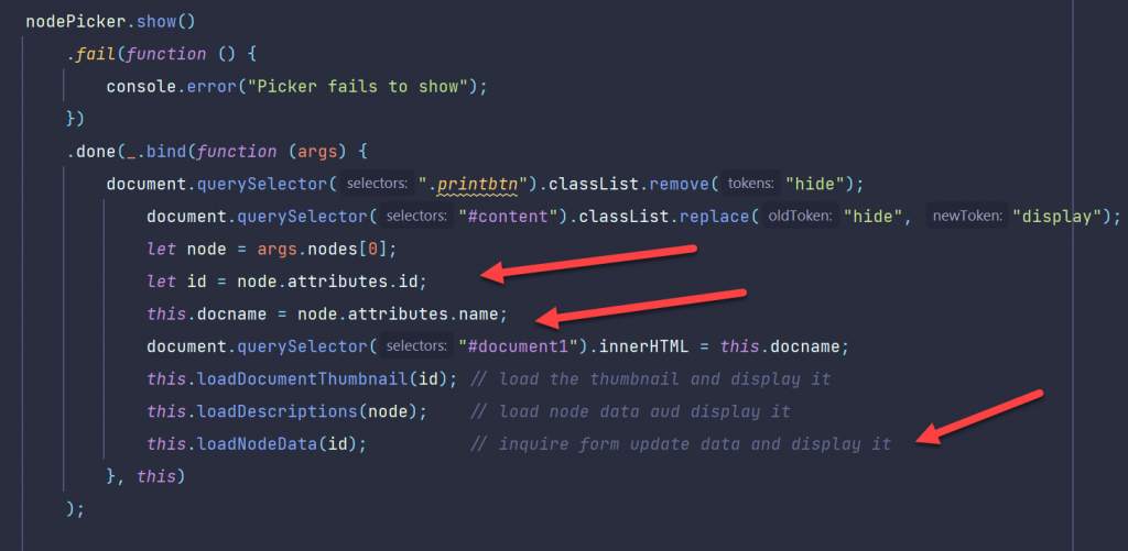
Here we are in the this function of the nodepicker. We extract the node from the callbacks arguments an get the id with the topmost arrow. We extract the name of the node and put this name inside the id #document.
The loadDescriptions function does the work.
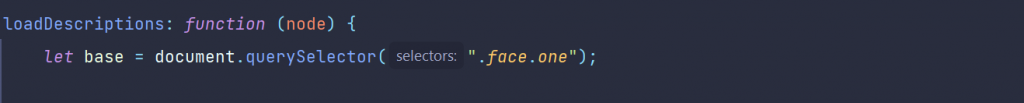
loadDescriptions
The prelude is simply to select the first face “.face.one”
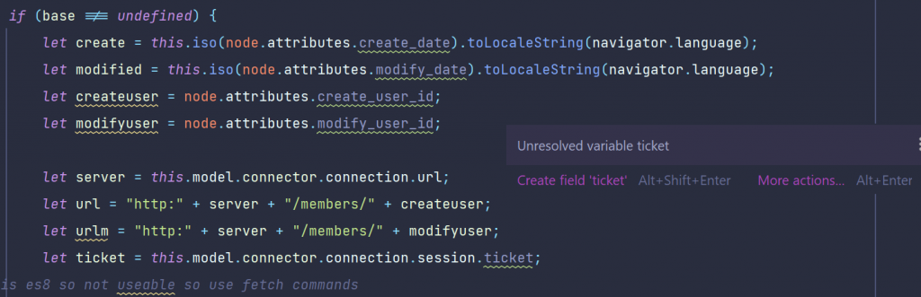
If this is not undefined (remember, smartUI always makes 2 runs, so its always a goot idea to test if its defined) the create and modify dates are extracted and translated in a standard js data. For non-US readers it will be always a difference between p.ex 04-05-20 and 4.Mai 2020 (US and german dates for the Star Wars day May the fourth), thats why we translate the dates.
Also we need to get the users of the creation and the modification. But these are numbers, so we want to translate them to names.
Next, extract the server from the connection and construct the members REST command to get these names.
First view: The fetch command
fetch is new in js 6. In this older, antique times you would have used some ajax variants like xmlhttprequest or some similar methods which we will use in other calls for comparism.
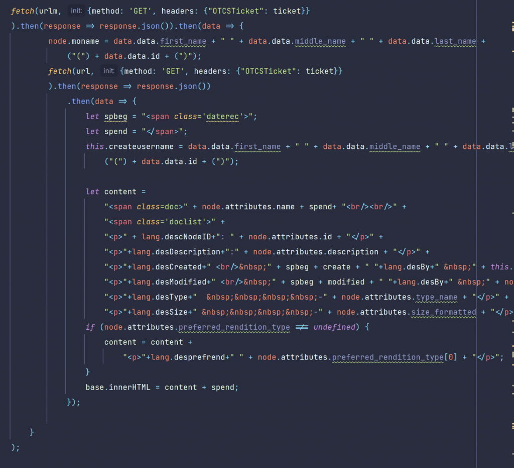
Technically, we have to issue two REST calls to /member/ to get the names of the createuser and the modifyuser. We use the fetch command.
Remark: the famous async/await would be much more handy for that, but we wanted to limit the language scope to js6 for these posts.
Once we get the responses, we’ll put that names simply as innerHTML on the panel.
Technically, you can use all other avaliable methods to put text on the panel, from template-strings to create a and fill a text nodein the DOM. You can even invite handlebars to do this for you.
loadDocumentThumbnail
In the top middle panel we added the document thumbnail, which is created automatically during indexing on the server.
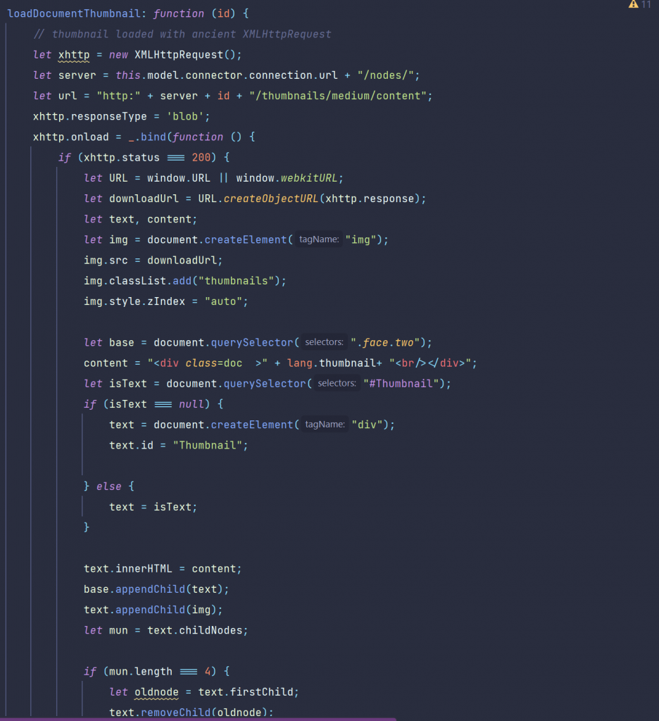
We must enter the nodeid in the REST command /thumbnails/medium/content to get the medium resolution version of the thumbnail.
To show the diffence to the fetch comand, the old archaic XMLHttpRequest was used.
The receiving image is put into a div with the id “Thumbnail”.
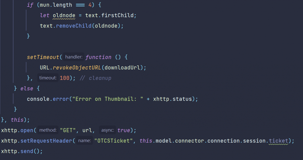
In the case the user selects another document the old thumbnail would remain. So we remove the old image element.
Almost done, we need to put our otcsticket in the request header and to send the request to the server.
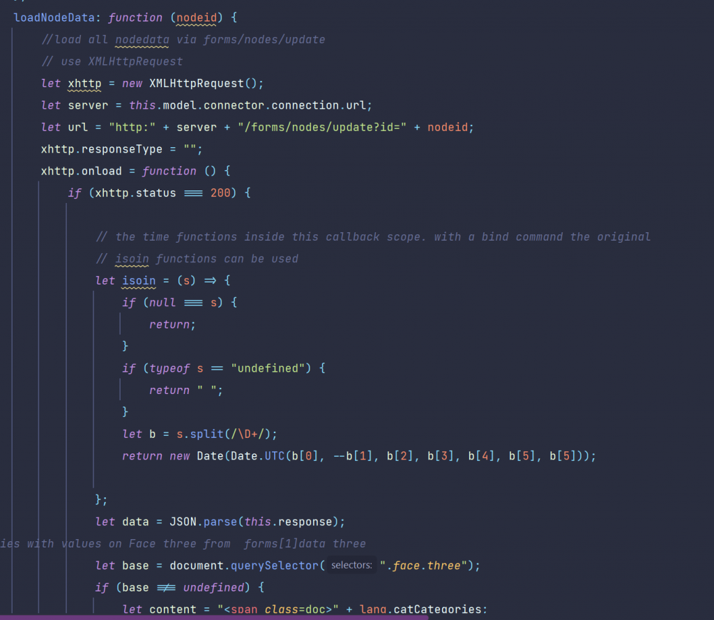
loadNodeData
In this function, we use exactly one REST call to get all data at once. This is done by the function /forms/update?id=xx whick will deliver all data for that nodeid at once. Expecially the categories take a while, so a css-fog was used to cloak the image of the approaching grid until the data was received (revisit the video). Then the css fog is cleared and trhe categories are displayed.
The call is also done with the old XMLHttpRequest to show the diffences to the modern fetch command.
Local functions were used instead of those in “this” to keep the scope clean.
The categories and the attributes
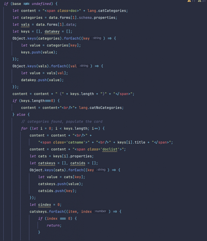
Categories were returned in an object with their category name a title in the entry. To get the attributes we have to do a little bit more.
We split the result into several arrays to extract the values. If we have “date” in the type field, we have to use our date translation also on that to display the dates correct.
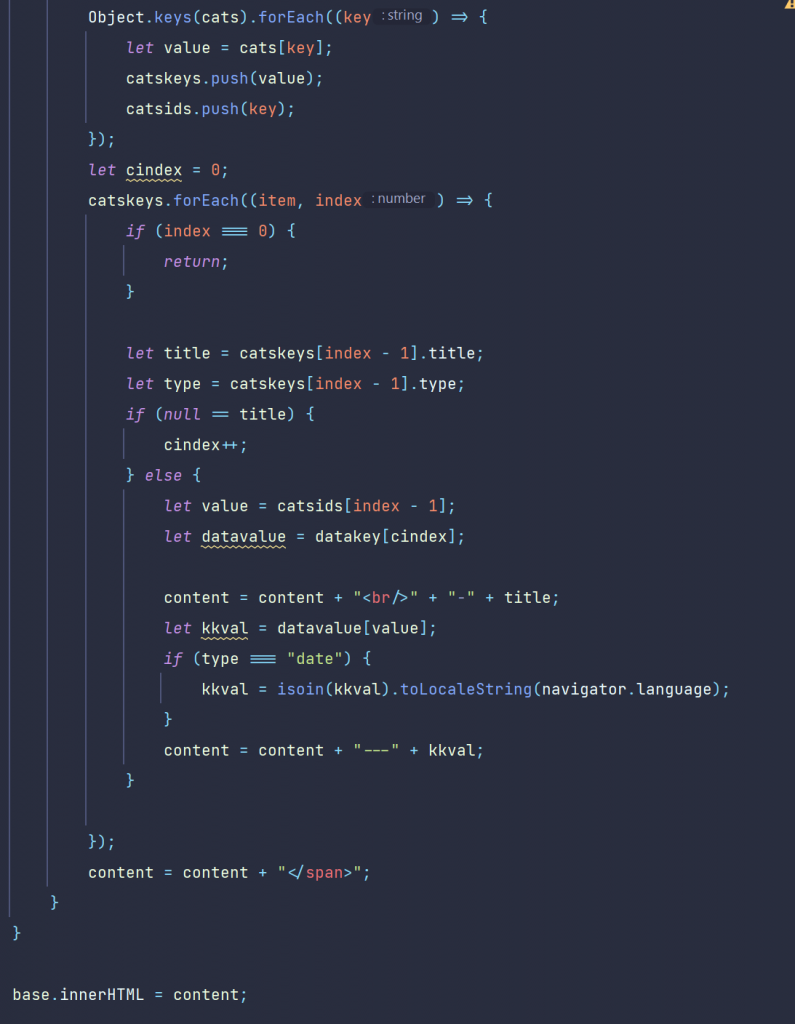
Security Clearances
All security related data is on the fouth face, the one on the lower left.
Here, all security levels and markings were displayed inside a span.
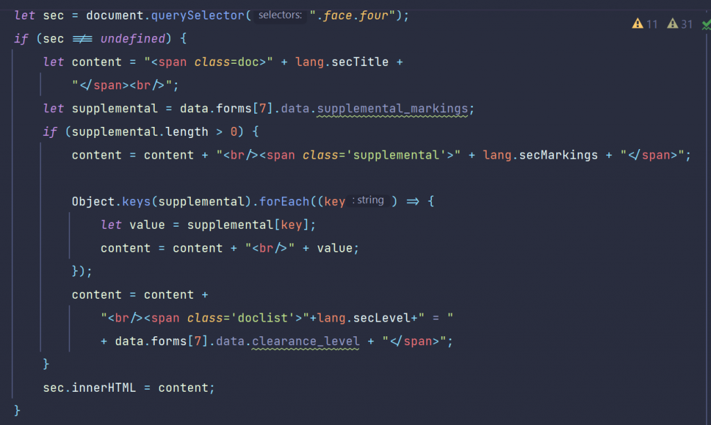
Records Management Data
here we extract and fill the data on the lower middle panel.
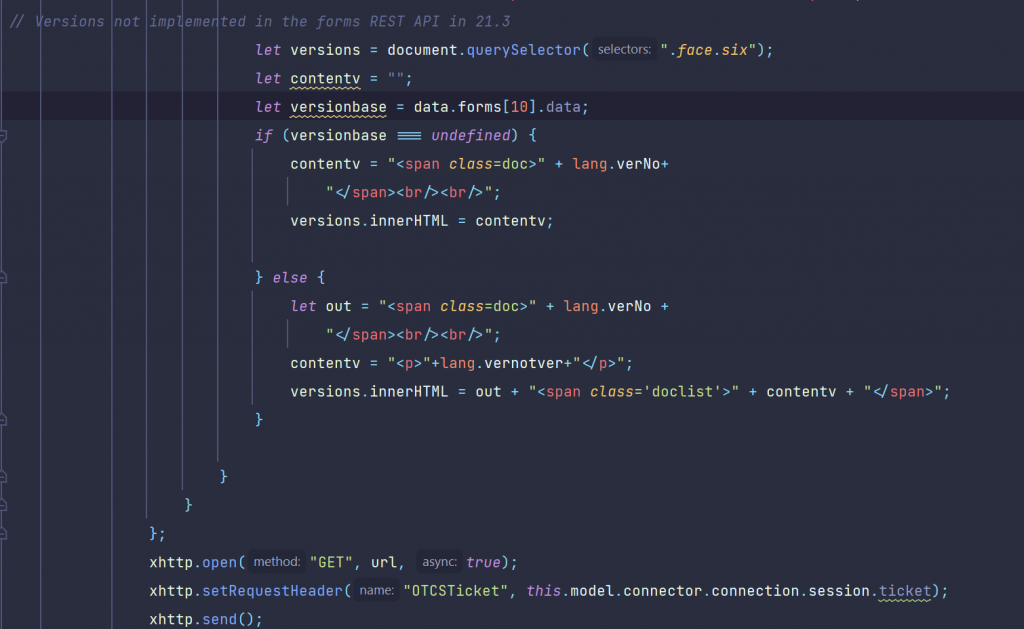
The Versions Data
Here, the REST commend has a problem. Versions are not included in the answer of the REST command, at least in the Content Server versions 21.3 and 21.4. So let’s ionform the user on this fact and display a local language string of this fact.
Tip: Maybe there will be a patch to fix this in the near future.
So we had all parts discussed.
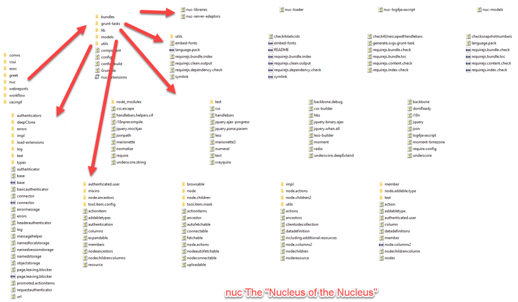
We offer a one day remote training to understand the javascript code. If you are already a sophisticated Javascript Developer, you can get the free Sources also from https://github.com/ReinerMerz/reinerdemo (a public repository on Github).
Warning: This is only the sourcetree of the project, so you have to insert this in your own project file.
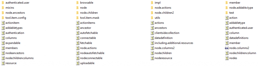
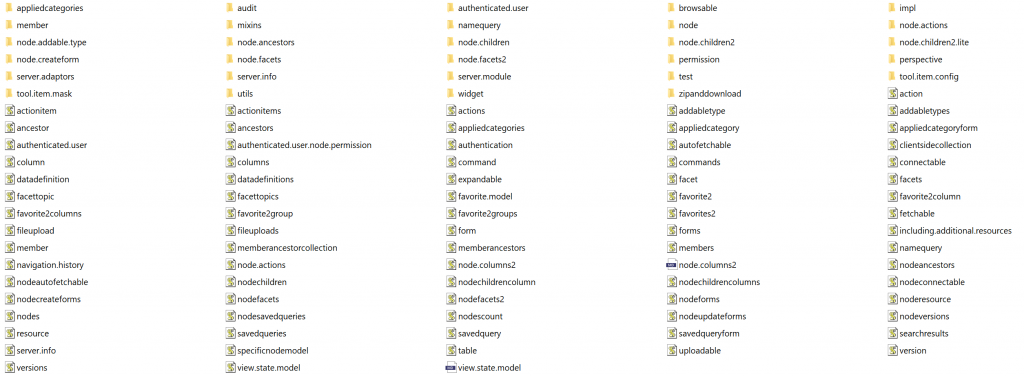
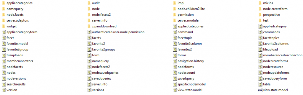
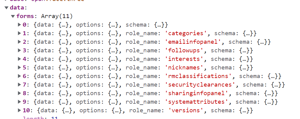
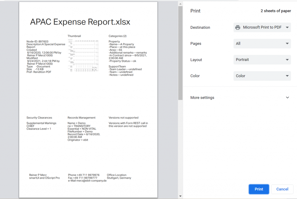
The data returned from the formsupdate?id=nn REST command
The whole data structure is send back in response to a forms/update?id=nnn REST call. Some of these entries take quite a while, so try using some css to cache this.
Have fun on discovering the endless possibilities of Dashboards and other Contentserver smartUI extensions using javascript6 and css3.
The sky is the limit.

