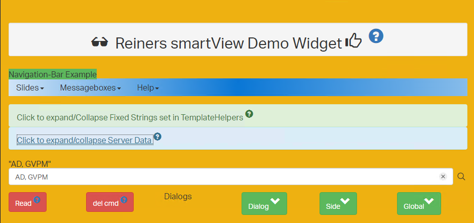
Two weeks ago I published a new video on Rethinking smartUI on Youtube. If you havn’t it seen yet, here is the short video. In this posts, we’ll go though the technical aspects of this new kind of approach to smartUI. This demo is a Document Pad (or short DocPad), displaying all document properties in a SCIFI GUI arrangement.
This is Part 3 of a multipart post covering the technical start of DocPad and the associated CSS
The post parts until now
Part 4-A The Javascript Part 1
Part 3 The Infrastructure and the CSS
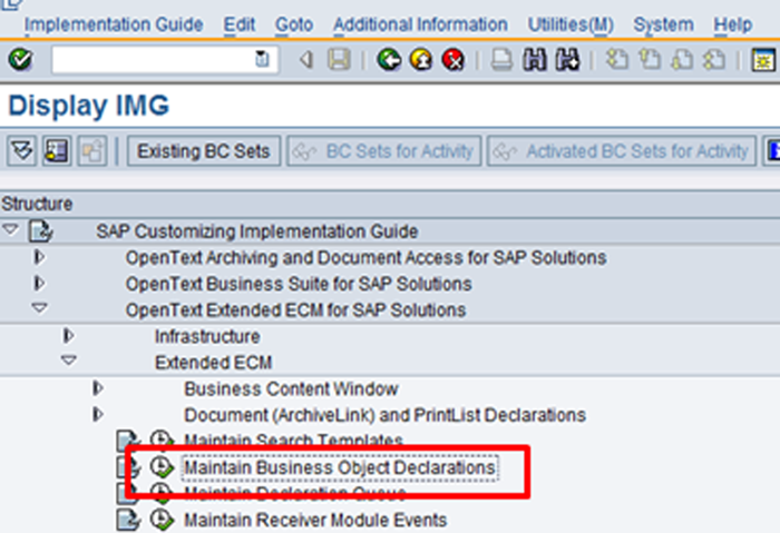
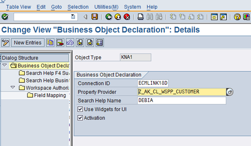
A. The technical infrastructure
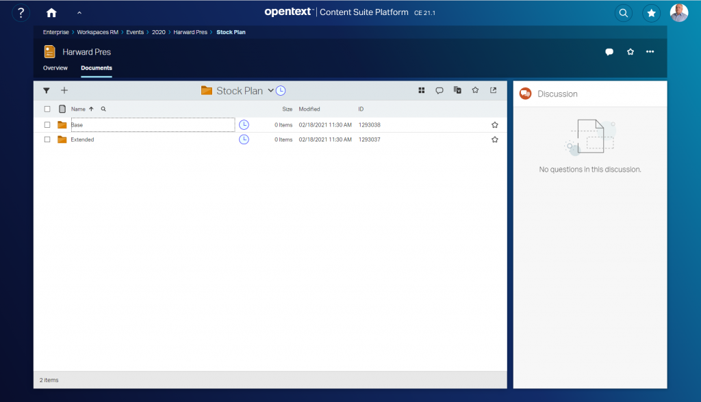
Die DocPad is started via the index.html, found in the test folder of the docpad. This is because of its much easier to test modifications via index.html compared to installing the finished widget in the content server and trying it then.
The first part of index.html
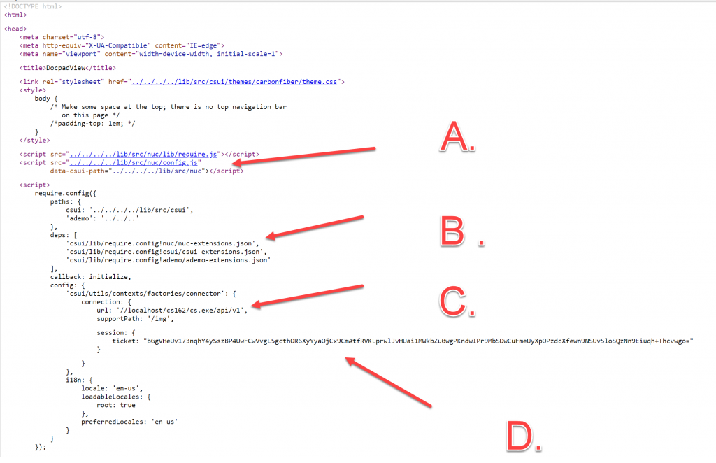
The whole page is more or less standard. We habe 4 areas of interest in the first part. Dont forget, nuc was introduced in 21.2. In older versions nuc was not existant.
- A. Here, you see the config is moved to the nuc area
- B. Change A will also require to add the nuc-extensions to the list of dependancies for csui. Thed whole js code is loaded by the “ademo” extension.
- C. My machine is on a VM. This means, if you put this on your machine, you’ll have to enter your url and your support directory (called supportPath) in the configuration.
- D. I’ve used my ticket to provide the login. You can use username and password to login the more convential way or also provide a ticket of youfself here. The displayed ticket won’t work at your site.
The second part of index.html
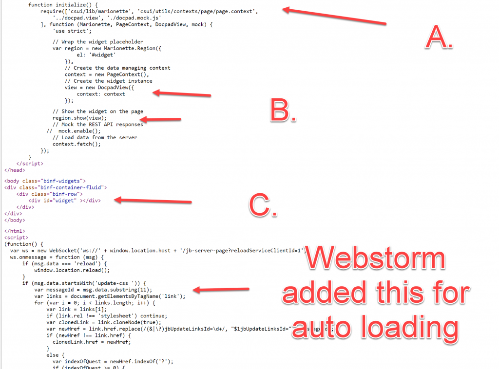
Here we have this points of interest
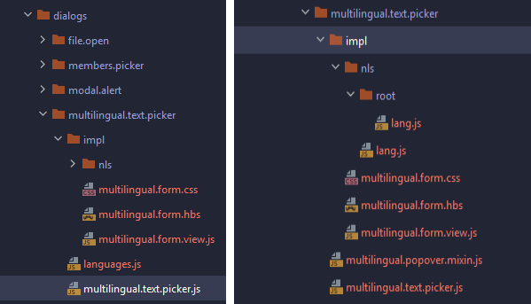
- A. The require parts of needed modules. It is a docpad.mock.js in the list of modules, but its not recommended to use the mockup facility because there is lot of traffic from and to the server. Its much easier to add a real content server behind that index.html.
- B. Standard procedure. Instanciate the widget with the context, display it in the region and fetch the context from the server. As mentioned, its easiere to use a real server as data source so switch the mockup off.
- C. The marionette region is associated with the id=”widget” of this div, so the widget is displayed here.
At the end there is immediate function starting with
(function() {
var ws = new WebSocket('ws://' + window.location.host + '/jb-server-page?reloadServiceClientId=1');
This is inserted by Webstorm (my JS IDE) to allow auto-reload of changed files. You can ignore that, other IDEs will solve that differently.
B. The CSS
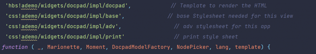
Here, all css files used in the docpad are listed in the require.js list of required modules. For demo purposed and to keep things simple, I used 3 css files:
base.css
This file contains the basic css instructions to style the .hbd template shown at the top of list.
adv.css
contains the more advanced css instructions for docpad
print.css
is the print style sheet to provide a proper output on paper.
Disclaimer: The css instructions selected do not impose or propose any styles to be followed, instead they are used for pure demo purposes here.
The base.css File
Here the main functionality of the css is found. One of the feature of css3, the variables, is used. In the pseudo element :root all variables used in different rules are defined.
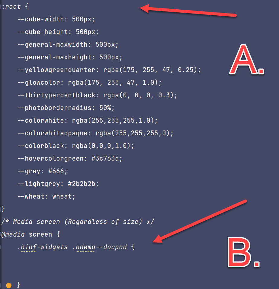
At the end of the snipped you’ll see a media query, saying the following is used tor screen display.
Lets discuss several stages:
The header + the footer
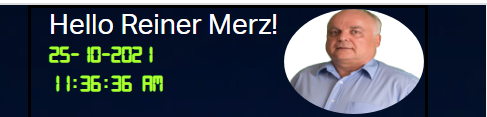

These two structures exploit the standard userinfo with REST from the content server in a standard backbone model. “Hello xxxxxx” is a structure from the hello world demo with the word “hello” and the signed in user. The photo is downloaded from the content server and dosplayed.
The bottom structure simply prints out other user data on the screen .
Points of interest:
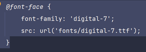
The nice digital effect is build with the font “digital-7”
The header is done with
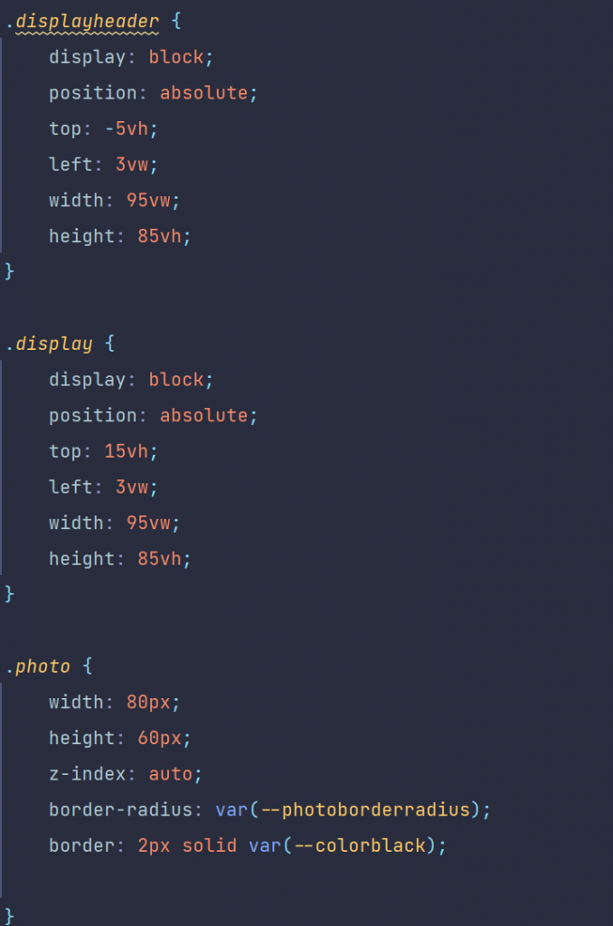
Ther photo is inserted at the position of the .photo class in the size of 80×60 pixel. Then the photo gets this nioce rounded look using border-radius.
the footer conststs of three divs, which are positioned in 3 columns
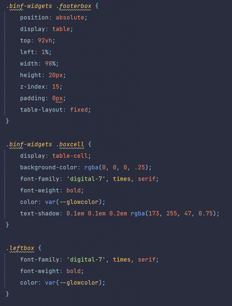
The divs have the classes .boxcell and .leftbox and are descendants of the .footerbox
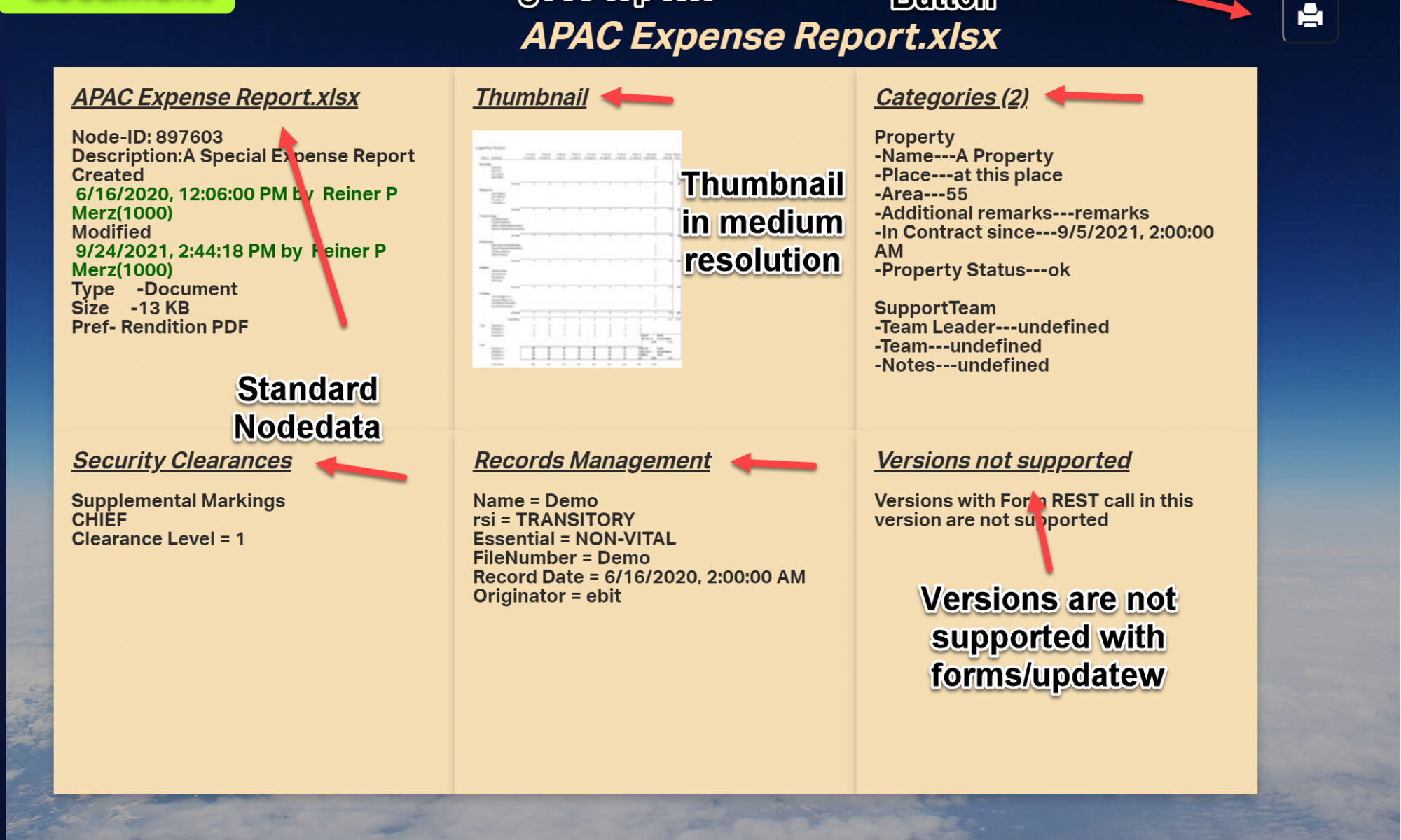
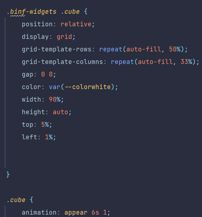
The document display
The document display consists of six divs and are positioned using a css grid.
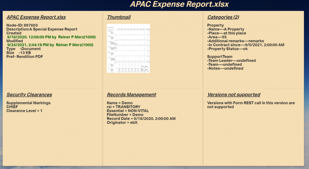
They have numbers, the numbers range from one (“card1”) to 6 (“card6”). The css part is (shown here only a fraction):
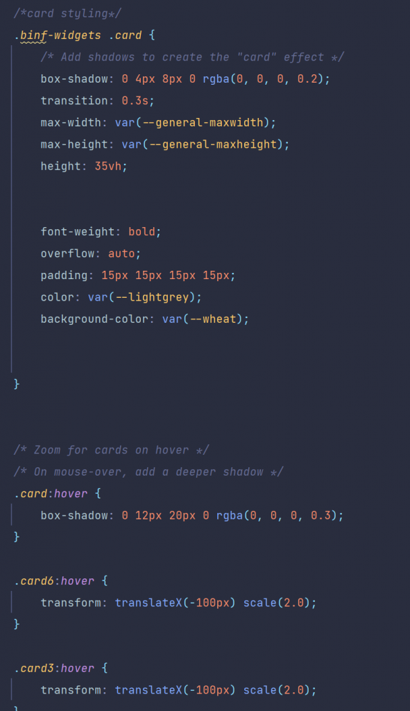
They are all children of the cube, using the display mode grid and displaying the 6 cards in two rows and threee columns.
Using the diffent REST methods in the js code, these cards were filled by the standard methods of DOM interaction from js. This will be the main theme of next weeks post, the js code of “Rethinking smartUI” Part 3.


